
Sakuga Espresso is our column about appreciating great animation in a format short enough to be read along with a shot of Espresso. ☕️
What makes a scene stand out? How do the drawings convey emotions?
Join us as we breakdown what makes stunning animation.
Illustration by Guillaume Carobbio
Like our content? Feel free to support us on Ko-Fi!
Sakuga Espresso – Heike Monogatari
The ninth episode of Heike Monogatari has particularly struck me through its visuals. The following scene, which serves as the climax to the battle between Taira no Atsumori and Kumagai Naozame, is representative of some of the aspects that made this particular episode so appealing.
The build-up to this particular scene presents some great animation. However, what strikes me most about this one is not its animation but its direction and storyboarding by Ryohei Takeshita.
While the struggle of the battle of going on, the focus is on the action and movement. The scene is thought out to let the animator’s mind express himself. But as Kumagai Naozome hesitates to finish his foe, the directing changes to a much stiller, cinematographic approach, and the emphasis shifts to shot composition and timing.
The detail that made me rethink how I viewed this scene is the rack focus when the Heike’s troops approach. Because anime is not shot with an actual camera, the intention of reproducing such an effect shows the will to emulate cinema.
The very intrusive shots put us right in the intimacy of these characters and their internal conflicts, amplifying their emotions and intentions’ expression through such framing.

The wider shot of the character lying in the water, the prolonged timing, and its stillness do a great job expressing Kumagai’s hesitation. Even though the characters are still in that scene, there is always a sense of movement. In this case, the flow of water and the reflection of light on its surface.
I can’t help but think of Akira Kurosawa’s filmmaking, which would often take a similar approach to include elements of movement, such as rain pouring in the background of scenes where the foreground would stay still. It allows, in my opinion, for a better appreciation of the flow of time despite the lack of action. In this case, helping to understand the internal struggle the warrior is going through.

As we cut to a close-up of the galloping horses’ hooves, a sense of urgency emerges, and the rhythm at which we cut intensifies exponentially. We feel that Kumagai is backed into a corner and has to make a decision until, finally, he gives the final blow.
Rather than showing us the violent strike, we cut to a shot of two albatross flying, reconciling with a calmer rhythm. The birds are a beautiful metaphor as albatrosses are thought to carry the souls of the dead at sea. Them flying through the middle of the shot as Atsumori’s lifeless body is sinking underwater is a poetic way to portray the passage to the afterlife.

The scene ends with a fisheye shot on Biwa, which once again exemplifies the use of cinematographic techniques, that can be found throughout this episode, mainly through the use of lighting and lens flare.
Sakuga Espresso – Honey and Clover
Tetsuya Takeuchi’s solo key animated episode 7 on 2005’s Honey and Clover is one of the classic works of 2000’s anime, and no doubt one of the best showcases of character animation from the period. In this slow-paced and quiet drama, Takeuchi could fully express the sensibilities that made him so special: an attention to the little motions of the body and the way they are able to convey emotion. This tendency, and Takeuchi’s ability to create a sense of bodily volume and presence situate him in a realistic lineage. But there’s something more to his animation: he does not simply try to reproduce the real physical properties of bodies or create some kind of photorealism. There’s an added quality to his drawing, a sense of quiet but pressing expressivity that makes the motion so special.
Because Takeuchi’s character animation here relies a lot on conveying emotion, it’s first necessary to understand this sequence in context. It is a tense conversation between Mayama and the woman he has an unrequited love for, Rika. In this scene in particular, Mayama is about to leave Rika for an extended period of time, but before that, he offers her a bracelet that’s the sign of his love for her, and promises that he will be back.
Rika is a thin, sickly, physically and psychologically hurt woman, whereas Mayama is a tall, bright young man. They are stark opposites, something visible in their character designs. But Takeuchi, who took some slight liberties with them in his solo episode, made this idea even clearer in this sequence. The second shot (from Rika’s point of view?) shows us Mayama bent over reading a magazine. The regular, wide curve of his large back already evokes height, but the fact that his shirt seems to be too large, especially around his thin arms and small, schematically-drawn hands, creates an opposite impression of someone ill-at-ease, not in the right position or situation.
Although we don’t see Mayama’s face, his contrasting feelings of hesitation and determination come off quite clearly. In a heavily modulated sequence that lasts for just a few seconds, Mayama suddenly closes his magazine, puts it back on the table, hunches back even more for a sigh and pauses. Then, the way he bends over and quickly rises up highlights his height and weight, and the apparent difficulty he has making up his decision of going to talk to Rika: the movement starts very slowly, on close spacings, with Mayama’s back still bent. But then the spacings suddenly get wider for a few frames, and slow back down when, finally up, Mayama starts looking for the bracelet in his pocket.
As Mayama walks towards Rika and the camera, Takeuchi once again put a lot of care into expressing weight, this time slightly exaggerating it: Mayama’s body and arms swing by left to right a bit too much, as if he was himself trying to act out some kind of weariness. This then brings us to the center of the scene: Mayama engaging the dialogue while giving back Rika’s car keys, and then offering her the bracelet.
After a few establishing medium shots, the camera settles on close-ups of Mayama and Rika’s hands. This emphasizes the awkward, sudden physical contact, but also requires some more work from the animator who had to convey in more detail the volume and motion of the hands. It’s really the sense of awkwardness which prevails here: such a gift is unexpected, and it’s clear that both Mayama and Rika don’t quite know how to react properly to what’s happening.
The actual motion of Mayama putting on the bracelet is rather simple and fluid, but the real highlight is when he takes his hands out, slightly caressing Rika’s arm and hand in the process. The deliberate timing and detailed anatomical linework allow us to appreciate this moment and what it means to both characters. But the real emotional reaction we see is Rika’s, as her fingers slightly contract and retract once they’ve lost the touch of Mayama’s hand – as if they were unconsciously reaching for it. This is where Takeuchi’s “twitching” kind of animation comes to the fore: both characters’ hands constantly move, in small bursts of barely perceivable motion. Although hands might not tremble in such a way in this kind of situation, this continuous but irregular motion perfectly conveys the feelings at play here: a short moment of intimacy, brief shivers of excitement and apprehension, the tension between two individuals who know each other’s feelings but try not to hurt them.
The second part of this moment is more sudden, as Mayama seemingly took his decision and acts more decisively: he tightens the bracelet around Rika’s wrist, so that it never leaves her – just like his feelings for her. The shapes and motion are once again very detailed, but they’re also more fluid and sudden. Mayama’s motion is less delicate and caring: it seems like he’s not searching for some however brief physical contact anymore, but confirming his feelings both to himself and Rika.
Takeuchi’s character animation, although it can go in much flashier directions, is the perfect fit for this kind of subdued, subtle moments. There may be exaggeration to the way he adds as many little movements as possible, but in instances such as this sequence, it’s limited, kept just to the right limit. This here is a kind of emotional realism, that exhibits a perfect balance between round, voluminous designs complemented by fluid motion on one hand, and more schematic linework that works best with more erratic timings and irregular movement. It is delicate work, one that plays on the smallest of details and impressions – a perfect fit for such a scene where all the emotions come through the positions and contact of bodies rather than words.
Sakuga Espresso – Mob Psycho 100
This beautiful cut from Mob Psycho 100 has a lot going for it: free, loose effects animation; a smooth and excellently-designed camera move; and some hilariously expressive cartoon faces!
However, what I’d like to bring our attention to first isn’t any of those, but rather the excellent color design and compositing that ties the whole shot together. This cut serves the narrative purpose of revealing Mob’s psychic abilities to us, the audience, so it’s fitting that the most bright and colorful thing in the room is the result of Mob’s power. When being exorcised, the spirit flashes a wild variety of neon colors in rapid succession, while sparks and flashing arcs of electricity surround it in a rainbow glow. Interestingly, the color palettes and compositing effects seem to change at a faster rhythm than the drawings, creating what I like to call a ‘sub-drawing movement’ that heightens the intensity of the scene without taking away from the vitality of each keyframe.
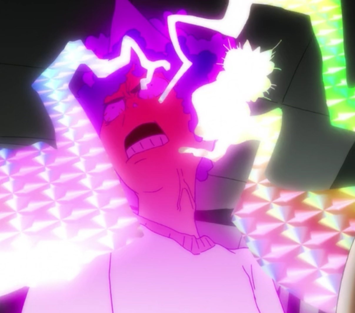
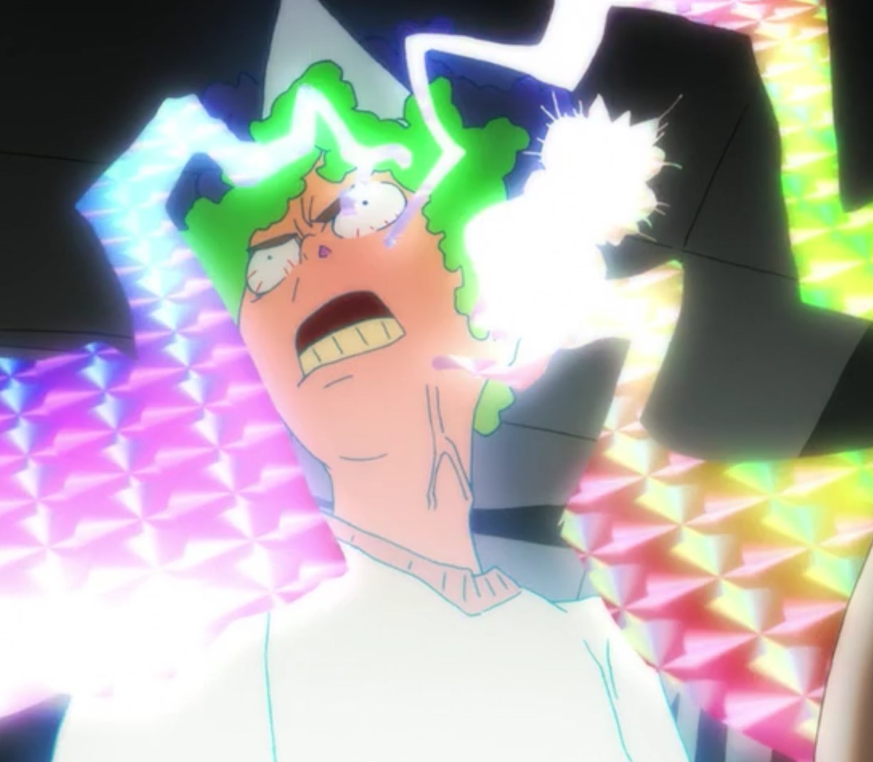
Speaking of keyframes, let’s take a moment to appreciate how excellent these drawings are! First let us consider the loosely-scribbled crackles of electricity that spring up in an instant and disappear just as quickly. I am especially endeared to the looseness with which these bolts are drawn: their rounded bends and jagged edges remind me of lines I myself have made when scribbling wildly to revive many a nearly-dead ballpoint pen!
Despite the lack of care these effects may seem to reflect, I feel that these effects function well in a unique way: the wobbly looseness of the effects animation here contrasts nicely with the precisely-drawn lines of the shifting background, and perhaps also help emphasize to the viewer how effortlessly Mob wields his psychic power.
Our appreciation of the looseness of this cut’s effects may be further deepened by the knowledge that this animator (or group of animators) can draw extremely well when they want to. There is an incredible amount of care put into conveying the solidity of the swirling spirit’s form as the camera rotates around it. Look at the way the thick contour lines overlap one another and taper off to depict a form that bubbles, twists, crunches, and overlaps itself! The short, scratchy lines on the inside of the form even begin to convey a texture I imagine being something like stretched taffy. This over-exaggeration of form helps sell the spirit’s otherworldly nature, while also reflecting the animator’s excellent shape design and solid drawing skills being applied in a playful, free way.
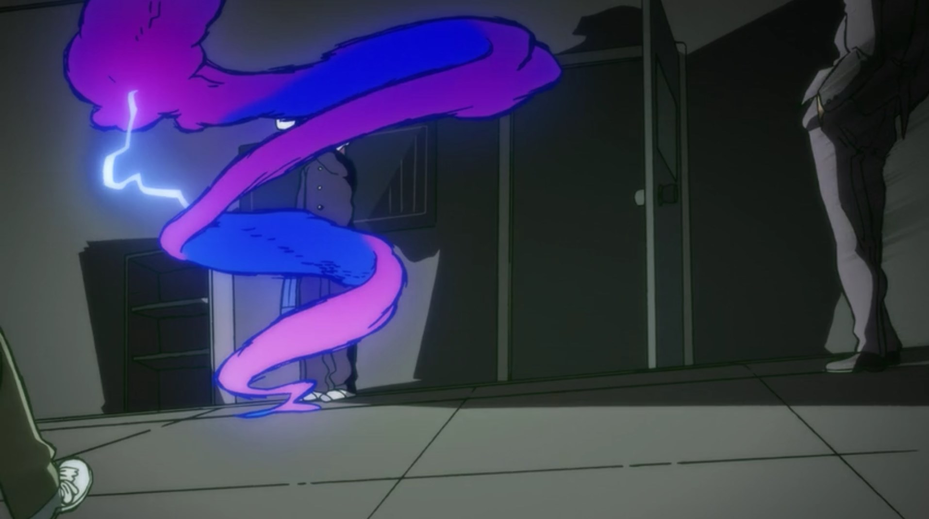
The intensive planning put into this shot shows not only in the drawings and compositing, but also in the excellent movement of the camera through the scene. The viewer starts the scene positioned roughly from Mob’s point of view, but when the exorcism starts our point of view shifts and begins mirroring the same spiral motion as the spirit. It’s almost as if the animator/director imagined a literal camera getting swept up and carried away by the same spinning psychic energy! The camera’s path of motion does a good job of highlighting the important secondary aspects of the scene: Mob’s bored expression, Reigen’s confident stance, and finally the scared couple huddling together. Near the end of its arc, the camera is momentarily obscured by two more unknown objects, but these obstructions are so brief that they mainly act as creatively-designed ‘impact frames’ for the final explosion.
All of this together makes for a shot that is exciting, gorgeous, and satisfying to rewatch. Animation at its finest – and, certainly – funnest.
Sakuga Expresso – Arcadia of My Youth
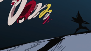
Among the many things he’s known for, legendary animator Yoshinori Kanada left his mark on anime history with his innovative way of drawing effects : lightning, smokes and explosions. The most recognizable aspect of his style is the very angular way he has of animating them, as is visible in this cut from Sailor Moon S.
The lighting bolt that opens the cut takes on a variety of shapes and irregular angles that are emphasized by a series of contrasts : the bright yellow against the dark background and, in the impact frames, red and black against yellow. As these rays move around, they create a sense of perspective that highlights the composition with the character at the center – this helps create visual flow as the light then comes back on the character who begins morphing. Again, it irradiates light in all directions as it slowly takes the form of a unicorn. But while the unicorn’s body takes on circular shapes, it’s still shining and the bolts of light still flash everywhere across the frame.
As the unicorn flies away, it produces smoke ; the shape of the smoke is pretty interesting as well, since it starts in a triangular fashion, then after an impact frame, it quickly moves away from the camera. The smoke effects and the rays of light contrast against each other (dark smoke/bright light, circular/straight trajectories) to create even more dynamism. The key idea behind this cut is geometry : these very bold shapes are what Kanada is famous for.
However, Kanada was also immensely creative, and he did not limit himself to just one kind of effects. In opposition to his geometrical style, he also developed what I’d call “liquid fire” which plays on a very different impression : see this cut from Arcadia of My Youth. As the ship on the right explodes, the flashing green light takes on the very straight shapes that are characteristic of his geometrical style. But the explosion itself starts as just a circle, before going off in all directions. Straight white vanishing lines accompany the eye into depth, following the other ship’s movement, but what’s really impressive here is the movement of the flames.
As he often does, Kanada creates movement just with color : yellow, orange, black, and a brighter white flare effect. The colors form large spans that move irregularly, like waves, in all directions along the surface of the frame. The impression given here is not that of fire, but rather of liquid magma. Rather than an explosion and flames, it’s more like another scene of morphing where fire takes on a life of its own and transforms into some sort of beast. The way he gives his animation its own autonomy, as if it were running without control, is one of the traits of Kanada’s genius.
Sakuga expresso – Re : Cutie Honey
How do you make a fight scene look as awesome as possible ? It’s simple : you just have to make everything move. But then if everything moves all at once, the viewer might not understand anything about what’s going on ! To this, Hiroyuki Imaishi might answer : who cares, as long as it’s cool. At least, that what I think he had in mind when he animated this jaw-dropping scene from Re : Cutie Honey.
The idea behind Imaishi’s style is simple : it’s to make each frame be as intense and striking as possible. To achieve it, you don’t necessarily need more images, you just need to use them well. The start of this cut is a good example of this : if you look at it frame by frame and start counting, you’ll notice it’s animated on ones… but in a very peculiar way. As the weapons of the two characters clash, the lightning casts long shadows. First, you’ve got to acknowledge that’s a strong composition emphasizing the power of the fighters ; but what’s interesting is that the same three frames are repeated during the whole shot : one of the two fighters, one of the lightning, and one of their shadows. That’s a smart move : because this is on ones, the viewer won’t notice immediately that these are the same images over and over, and it saves the animator his time, while still creating a strong impact.
But the real fun comes after that. The combatants separate from each other and Honey starts jumping around to counter-attack. In the first shot, notice how she begins by moving away from the camera, then comes back towards it as she strikes – but as her opponent parries, she’s moved from the right to the left of the frame. That’s an incredibly dynamic trajectory, but what’s amazing is that it doesn’t stop here : Honey does a barrel roll (while flying !), again moves away from the camera and jumps back towards it. The mastery of depth displayed is absolutely impressive, but from a less technical standpoint, this also contributes to put the viewer in the very middle of the action, something that becomes even more obvious in the next shots, as Honey rushes past the camera multiple times. The spectator is a part of this, and it is as awesome as disorienting.
But while it’s chaotic, that doesn’t mean it’s not fun : on the contrary, this is how the animator manages to make it as entertaining as possible. If you just close your eyes for an instant, you may lose sight of what’s going on : with Imaishi, you have to be hooked to your screen, or not watch it at all.
This becomes obvious as Honey, who’s flying back and forth, takes on a wild variety of poses and shapes : one of them has made this cut famous, when Honey becomes some sort of flying spaghetti, or a set of rings rotating very quickly. But even after that, as she jumps behind her foe, her extended arms and legs form a series of angular positions that are both funny and impressive. Their accumulation makes Honey look clumsy, as she barely evades the attacks ; but at the same time, her agility and speed are beyond comparison – just like the animator’s, whose creativity here and visual humor make this the best example of great animation.
Sakuga expresso – Yu Yu Hakusho
We’ve talked about the idea of “off-model” on this series before : to ensure that, in a show where different animators with different styles work together, the visual identity stays the same, the anime production process has some special measures. One is the animation director : often the character designer, he corrects all finished cuts to ensure that they’re good enough and all follow the same style ; another is the characters models. Each animator works with detailed character sheets made by the character designer which he refers to when he’s drawing.
However, sometimes, the animator doesn’t respect the character sheets, and the animation director doesn’t do corrections. That’s often intentional : by allowing the animation to go off-model, the animation director lets the animator’s personality completely express itself. That’s a double-edged sword, because some viewers might react badly to the different style of some scenes, and unknowingly call that “bad animation” because it’s not consistent. On the other hand, going off-model lets the animator more freedom to play with shapes and create dynamic movement. That’s precisely the case of this cut from Yu Yu Hakusho, animated by Shinsaku Kozuma.
The show’s character designs are normally very angular, especially Hiei’s, whose face is just a triangle. But in this cut, Kozuma totally disregarded it, and Hiei becomes completely circular. His face and ears get rounder, and in the first shot, he stretches on the frame in an almost unnatural manner – which helps, however, make his running more dynamic.
As the camera faces Hiei, this becomes even more pronounced : he jerks from side to side in an elliptic movement, his open mouth makes a big circle, and even his spiky hair becomes curved and less pronounced. As he runs to attack, his body becomes almost gelatinous and seems to lose its consistency – but his movement stays fluid, which is apparently the animator’s priority here. If you add to this the stark contrasts in lighting (blue/red and black/white) and the much more angular fire effects of his attack, you get a cut that uses strong oppositions for the sake of expression.
While off-model and this kind of wobbly animation are surely disconcerting, that’s precisely their strength : they surprise the viewer, and end up leaving a strong impact, which is what sakuga is all about.
Sakuga Espresso – The Tale of Princess Kaguya
One of the defining characteristics of The Tale of Princess Kaguya is how textured the entire film is. The climax of the titular princesses’ emotional journey is brought to life an amazing scene by the animator Shinji Hashimoto. The young Kaguya flees her home in a furious sprint. She is is angry, hurt. But how do we know that?
Part of it is the story/dialog contextualization, but I would argue that the actual emotion lies within the texture of the lines. At the same time, animation is the story. How something plays out, the actors on screen, the actual story only plays out if it is drawn. With animation, the animator is an actor, a cameraman, an artist, the special effects crew, and (last, but not least) a storyteller.
So let’s examine the clip:
Nothing in this shot seems stabilized. The camera is bouncing, almost struggling to keep subjects in frame. We cut to the moon as is fights (and fails) to stay centered. The ground shifts, straying up and down from the lower third of the picture. Princess Kaguya becomes reduced to a flailing, geometric figure. Her run is frantic, crawl-like, animalistic. It’s instinctual, without a goal, with no focus other than just running.
The background/foreground is inconsistent. The Princess is lost, and must stay lost. Where the frame to stop, it would allow us a viewers to orient ourselves, take in our surroundings. But that is the message of the scene; it’s all too much for Kaguya to take in at once. Her home changes. Her social circle, shifting. Shes maturing into a woman. So much has happened in the film up until this point. Her surroundings are never the same. As she navigates through this tumult, she stumbles, loses her footing, and falls.
All of this is owed to Hashimoto’s brushwork. The unruly, unpredictable nature of painting with a brush exacerbates this message. It speaks to the emotional instability of the character, bringing us into her world and showing us her perspective. This brushwork also provides a rhythmic pulse to the cut, as stands of hair are repeatedly brushed back by the wind, as dirt is clawed from the ground, fabric taking flight. Details become lost, foliage reduced to singular strokes of the brush. But yet the texture remains.
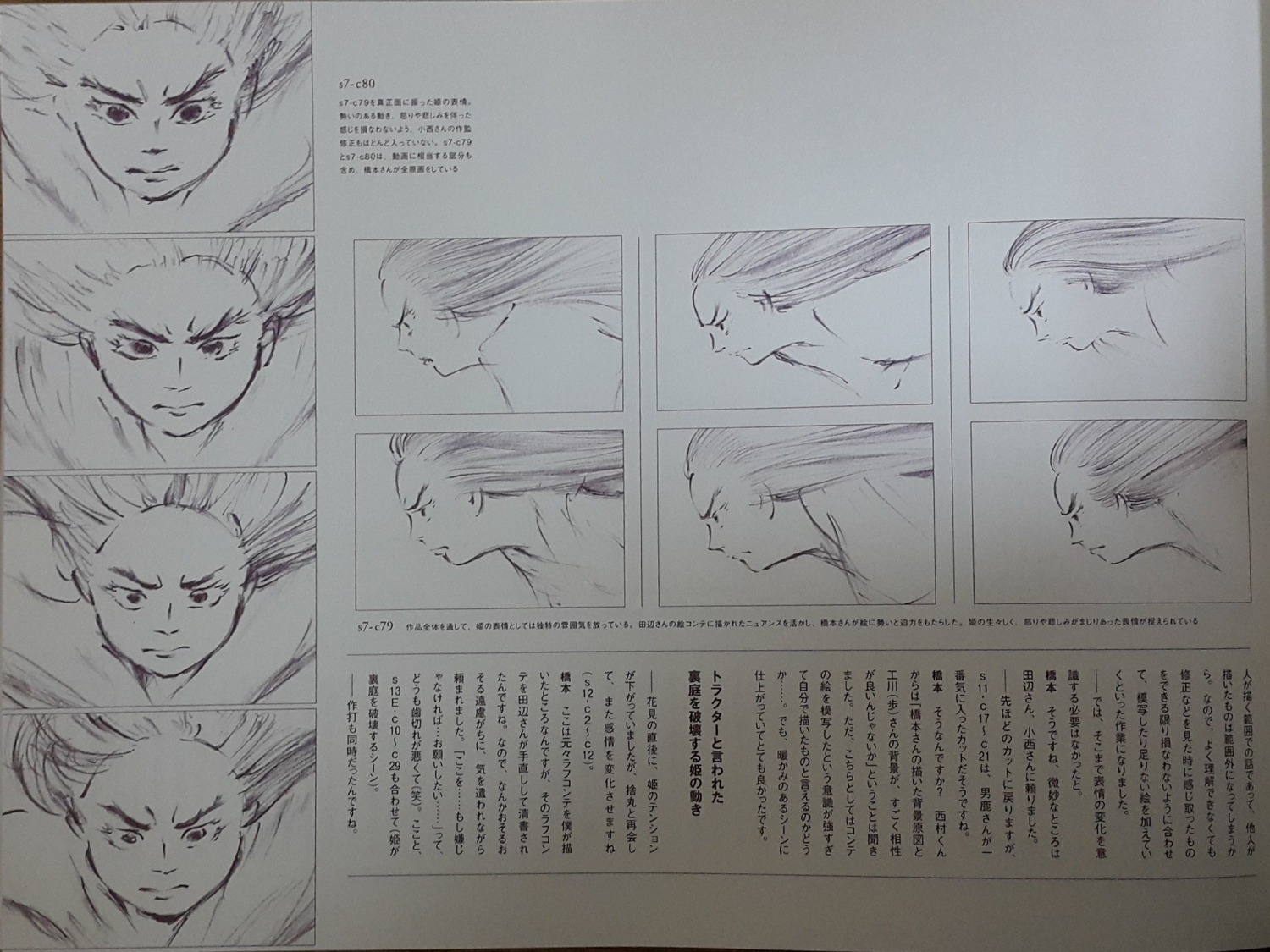
Story-boarder and character designer Osamu Tanabe was the brilliant mind to strike a balance between preserving details in the art while stripping away all other unnecessary details in a minimalist expression. To do this, the animation was drawn small, then enlarged. This method allows the natural grain to breathe life into the animation, capturing the lively spirit of art being made right before your eyes. But more than that, it speaks to the emotional integrity of the art.
It’s a moment where the everything, style, technicality, and feeling come together for a greater whole. ☕
Sakuga Espresso – Miraculous Ladybug
Every morning, my daughter wakes up and asks for two things: chocolate milk and Miraculous: Tales of Ladybug & Cat Noir. It’s how we start every morning, and I can’t complain, the show isn’t that bad for a CG kids’ show. But come to find out there originally was an anime project planned by Toei, I had to check it out. Turns out, it’s animated really well!
Unfortunately, all that exists of the project is a 2013 PV (short for preview, basically a trailer/concept reel), but some of these cuts are absolutely superb! Today’s clip is no exception! Presumed to be animated by Toei ace, Naoki Tate, what caught my eye was the movement and perspective used to give this action sequence a smooth (yet exciting) flow.
We start of with Ladybug’s heroic leap from above, stylishly tumbling and twirling into a kick. The smears and snapped key poses work together by contrasting each other. Let’s look at the former first. Half way through the fall to give a sense of energy and speed, Ladybug becomes one noodlely smear with only her head having a recognizable shape. Immediately there after, the latter kicks back in, snapping our heroine into a voguish pose (even sneaking in a wink). All of this happens rather quickly before the end of the jump, as Ladybug’s knee comes towards the camera.
On the technical side of things, there are a couple of core animation principles at work here. The first being ‘Slow in & Slow Out‘, a technique used that eases our eyes into and out of an action. We have plenty of time to establish that Ladybug is falling toward the camera, which allows us to focus more on how she is falling.
Another technique employed in this shot is the use of closure, or the mind’s ability to assume movement between the drawings. I mentioned the “noodlely smear” – anatomically, the isolated drawing makes no sense, but since we are used to assuming movement, we interpret the split-second frame as speed, the motion being too fast for us to track. A real life application would be the blades of a fan, they move too fast to track individually, but that doesn’t stop us from ‘seeing’ the movement.
The rest of this scene boasts impressive ‘camera work’. I put that in quotations because in 2D animation, there is no camera. This poses the obvious problem of ‘moving the camera’, since there is no camera to move. Instead, the animator must draw each frame with a shifting perspective.
Even with a stationary object, this would be a challenge, but factor in an action sequence with rapidly moving subjects on screen… now you see just what an impressive feat of animation this is! Each subject has to remain anchored enough that the shifting perspective makes us (the camera) feel like we are the ones rotating around the action. And yet not too anchored as to feel stiff and inappropriately heavy. It’s a perfect balance that’s simply miraculous! ☕
Like our content? Feel free to support us on Ko-Fi!
Benoît Chieux, a career in French animation [Carrefour du Cinéma d’Animation 2023]
Aside from the world-famous Annecy Festival, many smaller animation-related events take place in France over the years. One of the most interesting ones is the Carrefour du Cinéma d’Animation (Crossroads of Animation Film), held in Paris in late November. In 2023,...
Directing Mushishi and other spiraling stories – Hiroshi Nagahama and Uki Satake [Panels at Japan Expo Orléans 2023]
Last October, director Hiroshi Nagahama (Mushishi, The Reflection) and voice actress Uki Satake (QT in Space Dandy) were invited to Japan Expo Orléans, an event of a much smaller scale than the main event they organized in Paris. I was offered to host two of his...
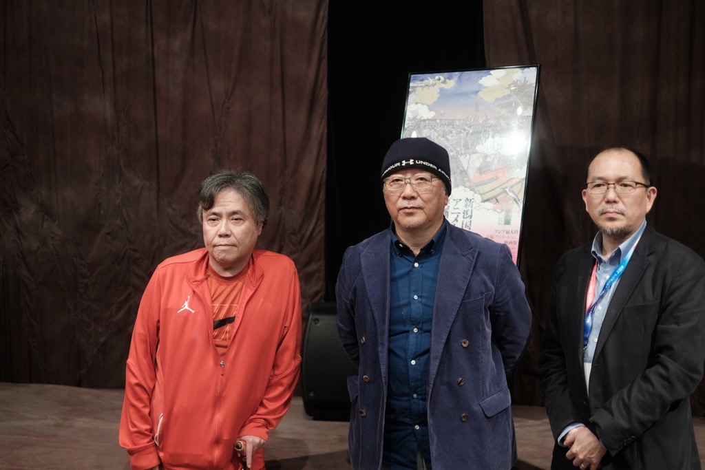
Akira stories – Katsuhiro Otomo and Hiroyuki Kitakubo talk at Niigata International Animation Film Festival 2023
Among the many events taking place during the first Niigata International Animation Film Festival was a Katsuhiro Otomo retrospective, held to celebrate the 45th anniversary of Akira and to accompany the release of Otomo’s Complete Works. All of Otomo’s animated...
I’m really loving these daily espresso essays! From a fellow sakuga fan and an aspiring animator, please keep up the good work!
These shorts really help me to better understand animation in a lexical way, thank you very much for the write-ups!
I love your elaborate and great understanding of animation. These columns are a great read. 🙂