
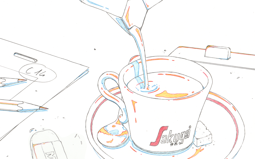
Sakuga Espresso is our column about appreciating great animation in a format short enough to be read along with a shot of Espresso. ☕️
What makes a scene stand out? How do the drawings convey emotions?
Join us as we breakdown what makes stunning animation.
Illustration by Guillaume Carobbio
Like our content? Feel free to support us on Ko-Fi!
Sakuga Espresso – Neon Genesis Evangelion
It’s not every day that you get to see an animator’s raw creative and unbridled ability on display. What I mean by that are these little moments when the animator has such complete creative control over what they are drawing – today’s cut from the final episode of Neon Genesis Evangelion is such an example.
It’s not every day that you get to see an animator’s raw creative and unbridled ability on display. What I mean by that are these little moments when the animator has such complete creative control over what they are drawing – today’s cut from the final episode of Neon Genesis Evangelion is such an example.
It’s no secret that the finale of Evangelion ran into production issues (putting it lightly) during its finale. A large portion of those final two episodes was incomplete, to the point that ‘next time’ previews for each respective episode were unfinished, having only rough key frames (some of which never made it into the episodes and was instead moved to the conclusive film) to show. That said, the story boards too were in a similar disarray.
The animator for the cut we’re focusing on today, the legendary Yoh Yoshinari, had this to say about the storyboards:
There were only brief indications about the content on the storyboard… The context was quite special too. The production was hard-pushed, and we didn’t even know if the episode could air in time, so it almost felt like we could draw whatever we wanted to.
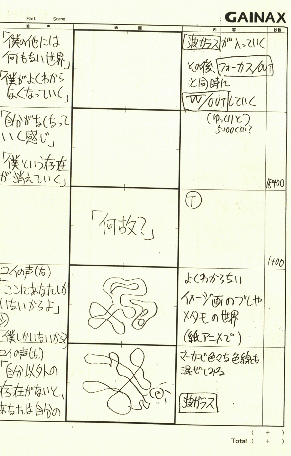
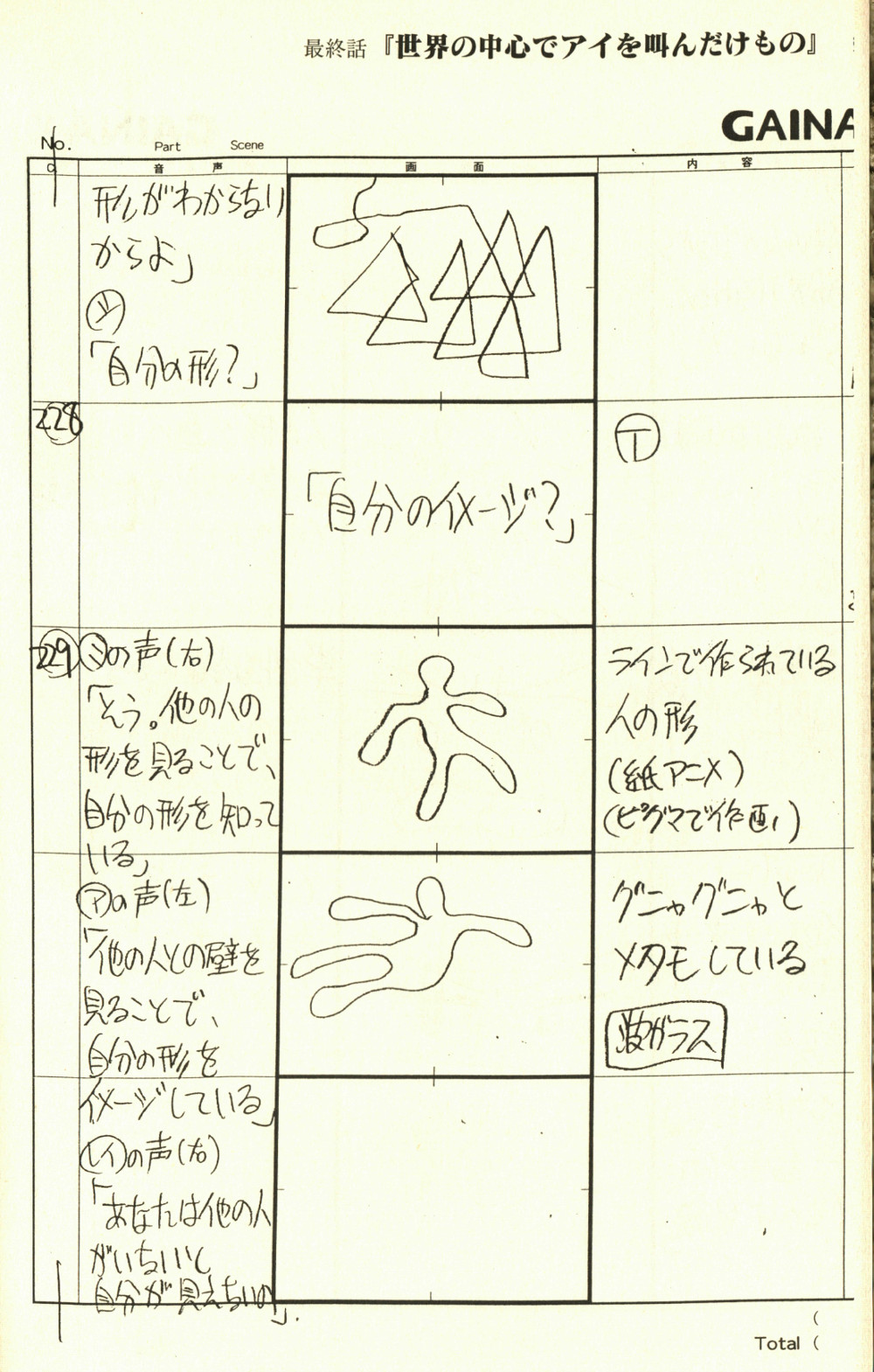
Looking at the original storyboards for this cut, we can see that Yoshinari is being quite modest when he says “brief indications”. Instructions in the margins are vague, to say the least. Director Hideaki Anno’s notes boil down to phrases like, ‘use different color markers’ and ‘some transformations here’, the most detailed being a ‘flappy metamorphosis’.
Using what little he has to go on, Yoshinari works his magic, as he goes through a series of shapes and forms seamlessly. To achieve this, Yoshinari alternates between animating on the 1’s and 2’s (a new image every one to two frames respectively).
It’s really quite lavish the way he does so, having explosions of movement and transformations between shapes on the 1’s, and solid forms on the 2’s. The slower (on the 2’s) animation allows the forms on screen to retain a sense of weight, and gives our eyes a rhythm to follow so we rest can catch up.
The other element that makes this piece of animation so special is that the lines scene are the actual marks made by Yoshinari, untouched by post processing effects or even transferred onto a painted cel for that matter.
Instead the actual genga (original drawings) was passed though a tracing machine. That rawness of the art speaks to the rawness of the story on screen. Our protagonist, Shinji, does not know what to make of himself, and thus the animation reflects that.
But notice how each form has roughly the same amount of mass. Shinji is still the same value no matter what his shape is. The art encapsulates the message of the show. ☕
It’s no secret that the finale of Evangelion ran into production issues (putting it lightly) during its finale. A large portion of those final two episodes was incomplete, to the point that ‘next time’ previews for each respective episode were unfinished, having only rough key frames (some of which never made it into the episodes and was instead moved to the conclusive film) to show. That said, the story boards too were in a similar disarray.
The animator for the cut we’re focusing on today, the legendary Yoh Yoshinari, had this to say about the storyboards:
There were only brief indications about the content on the storyboard… The context was quite special too. The production was hard-pushed, and we didn’t even know if the episode could air in time, so it almost felt like we could draw whatever we wanted to.
Using what little he has to go on, Yoshinari works his magic, as he goes through a series of shapes and forms seamlessly.
To achieve this, Yoshinari alternates between animating on the 1’s and 2’s (a new image every one to two frames respectively).
It’s really quite lavish the way he does so, having explosions of movement and transformations between shapes on the 1’s, and solid forms on the 2’s. The slower (on the 2’s) animation allows the forms on screen to retain a sense of weight, and gives our eyes a rhythm to follow so we rest can catch up.
The other element that makes this piece of animation so special is that the lines scene are the actual marks made by Yoshinari, untouched by post processing effects or even transferred onto a painted cel for that matter.
Instead the actual genga (original drawings) was passed though a tracing machine. That rawness of the art speaks to the rawness of the story on screen. Our protagonist, Shinji, does not know what to make of himself, and thus the animation reflects that.
But notice how each form has roughly the same amount of mass. Shinji is still the same value no matter what his shape is. The art encapsulates the message of the show. ☕
Sakuga Espresso – Haikyuu!! To the top
For the finale of Haikyuu!!’s fourth season, Sachiko Fukuda presents us with some action-packed cuts. This scene, in particular, shows how her style has evolved throughout the series, inspired by Takashi Mukouda.
The dynamic run at the start is breathtaking: the tempo of the animation suddenly accelerates the rhythm of the match. The immersion is accentuated by the camera angle, which focuses on the character’s legs and ending on a closeup of the deformed, stretched foot, which allows for an impactful transition to the next cut.
The wind effects, coupled with smears, enhance the strength put into the initiation of the jump.
The rhythm of the scene abruptly slows down as Hinata is in the air, leaving us to admire Hinata, the animation of his clothes and hair highlight his pose and prepare for the highlight of the scene: the hit of Karasuno’s 10.
The sequence is very reminiscent of the following scene by Takashi Mukouda.
Notice how, from 9 seconds onward, we have a similar closeup forerunning the jump, followed by the use of special effects to enhance the jump’s impact. The use of smears, as well as the model’s deformation through stretching, supply the speed, put into the action.
I love how the similarity of the two scenes serves narrative purposes. By successfully achieving the same jump as Hoshiumi shows his growth as a character and how close he is to become a Little Giant, like his Senpai. At the same time, it shows Sachiko Fukuda’s development as an animator, who is herself catching up to her senior.
After Hinata’s anticlimatic failure, the subtle smears when he lands are a great detail emphasizing the strength put in the jump.
The heavy use of speed lines in the last cut, as well as the frenetic movement, accentuate the comedic aspect of the attack’s failure ending the sequence with as much intensity as it started.
Sakuga Espresso – Dragon Ball Super: Broly
I think my favorite part of the clip for today’s Sakuga Espresso has got to be the first 15 seconds of Ryo Onishi’s cut from Dragonball Super: Broly. I find the way Goku moves absolutely captivating, so bouncy and child-like. I remember watching the clip when I was sitting out on my porch, sipping coffee, and the smile that came to my face. The entire spirit of Sakuga Espresso!
What Onishi has achieved is grade-A character acting. There are several elements that are perfectly balanced to bring this moment to life. From the character designs and storyboards, to the actual animation itself – it all comes together as parts of a greater whole.
Examining the animation, Onishi’s timing and sense of weight are fantastic – or you could say that Onishi’s timing is the sense of weight. The speed of ascent and fall on Goku’s jump has a very real pulse that makes his presence on screen feel physically weighted.
A perfect number of frames are spent on the squash and stretch during the closeup of Goku’s feet as he flexes and springs into the air. That squash and stretch is an essential building block of animation to depict mass and rigidity, and here it’s faultless.
But as we zoom out, we see more than just Goku bouncing one foot to the other, his shoulders raise and lower, he whips his head to loosen his neck – he’s preparing for a fight. What pushes this animation over the top for me is that it’s a very ‘Goku thing’ to do; the animation is portraying the personality of a long established character in a way that feels honest and authentic.
Pat of this is owed to the character designs of Naohiro Shintani. The previous designs of Tadayoshi Yamamuro are more detailed and intense, where as Shintani is more rounded, friendly, and playful; more like the original Dragonball look in my opinion. That plays in very well to the actual movement Goku opens with as Broly is powering up, it’s playful and almost childlike.
Another boon of the Shintani designs is that the use of shadow becomes more coded. The more shadow, the more intense the emotion. And in a series like Dragonball, that’s a very effective style. Notice how shaded Broly is compared to Goku, establishing him as the threat in this scene, while Goku remains virtually untouched by shadows, keeping him lively. ☕
Sakuga Espresso – Lupin the 3rd (1971)
What I find most interesting about this clip is how little it actually shows us. This clip from the 1971 Lupin the 3rd is only seven seconds long, and has seven cuts. Easy math tells us that each cut only lasts on screen for a second, so it’s quite fast. But when you actually watch the clip, you realize that a lot of these smaller ‘subjects’ (as we will call them) are even faster than a second, given that the bulk of the scene is a slow motion slash taking up half the run time.
That being said, the speed is only one factor. What I mean by “how little” is how the camera hones in on those subjects. A springing foot. Lupin and Jigen, diving through the air. Goemon slashing with his katana. A single, hairy hand landing. Finally, Jigen rolling to safety as Goemon slashes through an airborne tatami mat. The way I’m writing it might make these subjects sound inconsequential, after all, on their own they would be. But in this context, it actually paints a very comprehensive picture of the situation.
In sequential art, this is referred to as an subject-to-subject transition. And what is anime if not sequential art? In order for this type of transition to make sense, we have to consider what happened before, and what happens after. It promotes the understanding that these actions are happening in response to, or because of what is occurring out of frame. As such, it encourages audience participation as each subject must be added together like different ingredients that make a whole.
Given this, the scene reads as Lupin and Jigen preemptively moving to escape Goemon, being quick on their feet and diving out of the way. But Goemon is so deadly that the two just barely make it in time. That danger is suspended by the increased spacing between each drawing, creating a slow-mo effect of the tatami mat being cleaved clean in two.
So what makes this scene impressive if this is all par for the course in cinema? It is actually here that we return to the speed in which it all occurs.
One of the strengths of animation is how little it needs to be on screen to convey its message. Even though both live action and animation are displayed at the same frame rate of 24 frames per second, actions that take only a few seconds to complete take a massive amount of frames, where animation can display a similar (if not the same) action with only a few frames.
Our animator Osamu Kobayashi (小林治, for clarification) leverages this advantage to make this scene feel more intense. He even sneaks in expressions of glee on Lupin and Jigen’s faces as they jump (something that would be next to impossible to capture in live action).
But nothing about this scene feels rushed. We are allowed to breathe as we reach the pinnacle of the action. It’s a combination of framerate modulation (which we’ve mentioned before in a previous Sakuga Espresso!) and elegant storyboarding by Tameo Kohanawa.
Displaying action is one thing, it’s another to make it exciting! ☕
Sakuga Espresso – Ping Pong
I think sometimes we forget that good animation does not have to be flashy or lavish to be considered good. Yes, an objective element of technicality does have a large influence in the value judgement of a piece, but technicality and flashy are not the same thing. Sometimes a more basic approach with respect to the fundamentals goes a long way. Case and point, today’s cut from Masaaki Yuasa‘s Ping Pong.
The most important thing for food to do is to look delicious. But a lot goes into making the image of food invoke the viewer’s sense of taste. First, it must look good to the eye!
One of the first things you’ll notice in this cut is the movement. Fingers slowly kneed and fold the dough, giving way to new colors. What’s key here is the placement of the movement in the frame, especially since this shot pans upwards to another pair of hands performing a similar action.
Our first set of hands occupies a space that divides the frame into an equilateral triangle. Taking up one third of the screen space, the placement of the bowl and dough cloth behind the hands help extend this shape and balance the composition. As the camera pans up, the second pair of hands comes into view, but this time taking up the space in the triangle to the left. To completely balance out the cut, the folded dumplings are placed onto a try on the far right side of the screen, the last unused triangle.
This sequential showcase of movement gently leads the eye around the screen. During the course of this one cut, each sector of the frame is used with a subtle, but well planned efficiency. So even if you weren’t craving dumplings, you enjoy watching them being made.
The second piece of the equation is to make the food look like it’s, well, actually food. Looking closely at the textures in the composition, there’s a very strong relationship between the colors and lines of the objects onscreen.
Lines are used sparingly, giving objects shape, while the color is used to create depth. And since we instinctively look for color in food (veggies should be green, meats should be brown/red, etc.), it’s a much more natural way of depicting food.
So while it may not be the flashiest work of animation, or the most action packed battle scene, it is still an effective piece of cinema that incorporates a style and structure unique to animation! ☕
Sakuga Espresso – Jo Jo’s Bizarre Adventure: Golden Wind
Let’s talk a little bit about ‘being on modal’.
In animation, there are visual references that are established to help things looking consistent. Unlike live action films, the actors, sets, and scenery must all be drawn, and doing so where everything looks ‘as it should’ can be a monumental task.
After all without a semblance of consistency, characters would look different from scene to scene, maybe even unrecognizable in some cases. But it’s not only visuals that can suffer without these guidelines, tone and plot integrity can be jeopardized as well if the work doesn’t look polished and professional.
In anime, these reference materials are called settei (short for setting). Character designs/modals, architecture, and other important visual elements are drawn by the designer design team at multiple angles to give the animators a clear vision of what and how to draw what is needed. In this case we are going to focus on the character designs for Giorno from Jo Jo’s Bizarre Adventure Part 5, Golden Wind.
So why deviate from the designs that a painstaking amount of time and effort is put into keeping consistent? To figure that out, we need to ask, ‘What aspects of the animation are deviating?’ and ‘What does it do for the animation?’

The first thing we can notice is the added texture.
The characters on the screen appear coarse, almost scratchy. And even though it’s not ‘real to life’ per se, it’s an added layer that we can relate to. Involving all five senses is a challenge in cinema.
At the end of the day, all cinema is are images projected onto a two-dimensional surface, often accompanied by sound. Typically, taste and smell are ruled out (though not always) leaving visual, auditory, and surprisingly, our sense of touch. Perhaps that’s the reason the key animator, Takahiro Kishida, deviated ‘off modal’ – to further involve us as viewers in what’s happening onscreen.
This added texture also allows intricate details of muscles moving under the skin, or the malleable squishyness of Girono’s ear, to be captured in greater detail. Something that might have come off stiff in the highly polished and structured character designs that Jo Jo’s is known for.

Instead, Kishida leverages the stylization to draw out the action in a slow burn, little movements are made in a constant a consistent pulse like a drum roll that then pop or snap with a short bursts of larger movements.
This works especially well given the overlapping movements between the three characters onscreen. Standard practice with limited animation is to have only one subject move at a time, but instead we have characters clothes shifting, speaking, blinking, and ears popping all within the same span of time – just as it would if real actors occupied their space.
Since this is one of our first interactions with Giorno, the illusion that this character lives and breathes (or that we can imagine them living and breathing in our world) is a triumph of animation, character modals be damned! ☕
The first thing we can notice is the added texture.
The characters on the screen appear coarse, almost scratchy. And even though it’s not ‘real to life’ per se, it’s an added layer that we can relate to. Involving all five senses is a challenge in cinema.
At the end of the day, all cinema is are images projected onto a two-dimensional surface, often accompanied by sound. Typically, taste and smell are ruled out (though not always) leaving visual, auditory, and surprisingly, our sense of touch. Perhaps that’s the reason the key animator, Takahiro Kishida, deviated ‘off modal’ – to further involve us as viewers in what’s happening onscreen.
This added texture also allows intricate details of muscles moving under the skin, or the malleable squishyness of Girono’s ear, to be captured in greater detail. Something that might have come off stiff in the highly polished and structured character designs that Jo Jo’s is known for.
Instead, Kishida leverages the stylization to draw out the action in a slow burn, little movements are made in a constant a consistent pulse like a drum roll that then pop or snap with a short bursts of larger movements.
This works especially well given the overlapping movements between the three characters onscreen. Standard practice with limited animation is to have only one subject move at a time, but instead we have characters clothes shifting, speaking, blinking, and ears popping all within the same span of time – just as it would if real actors occupied their space.
Since this is one of our first interactions with Giorno, the illusion that this character lives and breathes (or that we can imagine them living and breathing in our world) is a triumph of animation, character modals be damned! ☕
Sakuga Expresso – My Hero Academia
What makes Yutaka Nakamura’s animation so special ? There are a lot of potential answers to that question, but here’s mine : among other things, it comes from the incredible sense of fluidity his animation has. To put it in other words, it feels like his characters and effects don’t move and act in the same world as we do – they’re not really bound by matter, but are beings made of pure movement.
Bakugo’s flight here is a spectacular example of that : after a spectacular explosion, he just flies away like it was nothing, as if he was just carried by the wind. This is in part simply due to the number of frame he uses : most of this cut is either on ones or twos, meaning that each new frame, or one frame in two, has a new image. But Bakugo’s attitude itself gives him an air of ease, as if this was just some simple exercise : for most of his trajectory, he’s just standing straight in the air, as if we wasn’t actually flying – and it’s the background rushing by that informs us about his actual speed.
As if Nakamura was showing off himself, he also switches between very schematic and detailed animation : when the hands join, he uses heavy smears that make shapes disappear in favor of pure movement, but when the camera centers on Bakugo talking, every little detail is animated, from the little motions of his hands, his hair, and even his shoelaces. This gives a sense of realism, as we can feel the wind ourselves, but most importantly the impression that everything is moving : there’s not a single still image, but pure movement and fluidity. And even though we know that animation is a grueling work, Yutaka Nakamura’s power is to make it seem effortless, as if things were moving on their own and by their own energy. This feeling of ease and power is what makes him so special.
Sakuga Espresso – Kizumonogatari
In animation, a line means everything. Take this scene in Kizumonogatari for example:
Panicked and afraid, Araragi’s gaze pierces us. He trembles until his panic overtakes him, clambering to get away. The action feels frantic. Part of that is due to the fact that animator Yuuya Geshi decides to contort Araragi’s outline, but I want to point out the smaller lines that assist the action. Speedlines are nothing new, they’ve been used since the dawn of animation, and before then in the still images of manga.
In animation, lines are the words that are used to convey meaning. Sometimes many words are needed to tap into the realism of an object. Other times profound thoughts are stated in simplicity. This concept is perfectly encapsulated in Yuuya Geshi’s cuts as just described. Too often the term ‘sakuga’ is all about movement, and while that’s not wrong, it’s important to remember that movement is often how and (more importantly) when lines appear.
But what makes Geshi’s next cut so visceral is how those lines evolve. Frantically, our hero (if he can be called that) flees. His limbs flail wildly, clawing at a chance to escape in a brazen display of pathos. His face sours from terror. All of this emotion is captured in the thickness of the lines that distort Araragi’s true shape. The lines bleed his hysteria, and give each action the perception of actual physical weight which only heightens the sensationalism.
Geshi’s depiction of running taps into a deep subconscious understanding that we have developed as a species: being able to guess what an object will feel like just by looking at it. This is a critical ability when it comes to discussing animation. Physical characteristics (like weight, speed, malleability, etc) as well as emotional characteristics (heavy, gentle, openness, vulnerability); all this information is conveyed with lines. In this case, the strength and thickness of the lines translates into the savageness of Araragi’s retreat.
Further punctuating the drama are closeups of Kisshot’s crying. As she lays helpless on the ground, abased and bloody, Kisshot’s face conveys her torture. But she stays beautiful. Relatively few lines touch her face in comparison. It’s a brilliant juxtaposition between using less lines and using many. ☕
Like our content? Feel free to support us on Ko-Fi!
Benoît Chieux, a career in French animation [Carrefour du Cinéma d’Animation 2023]
Aside from the world-famous Annecy Festival, many smaller animation-related events take place in France over the years. One of the most interesting ones is the Carrefour du Cinéma d’Animation (Crossroads of Animation Film), held in Paris in late November. In 2023,...
Directing Mushishi and other spiraling stories – Hiroshi Nagahama and Uki Satake [Panels at Japan Expo Orléans 2023]
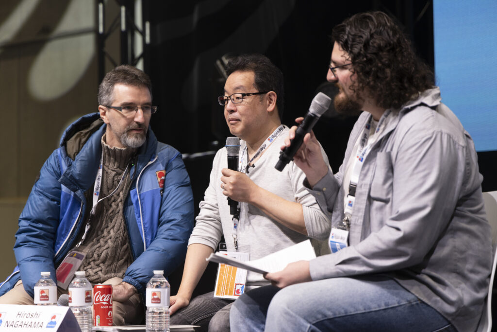
Last October, director Hiroshi Nagahama (Mushishi, The Reflection) and voice actress Uki Satake (QT in Space Dandy) were invited to Japan Expo Orléans, an event of a much smaller scale than the main event they organized in Paris. I was offered to host two of his...
Akira stories – Katsuhiro Otomo and Hiroyuki Kitakubo talk at Niigata International Animation Film Festival 2023
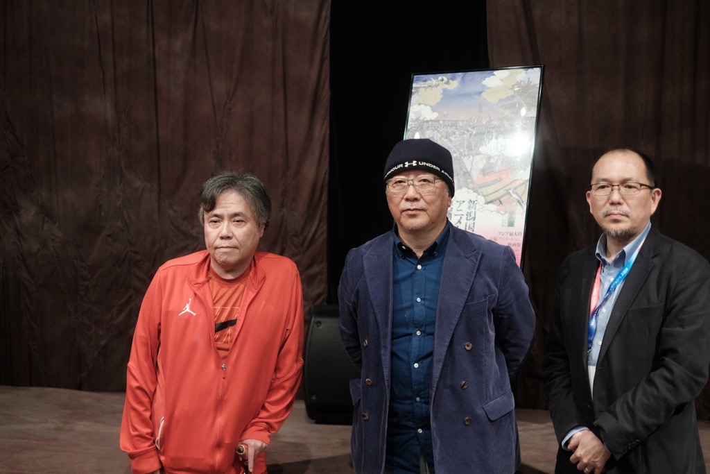
Among the many events taking place during the first Niigata International Animation Film Festival was a Katsuhiro Otomo retrospective, held to celebrate the 45th anniversary of Akira and to accompany the release of Otomo’s Complete Works. All of Otomo’s animated...
I’m really loving these daily espresso essays! From a fellow sakuga fan and an aspiring animator, please keep up the good work!
These shorts really help me to better understand animation in a lexical way, thank you very much for the write-ups!
I love your elaborate and great understanding of animation. These columns are a great read. 🙂