
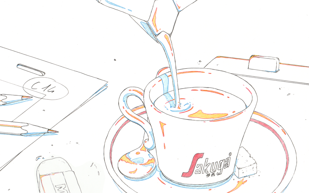
Sakuga Espresso is our column about appreciating great animation in a format short enough to be read along with a shot of Espresso. ☕️
What makes a scene stand out? How do the drawings convey emotions?
Join us as we breakdown what makes stunning animation.
Illustration by Guillaume Carobbio
Like our content? Feel free to support us on Ko-Fi!
Sakuga Espresso – One Piece #1074
Lately, something notable has been happening with the One Piece anime, particularly in the past few months. I can’t help but wonder how a long-running shônen anime like this managed to deliver top-notch animation consistently. In fact, some of the animation could be considered as some of the best this decade. I had this thought while watching the latest episodes, particularly during this breathtaking sequence from episode 1074, which we will explore in this Sakuga Expresso.
Have a look at that! It’s stunning, extensive, and, most importantly, entertaining. The animation team has done a fantastic job in creating a visual feast that embodies what an animated One Piece fight should look like. For those who are not familiar with the series, this is a part of Monkey D. Luffy’s battle against Kaido, the strongest pirate emperor, who has dragon powers. As you can see from the intensity of the scene, it’s the climax of the fight. Luffy has reached his infamous “Gear 5” form, which allows him to extend his rubber powers to not only his body but also his surroundings. Additionally, he transforms into a cartoon-like Looney Tunes character, giving him more freedom, which fits perfectly with One Piece’s theme of seeking freedom.
One interesting and often challenging aspect of the series is that due to production reasons, the anime can only adapt one chapter of the manga per episode (a One Piece chapter is approximately 17 pages long). This has caused pacing issues but also prompted the team to make creative choices to counterbalance this limitation. In this case, the scene from chapter 1047 in the manga is only five pages long and significantly different. It was mainly a fast-paced scene that provided a seamless transition to the next stage of the fight. However, in the anime, the team created this masterpiece of a scene to end that stage in an epic way, taking inspiration from the manga but not strictly following it.
This is all thanks to the talent of the young episode director Nanami Michibata and the storyboard artist and animator Sota Shigetsugu, also known as Hone Hone, who were both revealed during the Wano arc. Michibata has proven herself in several good episodes, including the wonderful 19th ending of the series. However, in this episode, she demonstrated that she can be just as exceptional as her colleague Megumi Ishitani, the top-class episode director of the Wano arc. Hone Hone has also shown that he is not only a great animator but also an exceptional action storyboard artist. The storyboard is the heart of the scene, making it captivating to watch. Despite all the impressive three-dimensional camera movements, each part is easy to follow and transitions seamlessly to the next, showcasing the talents of the different animators in a cohesive manner. I will break down each part of that action-packed scene and discuss both the storyboard and animation.
To begin an action scene that will give you chills and raise the stakes, look no further than the work of Shuu Sugita. This monster animator is incredibly skilled in many areas, including camera movements, energetic action with weighty lines, dynamic effects, and background animation. He also excels at adding subtlety to character acting. In this 36-second cut, he demonstrates all of his talents in the best way possible. The opening of this cut is particularly impressive, featuring a camera movement with background animation and effects that leads to a terrific composed shot of Kaido facing Luffy, who is preparing to launch a lightning bolt.


The rocks in the foreground are all drawn with very thick outlines to create a sense of proximity to the camera, while Kaido’s drawing has almost no outline, resulting in a silhouette. The effects animation and compositing, which were significantly improved in the latest episodes, contribute to the cut’s overall feeling of a massive storm in the battle arena. The compositing of the effects gives them a soft focus, adding a cinematic quality to the scene. This intro cut is a departure from what we’re used to seeing in One Piece and TV anime in general, making it perfect for building excitement.


In the next scene, we witness Luffy’s mouth as he prepares to deliver his powerful attack, starting with his signature “Gomu gomu no”. Shuu Sugita’s talent shines through as he expertly syncs Luffy’s lips with the dialogue, bringing a sense of realism to the animation. The simplicity of the drawing style, with chunky teeth and a round tongue, stays true to Eiichiro Oda’s style. By focusing solely on Luffy’s mouth, Shuu Sugita is able to create subtle yet realistic drawings without any awkwardness. This departure from the usual style of One Piece and anime is a clever way to build anticipation and excitement in the viewers and make us think that “something big is happening.”
The lighting and shadows in this scene and throughout the entire sequence are masterfully well composed. They move with Luffy as he positions the lightning bolt, creating a 3D volume that enhances the character’s presence. Some may argue that Luffy’s Gear 5 form seems more realistic and less cartoonish than in the manga, but Shuu Sugita cleverly incorporates funny and effective key poses from the source material.


The sense of three-dimensional depth in the drawings is enhanced by the values present in the colors used. Values refer to the contrast between light and dark areas in a drawing, which is crucial in creating a sense of volume. Therefore, color choice plays a significant role in achieving this effect. In this example, the drawing exhibits a clear high contrast between dark and light areas, resulting in good values. In contrast, in episode 1073, the color choice results in less impactful values, which creates a flatter feel compared to the example we’re looking at. While that episode has many excellent corrections by Mamoru Yokota, a skilled animation director, the importance of color choice is evident. Additionally, the animated shadows in this example contribute to a perfect cut. Notably, the choices made during compositing are just as significant as color selection in the creation of an anime.

Luffy in One Piece episode 1073

Luffy in One Piece episode 1074
The scene continues with a shot plunging into Kaido’s eye with effects creating a cool square around it. This is actually a callback to Koudai Watanabe’s cut in episode 870 of the anime during the climax of Luffy’s fight against Katakuri, the big fight of the previous arc. That episode came just before the start of the Wano arc, and several changes in the production started to be noticed. The callback is a smart way of emphasizing that this is the climax of the current conflict and that both sides are giving it their all to determine the eventual winner.

Close-up on Kaido’s eye in episode 1074.

Close-up on Katakuri’s eye in episode 870.
The scene goes on with something completely unique and original that is not found in the manga. Luffy combines lightning bolts and imbues them with his rubbery abilities, causing Kaido to bounce around in various directions. The sense of speed and bounciness is exceptionally well depicted, thanks to the line drawn in the center that shows Kaido’s movement and the variation in angle, thickness, and hatching of the lightning’s drawing. Additionally, the compositing is excellent, producing a beautiful effect emulating chromatic aberration, an effect resulting from a lens’s inability to accurately absorb white light, breaking it down into several color fringes.


The wild opening sequence by Shuu Sugita has come to an end. Toei has shared the genga version of the shot on their Twitter account, which is worth checking out. It’s fascinating to observe how Sugita employs various colors in his work, possibly to aid the compositing team. The chromatic aberration effect in the final cut is prominently visible in the genga due to the use of colors.
Next up is a predominantly original part, with Hone Hone taking the reins and animating almost a minute solo. It seems he crafted an impressive storyboard, so much so that he probably felt he was the only one who could do justice to this particular segment. The scene opens with Luffy bouncing on rocks, accompanied by a striking but straightforward distortion effect on the background art. It’s worth noting that Toei has publicly shared the entire genga art for this sequence, allowing us to appreciate Hone Hone’s artwork and clearly observe his intentions while drawing the deformations.


I love how Luffy’s knee strike looks so exaggerated. It’s a key pose inspired by Eiichiro Oda’s dynamic silhouettes in his panels. However, Kaido counterattacks and shoots Luffy, which results in an amusingly cartoony hurt face. The lighting effect adds a 3D feel to the character, emphasizing his ridiculous expression, which I particularly like. Hone Hone’s storyboards also do an excellent job of knowing when to slow down the action just enough to give emphasis to each funny drawing. Despite the short sequence, we can still remember and appreciate them.


The scene continues with Luffy bouncing on multiple rocks, providing us with amusing cartoon images and some outstanding background animation. It’s clever that there is a circular light focus around Luffy, as it saves Hone Hone from animating every detail on the rocks while also enabling us to concentrate on Luffy’s actions and understand what’s happening.
The scene then goes on to showcase Hone Hone’s background animation skills. Luffy grabs a rock with his immensely long arm and turns all around the flying battle arena of Onigashima, showing a really nice slow-down shot of the skull of the island. Once more, Hone Hone’s storyboard slows down the action to give us just the right amount of time to remember the strong images of the sequence and allow everything to connect in our minds. You can observe a slight tilt in the background the moment Luffy turns around the island, giving the scene the same sense of circularity he is making. This kind of detail makes for such an ambitious shot work in animation and shows how Hone Hone knows what he is doing and is an exceptional action storyboard artist. I also like how Luffy’s arm goes from just being a thin, beige line to being outlined. Hone Hone lined it in red in the genga to show when it has to be a simple colored line. Luffy charges towards Kaido, with the animation showing light trailing behind him to minimize background detail.


Do you think the display of skill is over? No, it’s just beginning. The choreography is so generous and never-ending. The scene shifts to a Luffy POV, where we see him grabbing Kaido’s tail and turning him like Mario vs. Bowser-style in the air. The background animation and Kaido’s cartoon expressions with his eyes popping out are hilarious, and the sky background tilts according to the movement. Then, Luffy punches Kaido to the ground, creating a big bouncy effect that was also well done in the manga paneling. I love how Kaido is thrown out of the bouncy rock quickly, and his movements are very subtle and realistic. The genga drawings of him are rough but show that a lot of thought was put into every pose he makes while in the air. I wonder if Hone Hone was referencing the movement of people jumping on giant trampolines or even bungee jumping.
I really enjoyed the following scene where the camera follows Kaido from behind, as he reacts quickly to Luffy’s speedy movements, represented by quickly succeeding flares, around the motionless rocks in the air. This was a great example of Hone Hone’s ability to slow down the action for better storytelling and emphasize powerful imagery. Following this, Kaido blasts Luffy after finding him, and we see vertical lightning effects in the background as Luffy is thrown into the air. This helps us understand his next move, where he transforms the lightning into a rubber band and moves quickly around Kaido. Kaido then jumps towards Luffy using the transformed rocks, which is an original idea not found in the manga. Overall, Hone Hone’s storytelling and storyboarding skills are excellent, as it makes the animation easy to follow and understand. I believe that most of the time, when people find animation “unreadable” or “too hard to follow,” it is due to the storyboard rather than the animation itself.
Next in the sequence is Yuu Yoshiyama’s part, a skilled animator known for her expertise in effect animation. She has demonstrated her talents at Toei on numerous Precure seasons and movies. The cut starts with an entertaining, almost subliminal drawing of Luffy racing past the camera at full speed, emphasizing the character’s lightheartedness.

The sequence that follows is all about speed. The lightning effects of Luffy rushing at a shooting star-fast pace are truly stunning, and the distorted background rocks in the foreground further emphasize the feeling of speed. Kaido then appears in purple and clashes with Luffy, showcasing the black lightning with a red outline that represents “Haki,” or the power of will in the world of One Piece. The animation effect in that shot is simply breathtaking. The asymmetry of all those effects feels like glass breaking, and even though your brain may not see all of those drawings, it still understands the chaos that it represents. This animation style is reminiscent of Yoshinori Kanada, a legendary animator who has influenced multiple generations of animators. Kanada would often use asymmetrical and subliminal forms like this to enhance his animation. During the first and last frames of the Luffy and Kaido clash, you can even see a sun-like bow and arrow and a dragon progressively deformed by the Kanada-like asymmetry. The “sun-like” forms you can see amid all those lightning effects probably evoke Luffy’s transformation in the story as the “Sun God.” You can also see the onomatopoeia “ドン” many times, which is the most used onomatopoeia in Eiichiro Oda’s manga, evoking a drum sound for a sense of grandeur and surprise. It’s used as an effect animation that transforms into the Romaji version of “DON.”


The next two shots of Luffy and Kaido’s faces are particularly impressive as they mark a shift in the overall style. The angular and dramatic drawing of the characters emphasizes the gravity of the situation and evoke the thrilling and epic vibes characteristic of shonen anime. I have seen some viewers who have mistaken these shots for the work of Naotoshi Shida, a talented animator frequently called upon to heighten the stakes in climactic moments of the series. This is especially crucial in a fight such as this one, where Luffy’s fantastical abilities can occasionally detract from the intensity of the battle.
Hone Hone is back at it again! It’s another cool cut that is absent from the manga. The storyboard choice of tilting the background upside down when Luffy steps onto a cloud in the sky is really neat. I especially enjoyed how Luffy’s body and face get all jumbled up when he grabs the cloud, similar to Weilin Zhang’s work in episode 1071, which reminded me of The Mask – and I think it’s no coincidence that the same sound effect was used again.

Hone Hone’s deformed Luffy in #1074

Weilin Zhang’s deformed Luffy in #1071
Luffy then uses his famous “Gear Second” pose fans love so much. This pose allows him to absorb the lightning energy from the cloud. As he strikes the pose, Hone Hone includes numerous impact frames for our enjoyment, with a few easter eggs hidden in the scene, such as another “ドン,” much like Vincent Chansard’s style.


The electricity effects animated in the following cuts are what we’ll see throughout the rest of the sequence. The animation of electricity is distinct this time, making it feel more fluid and lively, similar to the flow of water and fire. Each strand of electricity has its own movement, and the shot of all of them converging toward Luffy like living blood vessels is truly impressive. This technique of animating electricity in a lively, flowing manner is often referred to as “Kutsuna lightning,” named after the animator Ken’ichi Kutsuna, who is known for his realistic and highly dynamic animation of this element. However, it is worth noting that sometimes this term is used inaccurately to describe other forms of electricity animation.
Example of Kutsuna lightning by Kenichi Kutsuna in Fullmetal Alchemist: The Sacred Star of Milos.
I believe that in certain scenes, such as the one where Shuu Sugita returns and there is a remarkable display of Haki electricity, it’s clearly appropriate since the emphasis is put a lot on the liveliness and flow of the electricity. If you are interested in Ken’ichi Kutsuna, we suggest you read our interview with him from this year.
Hone Hone’s cuts end with a shot from above of Kaido running, with Luffy’s giant shadow looming over him, suggesting Luffy’s transforming in his giant form once again.
The next cuts are from Yen BM, an incredibly talented animator who, like Vincent Chansard, is part of Toei’s Western crew. Yen BM has consistently impressed everyone whenever they work on an episode. I particularly want to highlight two aspects of Yen BM’s sequence that I enjoyed. First, there’s Kaido’s elegant running and jumping as he avoids Luffy’s electrical attacks at 00:04 in the clip above. The strength of Kaido’s animalistic design is evident, with his dinosaur-like legs and tail flowing behind him. Kaido’s hybrid form is especially unique, with complex details such as scales and animal features. It must have been challenging for the Toei animators to animate him for so long, but this sequence is a fitting farewell to him – or maybe a liberation from him.
Yen BM continues with smooth and beautiful Kutsuna-like electricity effects, transitioning into one of my favorite moments of the entire sequence at 0:13, where Luffy wonders where Kaido could be.


The character acting is simply stunning here. Luffy appears to be floating in the air, but he slowly regains balance and moves his head in all directions in a way that many can relate to. The animation of the floating effect is also exceptional. Luffy’s hair, which looks like a cloud, appears very light, and his hat, which is suspended by a thread around his neck, can be felt. The movement of Luffy’s head affects the thread that holds the hat, causing it to move around in his hair. The subtlety of this animation is impressive and adds to the intensity of the fight scene. Kaido then returns and strikes Luffy like a shadow, with no defined outlines, just brush-like forms. I appreciate the diverse ways in which the characters are drawn throughout the sequence.
Next is a very cool short sequence made by Keisuke Okura. Luffy is falling through a storm of electricity, with a really cool balloon-deflating effect that perfectly suits Gear 5 Luffy. It’s especially effective, given that Luffy is getting beaten up then. One thing I love about this sequence is that most of the electricity we see is actually static and drawn in the background art rather than being animated. It’s a smart choice that really adds to the overall impact of the scene.
The long-awaited cut has arrived, featuring the talented animator Vincent Chansard, the French GOAT – or should I say “La Chèvre,” who has gained immense popularity within the One Piece community since his debut on episode 957 as an animator. Not only is Chansard a skilled animator, but he is also a devoted fan of the series, which is evident in his understanding of the characters he brings to life. Chansard expertly captures the cartoon-like quality of Gear 5 and the ferocity of Kaido, creating a memorable and impactful scene. The cut begins with Luffy’s fall, and Chansard masterfully portrays the elasticity of his spaghetti-like limbs as he takes on the monstrous shadow of Kaido. I’m convinced Vincent might have taken inspiration from the French spaghetti-like brand of cheese named Ficello! Additionally, the compositing of the scene is impressive, with a switch between hard and soft focus to convey the sense of speed and storm.


Even in the next shot, Luffy’s cheek and lips bounce around in a rubbery manner, while Vincent consistently injects humor and liveliness into Gear 5. Additionally, a zoom on Luffy’s eye reveals a dragon emerging from it, with no outlines but rather a seamless blend with the surrounding world. This leads to an intense animation as the dragon chases Luffy, with numerous impact frames, including a striking image of hybrid Kaido. Overall, this sequence effectively conveys Luffy’s fear of Kaido’s impending attack, making it materially visible to us. Vincent, was that in the storyboard, or did you come up with this on the fly?


I think one of the best-animated scenes in Gear 5 Luffy is when he gets caught in the electric vine with all those hilarious drawings merging seamlessly. It’s so satisfying to watch. I’m sure Vincent had a blast animating it, coming up with the funniest poses, and trying to connect them. Now that I think of it, the way he animates those spaghetti-like features of Gear 5 reminds me a lot of Olive from Popeye. This is exactly what I was hoping for when I first saw Gear 5 in the manga.


Vincent is a fan of both Luffy and Kaido, but he particularly loves the latter. He has expressed his admiration for Kaido numerous times, and this is evident in the drawings he creates of the character. Vincent pays great attention to detail, meticulously drawing every single scale on Kaido’s body and animating them with ease. His depiction of Kaido’s tail and its perfectly drawn scales that flow seamlessly in a circular motion is truly impressive.


The next amazing cut is Luffy is forced through a rubber rock so forcefully that it breaks and tears the rubber, another original idea added to the anime. The swirling lines around Luffy create a sense of being engulfed, and the subliminal, humorous expressions on Luffy’s face at the end of the scene are so enjoyable. Vincent, you had a lot of fun animating this scene, didn’t you?


One of the most impressive cuts in the sequence is when Luffy is thrown onto a large rubber trampoline. The animation’s bounciness timing is perfectly in sync with the storyboard, which is truly remarkable. The scene is quite ambitious in terms of staging, as it shows Luffy engulfing himself once again in a rubber rock, temporarily changing the point of view to an underground perspective. Every shot changes with a duration calculated according to the timing of the bouncy animation, making the bounciness feel real. As Luffy gets deeper into the rock, there are more frames of him getting squashed, while the bounce when he gets outside is swift. Despite the scene having two completely different points of view – underground and outside – it still works seamlessly.


The depiction of Luffy being flattened against the ground is impressively rendered with accurate shadows and depth, resembling someone pressed against a window. Additionally, the rubber trampoline’s gelatinous texture and the animation of objects sinking into a liquid are both well-executed.


Next, Luffy is shown badly beaten, with stars swirling around his head and spirals in his eyes. What makes this moment stand out is the incredible attention to detail in the artwork, which gives Luffy a sense of 3D volume and perspective. The moving shadows are also expertly drawn, even on the spirals and stars. You can see from the screenshot how accurately the cast shadows are portrayed, adding to the palpable feeling of immersion in the scene. Although Luffy is a cartoon character, the artwork creates a sense of realism that draws us in. The combination of 3D and cartoonish elements gives the scene a unique “low poly era” video game feel.
After that, we witness more of Kaido’s impressive abilities. Vincent adds shadows to his scales, causing him to overpower the stunning Kutsuna lightning effects with his purple Haki energy. The following shot of Luffy and Kaido appearing as horizontal flares adds to the already legendary and epic vibe of the scene.
One important point to note about Vincent Chansard is that his animation style is highly representative of the Yutapon influence that is prevalent in the new generation of animators. Yutapon refers to the style of legendary animator Yutaka Nakamura acquired after Star Driver and Space Dandy, although he had already earned that nickname at the time of his work on Overman King Gainer in the early 2000s. This style is characterized by simple yet impactful drawings, with a strong emphasis on geometry, volume, and 3D effects, and features action scenes that often incorporate fluorescent colors like the blue electricity of Luffy and the purple Haki of Kaido. Additionally, the animation may include unique impact frames that significantly alter the style, as well as simple background animation with the “Yutapon cubes” that have become famous. The influence of Yutapon is not limited to just Vincent Chansard’s work but can also be seen throughout the entire sequence, particularly in the next part, animated by Shuu Sugita. This demonstrates the significant impact this style has had on the current generation of animators.
Toei also posted Vincent Chansard’s original genga sequence on Twitter:
TVアニメ『#ONEPIECE』
— ONE PIECE.com(ワンピース) (@OPcom_info) September 15, 2023
9月17(日)朝9:30より放送
第1076話「ルフィの目指す世界」
ルフィVSカイドウの戦い
いよいよ決着🔥
第1074話よりChansard Vincentさん
(@Sparkleredpanda)の原撮を特別公開‼️
配信中の過去話もぜひチェックしてください👀https://t.co/9bfnkxSu7O pic.twitter.com/XuQ9a1FPRk
I noticed something intriguing while looking at Vincent’s digital artwork. He has the ability to utilize various brushes, including a thick circular one, to animate the electricity in a Kutsuna-like style. This made me realize how the animation process is much simpler and quicker compared to using a pencil to draw outlines. Such effects are an advancement that was only possible with Kutusna’s use of digital software such as Flash.
The sequence ends with Shuu Sugita’s work, just as it began. I don’t want to bring up Kutsuna lightning again, but this time, I truly believe that they are the highlight of the entire sequence. The initial purple lightning effects that flow onto the camera against a black screen resemble Haki blood coursing through veins, which creates the eerie feeling that we’re witnessing Kaido’s final attack. The compositing of these lightning effects is incredibly effective because the veins in the background become progressively darker based on their placement, creating a sense of volume despite the black background.


The final strike from Kaido feels monstrous, and the foreground debris is given a cinematic storm effect using the same compositing technique as in the opening cut. Oh, and did I mention those incredibly fluid Kutsuna lightning effects that destroy rocks to conclude this spectacular sequence?


I appreciate how the focus throughout the sequence is on Luffy’s ability to control electricity with his power. However, towards the end, Kaido’s Haki overpowers it using the same animation technique. This is in line with the dialogue between Kaido and Luffy, where Kaido emphasizes that despite the strength of one’s devil fruit power, Haki (willpower energy) is ultimately the most crucial factor.
That’s the end of Shuu Sugita’s amazing work on One Piece. I’ll never forget the first time I saw one of his cuts in episode 978 – it was during an incredible action sequence, and his work was simply phenomenal.
At that moment, I realized something amazing was happening to the series, and more and more incredible episodes followed. Sadly, Sugita won’t be working on One Piece for a long time since he’s now employed full-time by WIT studio. Obviously, we will keep an eye on his work there and keep witnessing his talent!
Shuu Sugita was also an animation director on this episode, meaning that he corrected some drawings. Here are some he shared on Twitter.

This very lengthy Sakuga Espresso (or should I say Sakuga Lungo Americano?) concludes here! I hope you enjoyed reading this detailed breakdown of one of my top three favorite action sequences in the One Piece series. The Wano arc has been particularly impressive, and I’m looking forward to seeing what the final episode has in store. I will continue to write One Piece-related articles on fullfrontal.moe, as well as fresh interviews we keep for you in store. Please look forward to it!
Sakuga Espresso – Dirty Pair, Satoru Utsunomiya
What makes a good action scene? That’s a question filmmakers, animators, critics and fans have been asking themselves for sometimes now, and there’s as many answers as there are people. But maybe there are a few general parameters that we can identify which, used in one way or another, give a scene its character and, perhaps, make it pleasing for the viewer. The following scene from the 1987 movie Dirty Pair: Project Eden provides a good example to explore at least 2 related ideas: readability and rhythm.
The sequence here is close to the climax of the movie: it is the final duel between one of the protagonists, charismatic thief Carson D. Carson, and Bruno, the servant of the evil mad scientist Dr. Wattsman. This little bit of context is necessary to briefly introduce Carson’s personality: who he is as a person influences how he fights. In other words, this isn’t cool action for the sake of it, but this remains character acting – a piece of animation that conveys information about the character. Satoru Utsunomiya, the animator behind this fight, is the one who seems to have struck this balance and, after having understood Carson as a character, who proceeded to create this cool action scene.
“Cool” is also the word that defines Carson: a sort of gentleman-thief, he is strong, good-looking and charismatic. His usual demeanor is usually nonchalant, but he’s also a pro and you can feel that he remains aware of his surroundings: this is precisely the case here. Carson’s very first movement is to come in the frame, notice Bruno’s surprise attack from above, and immediately jump back – he’s very reactive. Timing and posing here are key: the framerate modulation is very complex (basically switching very quickly between 1s and 2s), but the basic idea is as follows. Carson enters quickly and rather fluidly, and then the timing gets more irregular as he comes very close to the camera and suddenly stops, before everything slows down when he jumps back.
There’s a very close attention to the way Carson moves and his body behaves throughout the entire sequence. In the shot between 0:06 to 0:09, his tension is visible in his movement: he’s making slight movements of the arms and shoulders, alternatively trying to evade or perhaps making feints. He never stops moving, creating excitement, anticipation – and surprise, when he suddenly gets hit by his opponent as the spacings also get unexpectedly much wider.
The excitement – which, once again, naturally derives from Carson’s cool attitude – is also produced by a series of ornamental effects which code this scene as an amazing, futuristic fight. First is the sort of flash produced by the contact between Bruno’s lightsaber when it touches the railing, at 0:02. Then, in the shot on Carson, there’s both the dynamic deformations – notably the wobbly smears on his hand as it speeds past – and the elements that emphasize cool stillness, notably the Kanada light flare on Carson’s knife. The sort-of slow-motion impression created by the black frames in the middle of the movement only reinforce all that, as they emphasize the impact of each “real” frame.

These effects reappear at the end of the sequence, the climax of the fight where things suddenly get more abstract. We get a series of extreme close-ups which highlight the radiance of the lightsaber or reflections on Carson’s weapon; and then a series of black, red and white impact frames serving as background to splashing liquid effects. They are undoubtedly splashes of blood, but the pink color, the irregular timing and the unrealistic shapes and poses really make them look like a display of cool animation more than anything.
For this unexpected move towards abstraction, it’s necessary to celebrate not just Utsunomiya’s animation, but also Kôichi Mashimo’s direction. The animation and storyboarding work as a perfect duo, and not just because the fighting choreography must have been at least partly decided at the storyboarding phase. As viewers, we’re never bored but don’t lose track of what’s going on either: this is at least partly thanks to the alternance between close-ups and wide shots, which enables us to get both a general grasp of the fight and a close understanding of each fighter’s sensations. This is the storyboarding, but the animation also plays a part: for it to remain easy to process, Utsunomiya clearly decided how much information should be prioritized in each shot. In the wide shots, the characters’ faces are only approximate – making it easier to create that sense of constant motion. In the close-ups, not only is the motion itself different (relying on extreme poses rather than absolute fluidity), but the drawings are as well: although some of those details are blink-and-you-miss it, we get treated to beautiful smears, speedlines and fabric folds in many frames. The sense of detail is also anatomical – Utsunomiya’s hands, the way fingers move, skin and hair are carefully depicted, are simply beautiful.

The ability of an animation sequence to work always depends on a variety of factors: the narrative context, the storyboarding and layouts, the animation itself… Here, we get all of that in a tense and exhilarating fight that is both superbly planned and put in motion. But there’s another element, though it may be only subconscious for some of the viewers who haven’t seen the movie or aren’t familiar with 80s animation: the exceptional dynamism of this scene comes from the various technical elements I’ve highlighted here, but also from the fundamental novelty of their use. This scene is relatively early in Utsunomiya’s career (his first key animation was in 1984, 3 years before), and it already exhibits all the key elements of his style, one that takes anatomical realism as its foundation to develop a sense of constant, natural movement supported by unrealistic elements such as smears and deformations. One year before Akira, and two before Gosenzosama Banbanzai, the seeds of Utsunomiya’s aesthetic revolution were already blooming – and would keep doing so for artists who, like Mitsuo Iso and Norio Matsumoto, decided to walk in Utsunomiya’s footsteps.
Sakuga Espresso – Sailor Moon, Hisashi Kagawa
During the production of Sailor Moon, duos of episode directors and animation directors were one of the main factors in the development of different styles and individualities throughout the show. One such duo whose style would become notorious is Mr. Kunihiko Ikuhara and Ms. Ikuto Itoh.
Another emblematic one was the tag team of episode director Kazuhisa Takenouchi and animation director Hisashi Kagawa.
Hisashi Kagawa’s style as an animation director on the show stands out, especially if you look at the characters’ faces; you notice their chin’s soft angles, resulting in shorter, rounder heads distinctive of his style. Not only do the faces have more volume to them, but it also helps highlight the various range of expressions and making them more impactful.


Examples of faces in a Hisashi Kagawa episode (#20) and in a Nakamura Akira episode (#13) with more elongated faces.
The duo collaborated a first time on episode 20 of the show, then would meet again on episode 25, a pivotal moment to the story as it introduces a new story arc and a new main character, Sailor Jupiter.
Together, they were in charge of her transformation sequence, which would need a lot of attention since it is a BANK sequence.
According to Mr. Kagawa, there was a particular body flow in Mr. Takenouchi’s storyboard. Inspiration was taken from martial art movies which can be seen in the impactful poses.
The sequence opens with light flares reminiscing of Kanada-style effects, but strangely enough, the following lightning effects are not. Mr. Kagawa did not want to overpower the character’s flow with the effects, and admittedly he said he “did not think about the effects too much.” I think that also leaves enough room for the character and the poses to really stand out and be the center of the show.

Kanada-style light flare
What strikes me most with this transformation sequence is that it has the most sexual feel compared to the other ones in the first season. This was done so intentionally as Mr. Kagawa said that he thought people would pay more attention if there was a somewhat erotic feel to it. One tool used to evoke such a feeling was an effect called a BL Shadow.

BL Shadow is an effect proper to the celluloid era, consisting of a pitch-black shadow. You will also find such an effect in digital age anime that tries to replicate a retro aesthetic, such as in Gurren Lagann.
This shadow has impressive suggestive power. “Does she even wear anything under that skirt?” is the impression it leaves. I am sure this sequence has helped define sexual preferences for many boys and girls.
Sakuga Espresso – FLCL Progressive, Yuuta Araki
“Was there a need for a sequel?” is a question that comes up frequently. FLCL Progressive is a show which often gets harshly criticized. After all, succeeding one of anime’s most expressive and unique shows paints a target over your head.
FLCL made an impression not only through its themes, story, and compelling characters but mainly through the appeal of its visuals and the vast array of techniques used throughout the show to great effect, making it a cult classic to this date.
A lot of criticism towards FLCL Progressive is that the moments where it pays homage to its legacy feel like shallow attempts at nostalgia bait with no originality and that the moments where it diverts too much from it don’t feel like what FLCL is “supposed to be”. Many argue that the show does not present the same creative freedom and experimentation feel as the original does.
I feel like much of the criticism done to the show is done in bad faith. The analysis of the show’s themes and story will be left to a future article. For now, let’s focus on the visuals.
Episode 5 of FLCL Progressive is an episode that struck me from its very first seconds. The digital finishing, going for a rough crayon line, made it immediately stand out from prior episodes.
This is only one of the many aspects that make the episode memorable—Suezawa Kei’s directing and storyboarding successfully stay in touch with the spirit of FLCL while showing off the talents of a new generation of artists.
The scene which interests us today was animated by a friend of director Suezawa, a fellow member of the Mysterious Anime Group, Yuuta Araki.
Even though I could have chosen many scenes in this episode, I think this one makes the best use of the episode’s unique aesthetics.


The abundant use of smears and speed lines blends naturally with the rough outlines of the finish. They add a lot of intensity to Ide’s movements while still staying grounded in a certain sense of reality, or should I rather say coherence, despite how cartoony they are.


This drawing by itself is what makes the scene so compelling to me. Despite staying on screen for only two frames, it works exceptionally well on so many fronts. First of all, in regards to visual storytelling, it shows how mischievous Haruko’s character is through the catlike features of the figure and just how silly the drawing is overall.
From a technical standpoint, it makes perfect use of the conditions in which the episode was produced as such a result could only be achieved through digital painting.
I love the playfulness and creativity used in this scene, seamlessly connecting the visuals and themes. It’s a great example of a scene that looks great and carries a lot of infra-verbal information, which I find is a quality found throughout FLCL Progressive.
Sakuga Expresso – Gundam Unicorn, Takashi Hashimoto
What is it that makes effects animation so pleasant? Why do we find such pleasure in the movement of natural phenomena (fire, smoke, water) or scenes of destruction (explosions, debris)? This is an especially important question for Japanese animation, since it has historically developed without adhering to the Disney-inspired credo of the “illusion of life” and the way it favors character animation understood as “acting”. Since effects are fundamentally not alive, the way they work and become enjoyable is necessarily different: we can’t say that it is “lifelike” or “emotional”. In order to understand what is effects animation, how it functions and why we like it, let us turn to the work of one of the greatest effects animators in Japan: Takashi Hashimoto.
A first basic – and for that reason, crucial – element in the pleasure created by effects animation is probably that we just enjoy things being blown up. In a scene such as the one above, taken from Gundam Unicorn, there is no wide-scale destruction but the way the explosions play out is beautiful in its own right. There is visual symmetry, such as in the shots between 0:05 and 0:08, but also a distinct sense of rhythm created by the animation. The debris work here is minimal, and we have little information relating to exactly how much is being destroyed; but just seeing the explosions play out in sequence creates both accumulation and a certain kind of harmony.
If we like things being blown up, it is that, to some extent, destruction expresses power. In terms of animation and cinematography, there are multiple options to convey this feeling and to make the viewer share it – whether as a victim or someone who takes part in it. Here, ideas such as scale are created through variety: rather than just one huge explosion that sweeps everything away, we are treated to a series of explosions seen from different perspectives: sometimes very close, sometimes more distant.
In such a scene, most animators or directors would just do a few explosions that they would copy and paste over the screen: they would basically repeat the same few frames in cycle. If the cycled animation is good enough, this device would be perfectly effective, and no more work would be needed. But Takashi Hashimoto went the hard way, as every single explosion in this sequence is unique. This brings us to the second appeal of effects: diversity and singularity.

As noted earlier, effects are not alive, and it is impossible to imbue them with “personality”. But they still have an individuality of their own. It comes from the way they move and are drawn, and ultimately from the individuality of the animator. Here, it is not only the shapes of the explosions that vary, but their motion: Hashimoto has taken the way each explosion affects the others into consideration, which means that no explosion exists separately from the others. Let’s take two examples.
The first is the two explosions in the background at 0:04. They are both animated on 2s, which enables Hashimoto to use a sort of alternate movement: when one explosion moves, the other doesn’t, and vice-versa. This keeps the movement constant, even though there are immobile frames. And then, a third explosion happens in the foreground – it is closer to us, and to give that impression, it is animated on 1s.
The other example is the explosions at 0:09. At first, we have two symmetrical explosions – both on 1s. Diversity is kept mostly through the colors, as the explosion on the left is mostly made up of smoke (and is in darker brown), while the one on the right seems like it contains a larger combusting core (and has more orange). On the pole between the two, we first have a bright blue flash – a strong contrast which signals the bomb going off. Then a yellow flash and a new explosion in the middle, first a bright yellow that progressively darkens as it expands and cools down. During all that process, the new explosion pushes the billowing smoke on the sides further, having them almost disappear under the blaze.
I just discussed color a lot here, and that brings us to a third element: texture. Effects, and especially explosions, are particularly dense objects, that one may very well break down in a series of small, constituent parts. You can decompose water down to each single droplet, and an explosion to each particle of smoke and debris. Hashimoto is no stranger to this approach, but here he decided to focus on a different kind of detail: what happens in the explosion itself, in terms of movement and physical forces.
What makes Hashimoto’s explosions distinct is the way they seem to inflate, as if each explosion gave rise to another, new explosion within itself. To create that impression, Hashimoto puts a lot of importance on the coloring, as it is the color gradients within the explosion that suggest shapes and movement. Here, the hues go from bright yellow to orange and red until dark brown, suggesting different levels of heat and different physical states (from a blaze to thick smoke).
For such a sense of detail to work, the animator must be in close contact with the coloring staff; but he must also work in tandem with the compositing artists. Indeed, here we have different color hues, but also different levels of brightness, under the responsibility of the photography department. The last shot of this sequence is a good example of the synergy between animation and compositing: the far-off explosions are once again extremely bright, and we see a series of small debris flying all around the screen. They themselves emit some light, while there is another layer of almost transparent smoke on top.
This is probably the case for all effects animators, but because Hashimoto has such a sense of detail, compositing is a key step in making his animation what it is. When the animator is working with a competent staff on a good schedule, the results are awe-inspiring; when the conditions aren’t as good, they may be disappointing as the animation vanishes into a blur.
Animation in general is ridiculously complex: the creation of movement frame-by-frame, involving extremely diverse people, all with their own expertise and interests. Moreover, each category of animation has its own requirements: what one expects from character animation is not the same as what one expects in effects. Here, Hashimoto’s animation uses three principles: power, singularity and texture. One might add two other governing ideas of his general philosophy: fluidity and reference-based realism.
What, then, does this amount to? To come back to our original question, how do these “principles” create pleasure for the viewer? In my mind, the answer is as follows. Like all figurative animation, effects animation recreates the movement of objects – here, of natural phenomena. In realist animation such as Hashimoto’s, we are not only impressed by the scale and destructive force of the explosions: we are also shown their internal workings. Through the animation, we can apprehend in visual terms the interplay of physical forces such as weight and heat.
The key word here is force: if we go even further, it is possible to say that effects animation is all about energy. Indeed, what is an explosion but pent-up energy that is suddenly released? What is enjoyable, then, is that, in the course of its release, this energy takes on varied, unexpected, and sometimes truly beautiful shapes. Character animation is also about energies – the “illusion of life” philosophy often presupposes an inner life force – but those are constrained by the shape of the body. Such is not the case in effects: they are a domain of pure freedom, where the driving force behind both the animator and the objects they animate are liberated.
Sakuga Expresso – Dennou Coil
Mitsuo Iso’s Dennou Coil is regarded as one of the best and most impressively animated series of the 2000s. And this is no surprise since Iso, himself a legendary animator, brought some of the most talented artists of the industry on the series, some veterans and other younger, rising talents of the time. The sequence I’m going to analyze here was handled by one of the veterans, Takeshi Honda: a longtime collaborator of Iso at the time (although they stopped collaborating after conflicts on the series), he was character designer and animation director on the series. With Iso and, among others, Toshiyuki Inoue (who did the layouts for this scene), he is considered to be one of the major artists of the so-called “realist” school. Here, I will precisely aim to interrogate the notion of realism which, as we will see, does not primarily come out through very fluid animation, very precise drawings or photorealistic designs. Instead, Honda’s work here is a lesson in verisimilitude, as it creates extremely convincing acting through smart posing, choreography and detail.
To provide some context, this sequence is taken from the opening scene of the episode. It is our introduction to some of the main characters of the show: Yuuko, her sister Kyouko and their cyber dog, Densuke. It is therefore an important moment on a basic narrative level: the occasion for the viewer to get acquainted with these characters and their personality.
Moreover, it’s important to make some comments on the character designs, originally by Iso and reworked by Honda. At first glance, they are very simple, especially around the face which has few features aside from the essential hair, eyes and glasses. Their very round features emphasize their youth and make them very easy to animate. It is rather in their clothes that complexity slips in: as we can see in the sequence, they are full of folds, especially for Yuuko who has a plaid skirt and a knot on her uniform. All these details add lines and make the characters more difficult to animate. As we will see, even though drawings are more dense as a result, Honda’s animation manages to make a strength out of it.
But before that, let’s talk about the first highlight of this sequence: the storyboarding (by Iso himself) and layouts (by Toshiyuki Inoue). They can both be summed up under the general term of “choreography” – that is, how the movement is distributed throughout the scene. The second shot, where all three characters move out from their seats, is already quite complex: it is low angle, requiring complex perspective work on the animator’s part. It is made all the more difficult by the fact that Densuke and Kyouko move into depth, to stand behind Yuuko. Then, we get a more simple shot, with all characters from the profile. And, after a cut to Densuke, we get another complex movement towards the camera.
In terms of acting, the focus of this scene is the difference between the two girls. The older sister is taller, thinner, and preoccupied because she’s in a hurry. The younger sister is more playful, and seems to think that everything is a game – even the seriousness of her sibling. She litterally re-enacts what her sister does, but imbues it with a childlike dynamism. All this is conveyed by the drawings and animation.
In the second shot, Yuuko almost doesn’t move: she’s just trying to get her bag. Her stretched position emphasizes the wrinkles on her clothes and her motion, a cycle, is almost rigid. On the other hand, Densuke and Kyouko move all the time, and quite differently. Kyouko first stands on her seat, then jumps and seems to bounce when she touches the ground. But the real highlight is when she turns: whereas Yuuko is drawn in a very simplified, geometrical way, Kyouko’s body is very detailed. This is especially visible in the shading, something exceptional in a show with a very subdued color palette and very little shades: for me, the highlight is the shade on the girl’s arms, neck and back. Through this, Honda wanted to convey an impression of volume, to emphasize the physical presence of this girl standing very close to the camera. This is supported by the timing: Kyouko does her jump on 2s, but the end of her movement is on 3s. In other words, the motion slows down a bit and each frame is stressed so that the viewer can really take in what’s going on.
In the next shot it is posing, rather than timing, that conveys personality. Once again, Yuuko’s movement is minimal: her upper body just rotates on her hips and she drops the bag. On the other hand, Kyouko does wider movements: she looks at the bag for a few frames, then her face suddenly starts beaming, she picks it up in a sudden motion and drops it on Densuke in a very dramatic gesture. Each extreme is very well marked, and the link between each is created by a fluid arc on 2s. All this perfectly leads the viewer’s gaze from right to left and perfectly expresses the girl’s playful character. The gag in which the girl “gives” the bag to the dog illustrates in a fun way how she’s trying to imitate her sister. Although he’s just a “cyber” dog, Densuke’s frantic and slightly smeared movement just has the kind of playfulness and energy you’d expect from an animal. The dog and the camera’s left-right movement also leads our eyes in another direction, anticipating the next shot where Yuuko is now the focus.
It is there that the relative complexity of her design becomes an expressive device. She is in a hurry, running, burdened by a series of bags on her back and side. All the stark, straight lines of the folds and creases of her clothes create a lot of visual information, too much for the viewer to immediately take in: the effect is that of disorder and unrest, as if the young girl didn’t have the time to tidy up her appearance. Here, the timing on 2s and close spacing doesn’t create fluidity and volume, but instead increases the amount of variations in the folds’ patterns and makes it even harder to appreciate. The animator is in full control, but we feel that the character isn’t.
After that, as a final element of contrast, is Kyouko’s run. Once again, her movement is based on arcs: she leans left to pick up her bag, then does a turn towards the right which gives her just the right momentum to start running. Although the movement is rather complex, it’s all in one go, with almost no extreme poses as it was the case earlier. And now, Kyouko’s expression is more focused and serious, as if she were once again trying to imitate her sister.
This sequence is extremely short, as it lasts only for 30 seconds. But it teaches us a lot about the meaning of the expression “character acting” – a surprising one since animated characters are ultimately drawing and shouldn’t “act”. As we saw here, the work of the animator is to create a sense of verisimilitude and personality: manipulate the drawings in such a way that we can feel what the characters feel. The way it is done here translates a complete mastery of every aspect of animation: complex layouts delivered by even more competent animation. It is this incredible synergy between some of the greatest geniuses in the Japanese animation industry that makes Dennou Coil so special: every single moment of this 26 episodes series is filled with the same amount of talent and personality, on both the animators and characters’ part.
Sakuga Espresso – Tiger Mask W – Naotoshi Shida
Happy new year everyone, we are back from our holiday break! And what better way to start this year than by talking about our favorite feline, Tiger Mask!
Tiger Mask W is a show that impressed me through its fight choreographies which really bring out the spectacular side of wrestling.
I knew I was in for a treat as I watched the fight against Red Death Mask in episode 4, which ends with an intense sequence featuring a blood-soaked Tiger Mask and some beautiful stills and poses.


Another great feature of the show was how it handled its legacy, following the steps of the two legendary TV series Tiger Mask and Tiger Mask Nisei, be it narratively by making use of already established characters, thematically by including real-world wrestlers into the show like its predecessors or even visually by paying homage to the original show’s iconic looks.
For example, the show digitally replicated the original show’s thick pencil lines, symbolic of Keiichiro Kitmura’s designs.
From the fight serving as the show’s climax, this scene, animated by Dragon Ball era veteran animator Naotoshi Shida goes some steps further to pay homage to the previous show’s vintage looks.
The execution of the first blows is reminiscent of some of his first scenes on Dragon Ball, but the elongated poses remind very much of the first Tiger Mask show.


Then there are also these Kanada light flares, reminiscent of early 80s anime and Tiger Mask Nisei. I don’t think there was any intent beyond something in the likes of “it looks cool and vintage,” but it is interesting to note that Yoshinori Kanada did contribute some Genga to the Nisei series.
Even the few black and white impact frames convey an impression of classic pre-2000 Toei action.

What I like most about this scene and how it plays with these aesthetic choices is that they leave a faint impression of a vintage style, but they do not feel old and incorporate themselves ideally alongside the modern visuals. As such, in an age where franchises are milked dry to the bone, I think Tiger Mask W showed a respectful way to continue on the path laid by its predecessors.
Sakuga expresso – Kids on the slope
When you ask people what “sakuga” means, chances are they’ll answer “good animation” or “animation that stands out”. And this sequence by Bahi JD certainly does stand out. And not only to us Western sakuga fans: also to the Japanese viewer. The animator behind this cut, Bahi JD, comes from Austria; and apparently, when this scene featuring Japanese high schoolers aired, many spectators reacted by saying “Japanese people would never look like that !” That way, Bahi JD made himself a name as one of the first major foreign animators working on anime.
The reason why these characters apparently don’t move like Japanese is because of how expressive and outgoing they seem to be. In the first shot, the boy coming in from the left suddenly calls his comrades with his arm out and starts jumping. He’s so bouncy it’s almost like he’s on a trampoline. The same could be said of the girl in the next shot. What’s amazing with her is that she never stops moving : she comes in the room, makes some signs, and immediately darts back out. She does that in one single movement and almost loses her balance as she turns. In the last shot, the bouncing return as the different boys and girls run in the hallway, full of excitement.
What’s also worth noting in this cut is the idea of depth, and how the animator leads our eye in the frame. In the first shot, the boy entering from the right looks towards the left, and the other boy turning back with a curious look on his face. His movement is also very characteristic, since he sways back and forth to keep his balance. The second shot plays on the same idea, but reverses the positions : the character coming in the frame is in the back, while the girl tending to flowers is in the front. As she’s being called, she starts and her long hair flies around a bit, highlighting her movement. And finally, the last shot, in the hallway, is all about depth as the characters run towards the camera. Here, it’s actually difficult to make out different planes of depth as the characters are moving in all directions : jumping from left to right, running towards us…
All this jumpy character animation makes this cut look like a sudden explosion of movement and fluidity, and it’s what makes it so exceptional. But more than anything, it’s how much it’s suited to what’s happening : the excitement of these high schoolers that are so amazed that they stop moving like Japanese would and just start running everywhere.
Like our content? Feel free to support us on Ko-Fi!
Benoît Chieux, a career in French animation [Carrefour du Cinéma d’Animation 2023]
Aside from the world-famous Annecy Festival, many smaller animation-related events take place in France over the years. One of the most interesting ones is the Carrefour du Cinéma d’Animation (Crossroads of Animation Film), held in Paris in late November. In 2023,...
Directing Mushishi and other spiraling stories – Hiroshi Nagahama and Uki Satake [Panels at Japan Expo Orléans 2023]
Last October, director Hiroshi Nagahama (Mushishi, The Reflection) and voice actress Uki Satake (QT in Space Dandy) were invited to Japan Expo Orléans, an event of a much smaller scale than the main event they organized in Paris. I was offered to host two of his...
Akira stories – Katsuhiro Otomo and Hiroyuki Kitakubo talk at Niigata International Animation Film Festival 2023
Among the many events taking place during the first Niigata International Animation Film Festival was a Katsuhiro Otomo retrospective, held to celebrate the 45th anniversary of Akira and to accompany the release of Otomo’s Complete Works. All of Otomo’s animated...
I’m really loving these daily espresso essays! From a fellow sakuga fan and an aspiring animator, please keep up the good work!
These shorts really help me to better understand animation in a lexical way, thank you very much for the write-ups!
I love your elaborate and great understanding of animation. These columns are a great read. 🙂