
You may have already seen sakuga fans complimenting cuts, and especially something that they call “layouts” ; on the other hand, when they talk about the cinematography or direction, they tend to evoke the “storyboards” or “ekonte” (I’m going to use the English word here). So, what are those two things, and how do they interact ? This is going to be a two-part article, centered mostly around the layouts : in this first part, I’ll mostly talk about what the layout means in regard to the finished product, ie, what it means to comment on the layout when talking about a specific moment in animation. In the second part, I’ll focus on the role of the layout in the overall distribution of labour in the animated industry.
Because I like those, let’s start with some abstract and general definitions, and go down from there. In purely aesthetic terms, what the storyboard does is regulate the disposition of objects in the frame. On the other hand, the layout regulates the disposition of movements in the frame.
Like our content? Feel free to support us on Ko-Fi!
Let’s get a bit more down to earth. The storyboard is a sequential object : it shows every shot in sequence, with some commentary from the director/storyboard artist, and basic indications on what happens within each shot. But basically, it’s a tool for cinematography, or direction : how the different shots interact with each other, how the narration progresses from a shot to another, how meaning is conveyed.
The layout is much more detailed, in that each sheet of layout equates just one shot, or sometimes even less than that : just one movement. It’s a tool for the animator, that helps them see what kind of motions happen in their cuts, what objects or characters they have to animate, in what way…

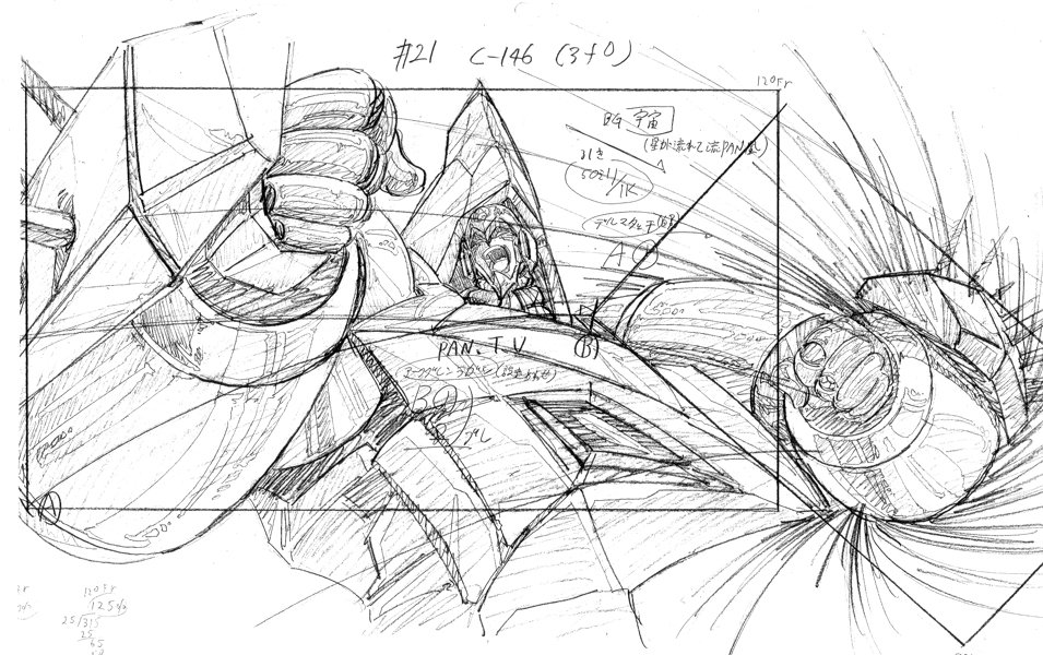
Little Witch Academia storyboard by Yoh Yoshinari
To understand it better, let’s take two examples. The first would be this sequence from Only Yesterday, directed and storyboarded by Isao Takahata. It’s a beautiful scene, with some delightful and detailed animation by Yukiyoshi Hane. The direction is especially strong, because the transition from reality to fantasy is at the same time seamless and surprising. That’s good storyboarding, especially since every shot is so simple and easy to read : even without sound or context, you get a general idea of what’s happening. But, however good the animation is, the layouts here are pretty basic : the movement or choreography aren’t really complex, especially in the second shot where there’s basically no background and the character is shown from profile – ie, the easiest angle to draw and animate – although the way she rolls around in the air is more complex and impressive.
On the other side of things, let’s look at this cut, animated and layouted by Hayao Miyazaki, arguably one of the greatest layout artists of the 70’s. In terms of storyboarding, it’s fairly basic : a single, uninterrupted still shot. I guess the storyboard must have been simple : a simple square with schematic versions of the characters and little annotations and arrows to indicate their movement. In terms of layout, however, this is incredibly rich. There are at least 3 layers of depth in this cut : the car, on the first level ; Lupin and the men who run after him, on a second one ; and Jigen in the back. All of the characters on the second layer run from right to left, which is fairly simple, but also from the back to the front of the image, which is much harder to pull off for the animator.
It gets even more complex as the car goes out of the frame (from left to right this time), and then comes back in the opposite direction : away from the camera, from right to left again. And in-between, you had Jigen shoot and make himself noticed, and then jumping down. Everything moves, and in every possible direction : left-right, top-down, in-out of depth. The way these different elements move and interact – that is, are choreographed – is layout.
These parameters can vary. In the case of directors like Satoshi Kon who make very detailed storyboards, you almost don’t need layouts, but it’s all already spelled out. But the difference between the two remains important to remember : the storyboard is about composition, whereas the layout is about movement.
After that, evaluating the quality of a layout is the same as for any visual work. There’s a large part of individual sensibility, of course, but the two main criteria are as follows : complexity, and readability. Complexity would mean how much things move, and what is their movement ; generally, the most difficult thing to animate is the movement in depth. The more complex the layout, the more technically apt the animator needs to be to pull off the sequence. But if it’s too complex, they will lose the viewer who won’t be able to follow the action. And while it might just be me, in my book, readability and clarity are some of the key virtues of good animation. In the end, it’s just a question of good balance – and that’s where the inspiration and the talent of the animator come into play.
Like our content? Feel free to support us on Ko-Fi!
You might also be interested in
Benoît Chieux, a career in French animation [Carrefour du Cinéma d’Animation 2023]
Aside from the world-famous Annecy Festival, many smaller animation-related events take place in France over the years. One of the most interesting ones is the Carrefour du Cinéma d’Animation (Crossroads of Animation Film), held in Paris in late November. In 2023,...
Do anime events have room for creators? – Interview with Koji Takeuchi
The Annecy International Animation Film Festival is a place of many little pleasures, and one of them is to meet with Kouji Takeuchi, a pillar of the anime industry, and learn a little bit more of Studio Telecom's lore, which you can read more about in our previous...
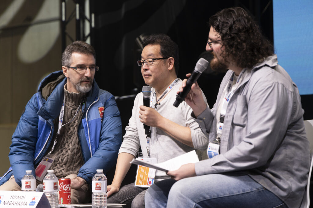
Directing Mushishi and other spiraling stories – Hiroshi Nagahama and Uki Satake [Panels at Japan Expo Orléans 2023]
Last October, director Hiroshi Nagahama (Mushishi, The Reflection) and voice actress Uki Satake (QT in Space Dandy) were invited to Japan Expo Orléans, an event of a much smaller scale than the main event they organized in Paris. I was offered to host two of his...
Trackbacks/Pingbacks