In my previous post, I mentioned that I would make a follow-up about the role of the layout in the production process of anime, so here it is. However, here, I also hope to show that the layout isn’t as simple as I explained last time: if you take a historical approach to it and look at its evolution, you’ll see how complex of an object it is, and how much it has changed over time.
Like our content? Feel free to support us on Ko-Fi!
Last time, I explained that the layout is a tool for the animator, that helps them plan and visualize the movement of their cut before the actual animation. As this tool that’s between pre-production and the actual drawings, we could say that layouts have always more or less existed in more or less complex forms, even though they weren’t always called like that (for example, it wasn’t until 1950 that an actual “layout man” was credited in a Disney movie, even though the role had existed for much longer). In the case of Japan, Yasuo Otsuka has said that Tôei studio already used something like layouts back in the 50’s, although he doesn’t know if the idea was imported from the US or a local reinvention.
According to Otsuka, here’s what happened on the production of the first Tôei movie, The White Serpent, in 1958: the storyboard was handled by ex-mangaka Kazuhiro Okabe, and then handed out to the two main animators, Akira Daikubara and Yasuji Mori, who adapted it to make it more animation friendly, and then did the animation with their assistants, among them Otsuka. As Tôei evolved and animators developed their skills, it would be the individual staff members who would do the layouts of their own sequences. This meant that animators had a lot of leeway, and that the central document on the production was the storyboard: made by the director and/or his assistants, it was passed among all the team and was the main tool for communication between its members. There were exceptions to this, but it was generally a very storyboard-centric model, with a lot of importance given to the storyboard, and therefore to the director over the general look of the movie, whereas the animators had some more freedom on the little details.
Jump forward a few years, in 1974, with Heidi, Girl of the Alps. It’s on this show that Hayao Miyazaki is credited to have invented the “layout system”, i.e. standardized layouts made by a single man or his team (as would be the case in 1978, on Future Boy Conan). But this isn’t totally exact: in the 70’s, artists all over the industry were starting to implement similar innovations. Close to Miyazaki, studio A Pro and TMS had been trying out ideas as early as 1972’s Gutsy Frog until, in 1975, the animation director of Gamba’s Adventure, Tsutomu Shibayama created “movement layouts” (動きのレイアウト) for the animators. The same year, on the series Manga Wanpaku Omukashi Kum Kum, character designer and animation director Yoshikazu Yasuhiko, made the exact same move with the very detailed layouts that would become his trademark.
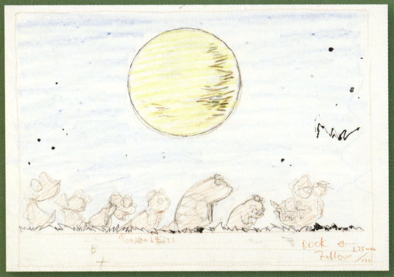
Layout sheets from Gamba’s Adventure
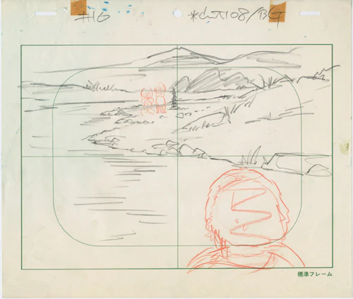
Layout sheets from Manga Wanpaku Omukashi Kum Kum
Layout sheets from Gamba’s Adventure (left) and Manga Wanpaku Omukashi Kum Kum (right)
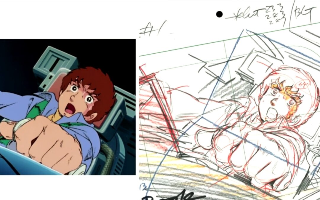
What you may have noticed is that, in all of those cases (except Heidi), the layout artist was also the animation director. That is no coincidence, and a direct consequence of TV production: because of its fragmented rhythm and intense cadence, directors had less time to polish their storyboards and control the animators. The role of animation director therefore became even more strategic and it was them who often exerted the most control. In such a context, it’s natural that they would have been the ones trying to make motion more uniform and more controlled. It was a way for them to keep track of what actually happened on the screen and avoid any inconsistencies or too major bursts of individuality – but they did happen, and not without consequences, such as when Yoshinori Kanada left the production of Mobile Suit Gundam in 1979 because he had messed up Yasuhiko’s layouts a bit too much.
As time went by, more and more productions started implementing this new, standardized layout system, although it was never universal – after all, anime production is anything but a unique template, and things might vary wildly if you go from one studio to the next. The next big date is then 2002, on the show RahXephon. At the time, a young and talented mecha animator was on the rise, someone called Yutaka Nakamura. The director Yutaka Izubuchi and animation director Hirotoshi Sano wanted to have as many Nakamura cuts as possible, but there’s only so much you can do within the pace of TV production. So they took a radical approach: they divided the animation work, with Nakamura and other major figures doing “1st key animation” and less important animators “2nd key animation”.
What does that mean, precisely, and what’s the relationship with layouts ? Basically, 1st key animation at that stage was just rough, uncorrected animation while the 2nd key animators would just handle the cleanup stage. But as time went by and the 1st/2nd KA spread all over the industry, 1st KA started looking more and more like layouts and not actual KA. Today, 1st KA is basically more or less detailed layouts – indications of how the movement goes in the frame.
Edit, added on 14/01/2021. In fact, it seems that the second KA system had existed for a long time. You could trace it back to the early days of Tôei studio, but in terms of TV production, you can find traces of it in the 70’s and early 80’s, when animatoors such as Yoshinori Kanada and Motosuke Takahashi used it on Zambot 3 and Urusei Yatsura. So what was the difference with what happened in the 2000’s ? It was, mostly, a change in scale. In the Kanada and Takahashi’s cases, the 2nd KA were their students, and they were either uncredited or credited as key animators. Now, 2nd KA is an official position that’s credited as such. It has, therefore, become much more normal and accepted in this industry than it ever was.
In this 1st KA from Jujutsu Kaisen by Vercreek, you can see the animation switching from detailed finished KA and more rough and simple layouts
In terms of production process, this is totally different from the layouts of the 70’s, 80’s and 90’s. First, they came back in the hands of the animator, as the number of animation directors has only increased and their individual influence on the overall look of an episode has decreased. But it doesn’t mean more freedom for the animator. It’s in fact quite the opposite : the work is getting even more fragmented, and 1st key animators have less and less control over their own cuts – whereas 2nd key animators are left unsatisfied with work that’s edging closer to in-betweening than actual key animation.
Understanding layouts is not just being able to speak more precisely about anime, or just some nice knowledge to have about the production. What we call the “layout system” is in fact one of the most distinctive elements of the Japanese production process of animation, that is what we call anime. But this also shows that this process is not set in stone : it has always evolved and will keep doing so. At the heart of this is, of course, the individual animator : the evolution of the layout is also the evolution of the role of the animator, always torn, in anime, between greater individualization and uniformization.
Thanks to Peter and Ukrainian Z’Gok for the tips on Gamba and Yas. For further reading, you can read this highly informative article from the Sakuga Blog.
Like our content? Feel free to support us on Ko-Fi!
You might also be interested in
Benoît Chieux, a career in French animation [Carrefour du Cinéma d’Animation 2023]
Aside from the world-famous Annecy Festival, many smaller animation-related events take place in France over the years. One of the most interesting ones is the Carrefour du Cinéma d’Animation (Crossroads of Animation Film), held in Paris in late November. In 2023,...
Do anime events have room for creators? – Interview with Koji Takeuchi
The Annecy International Animation Film Festival is a place of many little pleasures, and one of them is to meet with Kouji Takeuchi, a pillar of the anime industry, and learn a little bit more of Studio Telecom's lore, which you can read more about in our previous...
Directing Mushishi and other spiraling stories – Hiroshi Nagahama and Uki Satake [Panels at Japan Expo Orléans 2023]
Last October, director Hiroshi Nagahama (Mushishi, The Reflection) and voice actress Uki Satake (QT in Space Dandy) were invited to Japan Expo Orléans, an event of a much smaller scale than the main event they organized in Paris. I was offered to host two of his...

Liked the article! Short and on point, although I don’t know about the Kanada Gundam thing.
Thanks !
The formulation might have been a bit misleading, as it seems to imply that Kanada was fired from Gundam or something. Besides Tomino’s comments (Kanada was too charismatic an animator for them to go well together), Kanada has stated that he left Gundam because he felt that his own approach to layouts and animation was too different from Yasuhiko’s. The way he tells it, it sounds like he left of his own volition, but I don’t know that Yasuhiko ever commented on this so what exactly happened is left to speculation.