Kamichu !’s first episode is pretty much a self-contained story, and that’s why it works so well : in 24 minutes, it establishes its characters and setting, quickly reaches a narrative and thematic climax, and resolves it with a beautiful confession scene in the sky. The way it does all this could be applied to the show in its entirety : it is delicate, and charming. This is due no doubt to the excellent direction and writing, but as expected, the animation plays a large part here. Kamichu is slice-of-life and romance, and being flashy is not its thing : what makes it work so well during its 16-episodes run is its consistently expressive character animation and acting, due in large part to talented animators such as Koji Yabuno, Tetsuya Takeuchi and Hirofumi Suzuki, who had the chance of handling long cuts on their own. Let’s now see what makes their work so special !
Kamichu ! #01
Episode Director : Koji Masunari & Hiroyuki Hata
Storyboard : Koji Masunari
Animation Director : Takahiro Chiba
Key Animation : Akie Tsutsumi, Fumino Fuji, Hideki Nagamachi, Hisayuki Tabata, Junko Abe, Kaori Takamura, Katsu Yoshioka, Katsuya Asano, Koji Yabuno, Kouji Komurakata, Masayuki Yoshiki, Norikatsu Nakano, Shiinsuke Ishikawa, Takayuki Gotan, Takeyuki Suzuki, Tetsuya Takeuchi, Tomotaka Shibayama
Like our content? Feel free to support us on Ko-Fi!
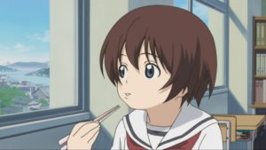
Kamichu starts in medias res : the first line is main protagonist Yurie claiming that she’s become a god, and we’re supposed to accept that fact, without being given any background – and all this with a very matter-of-fact tone. In this opening scene, the animation is, as well, very matter-of-fact : it’s good, but not flashy ; fluid, but without too much movement ; expressive, but not expressionist. Such subtlety is due to Koji Yabuno, one of the star animators of the show, who has more recently made precious contributions to the Boruto series.
This first cut, the first of the episode, is when Yurie announces that she’s become a god. This is a mundane, ordinary conversation, and the animation successfully conveys this feeling : there’s nothing exceptional happening, and the animator instead chose to focus on minuscule details that one may not notice, but that are of the utmost importance, as we’ll see again in this breakdown. Let’s mention a few of them.
First, we have to mention the camera position : it’s not directly facing Yurie, but partially turned away and directed towards her left side. This makes for a softer, less direct approach, but more importantly emphasizes Yurie’s movements as she turns towards the left, and then towards the right again. Rather than just having her full-face and then showing her profile, the way she turns her head in the opposite direction from the camera (which is on the right) highlights the volume of her head, which is helped by the shade of her hair and the curve of her mouth and eyes.
The impression that Yurie gives off, from the get-go, is that of a shy and cute character. The animation sells it off with a series of little movements. As she swallows her omelet, she moves her head back every time, as to mark just the moment of swallowing. Then, as she starts talking to her friend Mitsue, she slightly turns her face to the right. But what’s interesting is that her eyes move before her head as she blinks. That’s a nice little effect of anticipation that brings us fluidly to the next shot.
What’s also striking in this first cut is the attention given to Yurie’s mouth, which will become a motif of sorts as her cartoony expressions form a big part of her cute and funny aspect. For example, as she faces the window, her mouth slightly sticks out, giving volume to her head. Then, in the last shot of this cut, as she complains that Mitsue doesn’t believe her, her mouth takes on a variety of shapes : it’s interesting to note that Yabuno did not limit himself to simple lip-synching, with only two drawings for the mouth, open and closed. It’s more or less open, and we sometimes even see her teeth as it’s just half-open : in these little kind of things, we see the animator’s dedication to realism and detail.
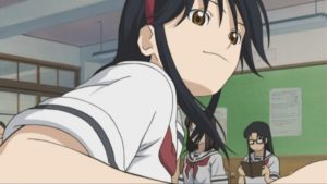
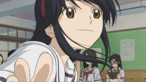
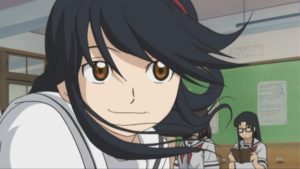
But it’s in this second cut that Yabuno’s talent shines the most. In the first shot, we see the third main character, Matsuri, make her entrance. In it, let’s acknowledge the comical contrast created by the positions of Yurie, cowering as she sees Matsuri suddenly approaching, and Mitsue, sitting straight with her eyes closed, as if she ignored the world around her. As Matsuri enters the frame, she slowly turns, and the two girls’ heads’ movement from left to right as they follow Matsuri both emphasize the latter’s approach and anticipate the next shot as she makes a large movement from right to left, approaching the camera and Yurie with a large smile.
This shot is particularly striking, as Matsuri’s curved and ample motion goes from the back right of the frame to the front left, and creates by itself alone a sense of volume and depth. The sudden approach of the character is sold with excellent timing and snapping : for example, these three frames are all key, without in-betweens, and the distance between each position only gets wider from the first to the third image. Notice also, on the second frame, the little smears on the fingers which make the hand’s movement more dynamic as it comes out of the image.
The most noteworthy aspect of this cut, however, is probably the hair animation. Already, as Matsuri approaches, her hair jumps up and emphasizes the rhythm of her gestures. But then, in the second shot, the strands of her hair accompany and help to make the head movement stronger as they seem to move around on their own. Noticeable is the hair on her back, which jerks to the side before coming back to its initial position as Matsuri steadies. During the entire scene, hair takes an expressive role as the individual strands take a life or their own or act as a follow-up to the main movement of the body.
For another example, let’s look at the cut showing Yurie reacting to Matsuri’s declaration. Yurie’s movement downwards is animated on twos, and we can already notice that, aside from the face, there is a great deal of attention on the shading, which creates the impression of the hair moving. Then, as she jerks slightly backwards, the animation shifts to threes : the movement is naturally slower, as it’s just an effect of inertia. And it’s at that moment that the hair gets wild, as it moves from key pose to key pose : in the first two frames, it moves from right to left without in-betweens, and then steadies in the center.
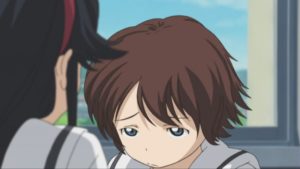
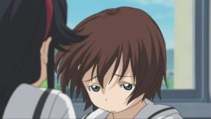
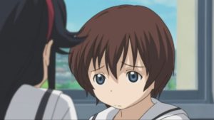
A few seconds later, as the camera stays in the same position, Yurie’s emotion is again expressed through visual cues (her cheeks becoming red and her eyes lighting up) and the movement of her hair, animated again on threes, as the rapid motion expresses enthusiasm and joy. The same could be said about the mouth motions, once again varied and expressive. What makes these cuts as expressive is also the extensive amount of snapping : just striking key frames, with little or no in-betweens. Especially in the case of Yurie, they create a sharp contrast with the shy, introverted character the first cut introduced us to.
With just more than a minute of animation, Koji Yabuno has perfectly introduced us to the characters : Yurie, cute and shy, but who becomes all bubbly when she’s enthusiastic ; the cheerful, sometimes invasive Matsuri whose ample movements are one of the most striking aspects of this cut ; and the silent and serious Mitsue, who stands silent and more importantly practically doesn’t move during the entire sequence.
The second scene we’re going to analyze was animated by Tetsuya Takeuchi, one of Japan’s most talented action and character animators. His work here is less flashy than his awesome action scenes, but it is no less impressive.
In this cut, the animation switches between two registers that I would describe with shapes : one, more circular, soft, and one might say feminine, is mostly used for Yurie’s movement and conveys an incredible sense of weight and fragility. The other is more angular, rough, and masculine, as it is applied to the male character, Ninomiya.
The cut starts with Yurie climbing the ladder on the roof and noticing the boy she likes, Ninomiya, practicing calligraphy. As she looks at him, her expression becomes softer and her cheeks red : her expression is enough to tell us about her feelings towards him. Yurie is so expressive not only because of these cues, but also thanks to her movement on the ladder. Standing on a ladder is rather an awkward and tense position ; but in this shot, she totally eases up, as all her little movements back and forth, and her closing her eyes in content illustrate.
Then, the camera adopts Yurie’s perspective and lets us see Ninomiya. Just after the former’s soft expression, we enter in the second register, with straight lines and more irregular shapes. The geometric composition is already visible in the shot of Ninomiya writing : the camera is looking down from an angle, and the eye is brought into the image by the line of the arm who moves in a curve as it writes a character. But already, as it moves, it shapes loses its consistency : the wrist disappears in the straight lines of the arm and the hand becomes a sort of triangular shape.
Then comes the highlight of this cut, as the camera adopts Yurie’s point of view once more. It is animated entirely on threes, with occasional shifts to fours for a frame or two, which emphasize the irregular rhythm of the boy’s movement.
First, as if he just wanted to rest, Ninomiya silently puts his brush down and raises his hand to his face : that’s the calm before the storm, stillness before explosive movement. But already, the lines of the fabric of his shirt give his position a stiff feeling, and will soon serve to emphasize motion ; and notice also the use of snapping in the left arm going up : the movement is getting more irregular.
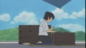
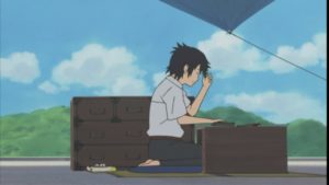
Then, after scratching his head, the boy becomes angry and suddenly snaps : the shape of his hands becomes schematic, his expression is reduced to a few eloquent lines, and his arms themselves lose all proportion as the right arm looks much thinner than the left. In the next frame it becomes even more angular and sharp. As Ninomiya hits the table and his movements get more brutal, the snapping becomes more frequent and the interval between each key position wider. The shapes of his arms and his shirt also become much more irregular : the angles and curves of the fabric on the back and the sleeve of the shirt contribute to a large degree to the dynamism of this cut. As it goes on, the boy’s motion becomes even more jerky, most notably when he turns towards the camera to throw away the piece of paper he was just writing on : for example, on one frame, his hands take on an almost impossible angle. Finally, as he steadies down after having thrown the paper, his figure seems to lose most of his consistency in an expression of physical and psychological exhaustion : the lines on his shirt become more curved and his hair starts to move on its own.
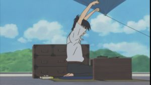
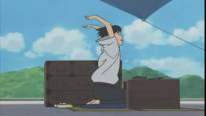
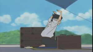
We then cut back to Yurie, who tries to take back the piece of paper and almost falls down the ladder. The movement of fabric again plays a large role here : for example, in the first frame, the circle formed by the shirt, the sleeve and the open mouth create an effect of echo and surprise in the figure losing its balance. It also creates instability : as Yurie dangerously bends over, the lower part of her shirt and her collar point towards the right, whereas the triangle opened by her sleeve seems to open towards the left, that is the void. The angles formed by the knot of her uniform also convey the impression of something unsteady, losing shape and balance. Then, Yurie loses her grip on the ladder. What’s notable is the strange shape of her hand, but also her dismayed expression as she looks at it, seemingly surprised at herself for letting go.
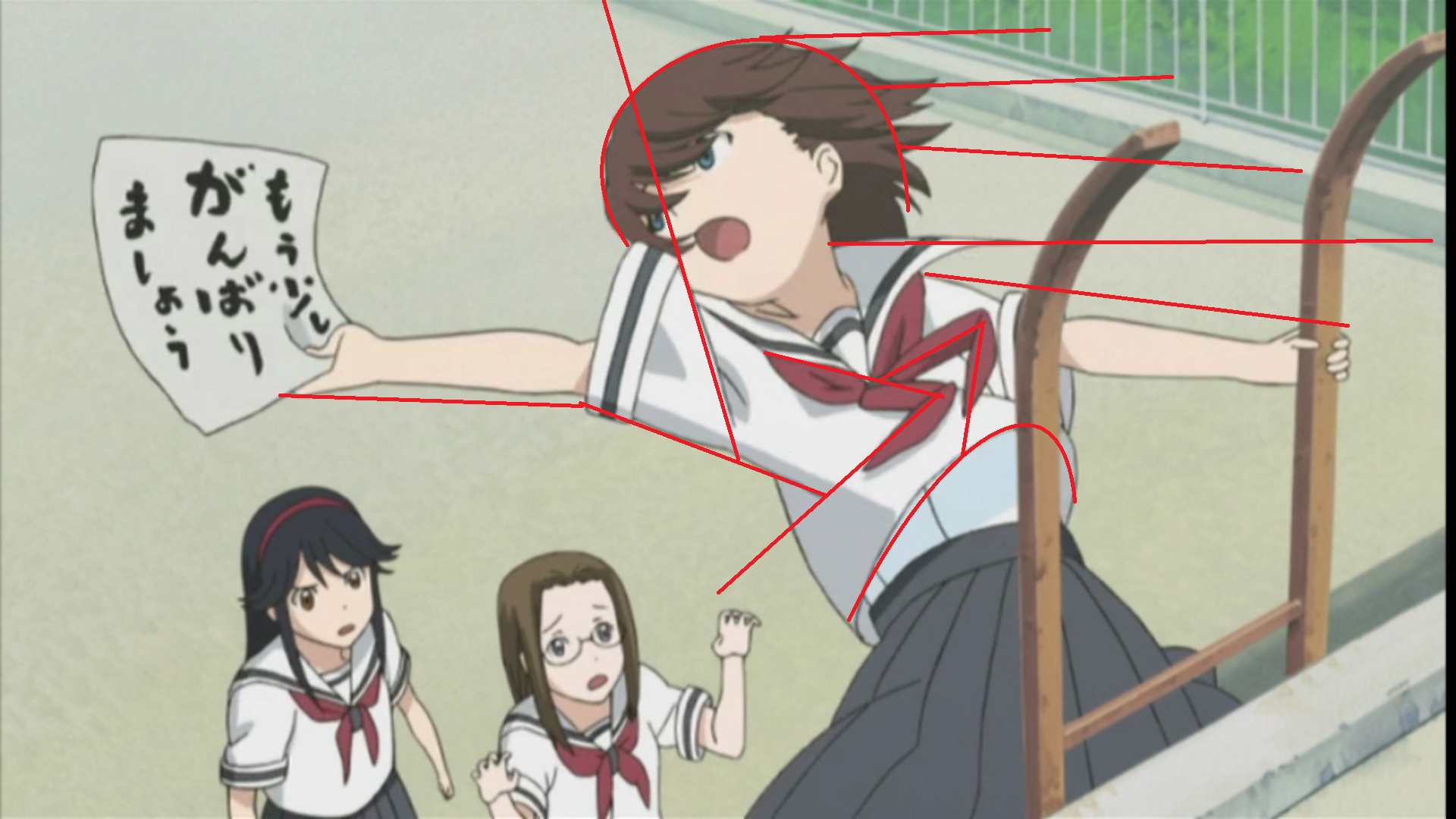
The camera then moves away, as we see Yurie and Ninomiya from further away. The angle is, once again, pretty interesting : the characters are relatively afar, which makes the angular and schematic animation more easy as a large part of the frame is empty ; but it’s also looking up, which makes animating harder. But notice how the lines of the roof, from right to left, and from the top to the bottom of the screen, complement Ninomiya’s motion who pulls Yurie from the low left to to the top right. In the same vein, the curve of Yurie’s skirts perfectly contrasts against the stiffness of her body, who becomes almost elastic as it falls down. In the last image, just before Ninomiya starts pulling her up, she’s entirely drawn in curves. This is what gives her a sense of weight : her body is not an inert, hard object and her clothes are taken in her fall.
Then, there are a few frames of almost no movement (8, to be exact), as Yurie opens and closes her eyes trying to understand what’s going on, and as Ninomiya steadies his position. This pause in the action is vital to make the scene believable : it’s not all automatic and immediate, Yurie is understandably stunned and Ninomiya is not some kind of superman who would be able to lift her without any effort. It’s so hard that he has to try another time, with his two arms, because he’s unable to do it with just one. He finally manages to do it, in notably less frames than on his first try.
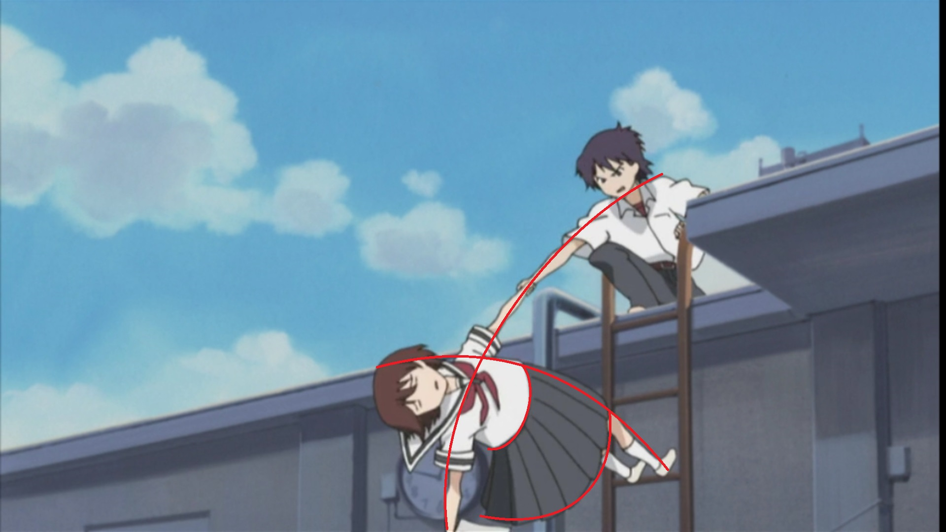
But then again, the show wants us to know that Yurie is heavy and that inertia is a thing : Ninomiya’s pull is so strong that Yurie hits her head on the ladder and almost falls back before she hangs on to it. Hair and fabric work once again as strong indicators of movement and expression. But it’s only in the next shot that we fully understand what just happened and why Yurie hit the ladder so violently : Ninomiya just fell down. This is again a great way of expressing weight, while maintaining continuity between the two shots : the second one explains what happened in the first, and Yurie’s hands in the second tells us that we’re still in the same space as in the first one. That’s not just great animation, but also great cinematography. This sense of continuity is kept in the next shot, which is just a fantastic composition with rich straight lines and curves that all bring the viewer’s eyes towards the joined hand of Yurie and the boy she likes. Even though there’s little movement in this shot (except for Yurie’s charming embarrassed expressions), it’s the thematic climax of the scene.
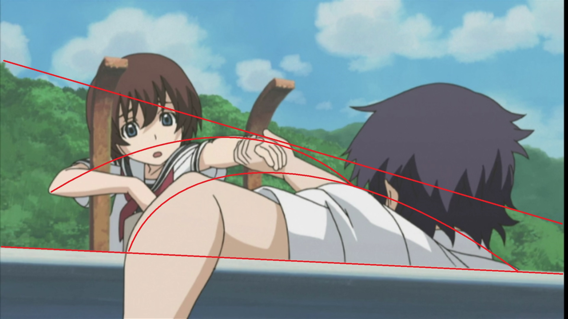
This shot is also interesting because of how it elevates Ninomiya’s simple act of getting up. He first has to get his arm over the tube he’s sitting against, which makes him do a circular movement in depth. While not particularly intricate, the movement must have been complex to animate as the animator had to keep in mind the precise proportions of the arm that’s moving away from the camera. At some point, it almost serves as a vanishing line into the depth. But what’s also particularly interesting is that, even at this angle, Takeuchi did not just animate the arm, but took care to have the whole body moving : as he raises his arm, Ninomiya slightly falls down to the right and then rises up, indifferent to the flustered Yurie in front of him.
What’s so wonderful in this entire sequence is no doubt the incredible sense of weight created by the animation, something notoriously difficult to express. But the way that Yurie and Ninomiya are each animated in a slightly different manner is also without a doubt a proof of Tetsuya Takeuchi’s talent : with two different styles, he easily conveys the two personalities of his characters. Acting is especially hard, because it has to play with the little details of movement and can’t always be flashy like effects or action ; but that doesn’t stop it from being expressive and beautiful.
Like our content? Feel free to support us on Ko-Fi!
You might also be interested in
Benoît Chieux, a career in French animation [Carrefour du Cinéma d’Animation 2023]
Aside from the world-famous Annecy Festival, many smaller animation-related events take place in France over the years. One of the most interesting ones is the Carrefour du Cinéma d’Animation (Crossroads of Animation Film), held in Paris in late November. In 2023,...
Directing Mushishi and other spiraling stories – Hiroshi Nagahama and Uki Satake [Panels at Japan Expo Orléans 2023]
Last October, director Hiroshi Nagahama (Mushishi, The Reflection) and voice actress Uki Satake (QT in Space Dandy) were invited to Japan Expo Orléans, an event of a much smaller scale than the main event they organized in Paris. I was offered to host two of his...
Akira stories – Katsuhiro Otomo and Hiroyuki Kitakubo talk at Niigata International Animation Film Festival 2023
Among the many events taking place during the first Niigata International Animation Film Festival was a Katsuhiro Otomo retrospective, held to celebrate the 45th anniversary of Akira and to accompany the release of Otomo’s Complete Works. All of Otomo’s animated...

Recent Comments