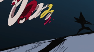
How do you make a fight scene look as awesome as possible ? It’s simple : you just have to make everything move. But then if everything moves all at once, the viewer might not understand anything about what’s going on ! To this, Hiroyuki Imaishi might answer : who cares, as long as it’s cool. At least, that what I think he had in mind when he animated this jaw-dropping scene from Re : Cutie Honey.
The idea behind Imaishi’s style is simple : it’s to make each frame be as intense and striking as possible. To achieve it, you don’t necessarily need more images, you just need to use them well. The start of this cut is a good example of this : if you look at it frame by frame and start counting, you’ll notice it’s animated on ones… but in a very peculiar way. As the weapons of the two characters clash, the lightning casts long shadows. First, you’ve got to acknowledge that’s a strong composition emphasizing the power of the fighters ; but what’s interesting is that the same three frames are repeated during the whole shot : one of the two fighters, one of the lightning, and one of their shadows. That’s a smart move : because this is on ones, the viewer won’t notice immediately that these are the same images over and over, and it saves the animator his time, while still creating a strong impact.
But the real fun comes after that. The combatants separate from each other and Honey starts jumping around to counter-attack. In the first shot, notice how she begins by moving away from the camera, then comes back towards it as she strikes – but as her opponent parries, she’s moved from the right to the left of the frame. That’s an incredibly dynamic trajectory, but what’s amazing is that it doesn’t stop here : Honey does a barrel roll (while flying !), again moves away from the camera and jumps back towards it. The mastery of depth displayed is absolutely impressive, but from a less technical standpoint, this also contributes to put the viewer in the very middle of the action, something that becomes even more obvious in the next shots, as Honey rushes past the camera multiple times. The spectator is a part of this, and it is as awesome as disorienting.

But while it’s chaotic, that doesn’t mean it’s not fun : on the contrary, this is how the animator manages to make it as entertaining as possible. If you just close your eyes for an instant, you may lose sight of what’s going on : with Imaishi, you have to be hooked to your screen, or not watch it at all.
This becomes obvious as Honey, who’s flying back and forth, takes on a wild variety of poses and shapes : one of them has made this cut famous, when Honey becomes some sort of flying spaghetti, or a set of rings rotating very quickly. But even after that, as she jumps behind her foe, her extended arms and legs form a series of angular positions that are both funny and impressive. Their accumulation makes Honey look clumsy, as she barely evades the attacks ; but at the same time, her agility and speed are beyond comparison – just like the animator’s, whose creativity here and visual humor make this the best example of great animation.

Recent Comments