You can read a breakdown of the first episode of Kamichu here !
If you know a bit about the Japanese lifestyle, or if you’ve seen enough anime, you may be aware of the fact that most Japanese houses have this thing called a kotatsu : a table covered by a futon under which is a heater. Sitting, or even lying under it in winter, is a comfortable and essential part of the daily Japanese domestic life, and it’s not unusual for people to spend their day under it.
That’s precisely the premise of Kamichu’s 14th episode : during its entire 25-minutes run, the main character, Yurie, does not leave the kotatsu even once. At first glance, that might seem like the best way to make your episode boring : nothing is bound to happen if your character lies down all day without doing anything. But for the team of the show, that was the occasion to exhibit their skills in both direction and animation, under the lead of two talented artists : Yuu Yamashita at episode direction and storyboarding, and Koji Yabuno as animation director.
Kamichu ! #14
Episode Director : Yuu Yamashita
Storyboard : Yuu Yamashita
Animation Director : Koji Yabuno
Key Animation : Chikara Sakurai, Dai Suzuki, Hiroyuki Sasaki, Kazuyoshi Yaginuma, Koji Yabuno, Masakazu Kawazoe, Masakazu Saitô, Masaki Tanigawa, Mitsuhiro Yoneda, Ryousuke Sawa (Ryo-Timo), Suguru Iijima, Takayuki Gotan, Takeyuki Suzuki, Yuu Yamashita
Before diving into the animation, let’s talk a bit about the direction, and the stellar work made by Yuu Yamashita. Having a character in the same place for an entire episode, and moreover in a closed room, can become boring pretty quickly. That’s even more true if almost nothing happens in the episode : it’s just after the New Year, and protagonist Yurie is resting and waiting for a New Year’s card from the boy she likes. Nothing really eventful. In such a situation, animation and direction are essential : you have to make the images interesting and appealing no matter what.
In fact, the kotatsu is the perfect place in a Japanese house if you want to have things happen without the main character moving : it’s in the living room, the center of the house, and the warmest place there is. It’s only natural that people would pass by it and warm themselves up under it. And that’s just what happens in this episode : all the family comes and goes, enjoying the occasion to have a talk with Yurie ; even her friends who aren’t physically here can join her through the phone, though she has to crawl to reach it. And because it’s the New Year, the outside world is still very much present, in the shape of the traditional New Year’s cards.
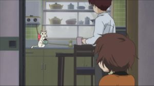
The storyboards, layouts and shot compositions are also very much worth it. You can only show a room from so many angles, after all, so the director has to get creative. And that’s precisely what Yamashita did. She places the camera in all sorts of places, not only so that the viewer gets the layout of the living room, but also in such a way that he can understand the layout of the entire floor. Most notably, a shot and reverse-shot to and from the kitchen are enough to make us see how they communicate. Yamashita also had a bit more fun with some camera positions, such as when she placed it inside the fridge, a classic shot in anime, that likes to play with the absence of a physical camera and stick it in some unlikely places.
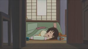
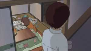
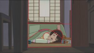
But my favorite here would probably be this this shot from the stairs : first, it makes us see how the living room is connected from the entrance hall and the upper floor. But most importantly, it’s a great composition : the camera adopts Shoukichi’s point of view and looks down on Yurie. The angle, and the depth of field effect that puts Shoukichi out of focus bring us right into the image to focus our gaze on Yurie and the mess around her. And the multiple angles and lines (the table, the floor, the different doors) all form a grid around Yurie, just like the warm and soft prison of the kotatsu she’s unable to get away from.
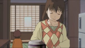
Another device used by Yamashita is shading. It’s not used in a flashy, striking way, with huge contrasts, but softly, just to create depth and emphasize the animation. This shot would be the most striking : in the foreground stands Yurie’s mother, making tea. The light coming from behind – in the living room – illuminates her from the back and left, while the other part of her body is slightly shadowed. The way the light gently curves around her face and clothes makes the drawing all the more appealing, and makes her stand out in the foreground, without the need for techniques such as depth of field. This use of shades is vital in such a show focusing on character animation, as it serves to subtly emphasize the characters’ expressions.
Now that I’ve said this, we can agree on what makes good direction : it emphasizes the animation. And it’s time to talk about said animation. Sadly, most of the cuts of this episode are uncredited ; however, there remains a major creative figure : Koji Yabuno, who was animation director for this episode. He either corrected or animated himself all the cuts I’m going to present here, and his energetic style of character animation paradoxically is the best choice to render Yurie’s lazy movement.
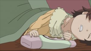
This first cut, probably animated by Ryo-Timo (not credited, but thanks to @ten3_1 for the tip) is all about laziness : this is the very beginning of the episode, as Yurie wakes up from under the kotatsu and takes possession of her surroundings. It naturally opens with an establishing shot of the kotatsu, the main protagonist of the episode. Yurie slowly comes out, announced by folds in the futon, and then her head appears. Already, her shape expresses her feelings : from afar, her face has an oval, blob-like appearance. She barely looks like a human being, but more like a pillow or a sloth.
Then, the camera approaches her as she slowly wakes up and opens her eyes. As is often the case, her eyes and mouth are the most eloquent : they are half-open, with a little bit of drool coming out. But as she slowly rises forward, she makes more of an effort, and the animation becomes more intricate : the little movements of her body are expressed through the folds of her pajamas, in a series of little lines. Moreover, her neck spreads out and becomes almost unrealistically long in a short moment of exaggeration. What’s also nice is that, as lazy as she is, Yurie is unable to really advance in the frame : her movement goes along a falling curve from the center to the right of the image. She’s barely able to stand, but already falls, as if the weight of her head was too heavy to bear.
The next shot, from further away, only emphasizes this : as Yurie is not as close from the camera, there’s less focus on her small movements, and at first, it’s just her mouth that’s moving. But as she gathers some energy, we can again note the quality of the storyboards : this time, Yurie’s motion goes from right to left, which transitions perfectly with the next shot as her movement away from the camera follows the same direction. Moreover, the composition is worth paying attention to : Yurie is all in curves, contrasting against the straight lines that compose the image. She definitely represents a softer, rounder and weaker presence that refuses to stand up.
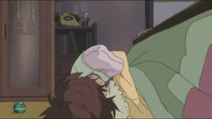
But for Yurie to be rolling around is already a sign of dynamism : this time, she’s moving her whole body ; the movement into depth, emphasized by the depth of field, only makes it more striking. If we only look at the animation, that shot mustn’t have been easy : a character rolling takes on a variety of different shapes and continuity must be hard to maintain ; it’s even worse considering that, with the angle of the camera, size must also have been taken into account.
To give a sense of both continuity (in the shape) and irregularity (in the movement), this shot is animated in a rhythmic pattern : 4-4-3, and as Yurie settles and slows down, she’s animated on 4’s. Again, the highlight is the fabric animation, as the folds on her clothes form various kinds of angles. But her hair is also quite expressive, rising up and falling down. As it falls down, it takes a more geometrical, angular shape, and then becomes more curved and regular in the end of the movement.
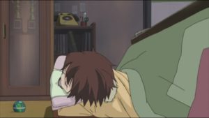
After this ample motion, Yurie stays immobile for a few moments and the viewer rests with her. She then tries to look up at the clock, but can’t see. As she tries to look and seems to slightly lose her balance, she just trembles and adopts another adorably awkward expression. In the next shot, she is again completely stretched out as her back takes on a curved line ; the shape of her body becomes triangular, with the circle of her head on top. But this position seems too tiring for her, since she quickly falls down. Her fall is sudden and unexpected : nothing moves for a few frames, and then there’s an unexpected snapping. Her positions in the first and second frame are totally opposed : the first is vertical while the second is far more horizontal. Her fall is animated on threes, but then we have time to rest as she stays with her face on the ground, apparently disappointed at her own inability to stand up.
This second cut allows us to explore another kind of movement : it’s not about Yurie, but about her cat, Tama, who’s just eaten some pretty spicy food. This moment is pretty hilarious, because Tama tries to hide the fact that she can talk and walk on her two feet to Yurie’s family, but obviously gets noticed. Here, it’s her brother that walks on her as she’s cleaning plates. In this cut, she’s as much writhing in pain as running away.
The cut opens with Yurie noticing the arrival of her brother. It’s a good demonstration of what I said about Yamashita’s direction and the show’s sense of space : in the first shot, there are three layers, each corresponding to a different character and (probably) to a different cel. It’s Yurie’s movement that brings us in the image, as she turns and notices her brother. First, she just raises her head, hearing noise in the kitchen : a nice touch in the acting is how she stays still for a few moments (almost a second), her eyes looking up in attention. This marks the end of her movement up : after that, her head turns left. Again, she’s still for a bit more than a second, which allows the viewer to register her movement in detail, but most importantly here, to take in the awkward situation as all the character’s eyes are directed towards Tama who’s been caught in the act.
As Yurie realizes the situation, she starts reprimanding the cat, and the energy she puts in it is conveyed, once again, in the hair animation. That’s pretty normal here : she’s got her back turned, so we can’t see her face expressions. But, beyond just hair animation for the sake of it, what makes this moment interesting is that all the motions of the strands of hair moving up and down emphasizes how messy Yurie is. It’s also the first noticeable burst of this scene, since Yurie’s movement before is cut by long pauses, and then nothing moves for another few seconds as Yurie’s talking and her mouth is, from the back, barely animated.
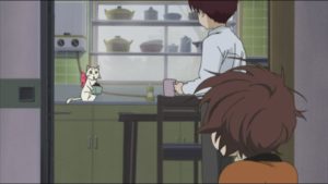
As a response, it’s now Tama’s turn to move. Her motion is very slow and deliberate : the animation alternates between 3’s and 4’s, and all of her different poses are very well marked until she lies down and tries desperately to act like a normal cat. The little movements of her paws is once again on 3’s, but with longer pauses that convey the awkwardness of the situation quite well. It’s only after she’s tasted the spicy beans that all hell breaks loose and that the animation gets wilder.
Tama’s figure changes completely : from its previously curved shape, her tail becomes a straight white line, the hair on her back bristles up, and even the knot she’s got around the neck seems to move up, in a kind of anticipation of her jump. She’s so upset that the animation gets faster, as the shift between 3’s and 4’s becomes one between 3’s and 2’s. The next shot, a close-up, animated much more irregularly, as it goes from 3’s to 2’s to 4’s. The extensive use of snapping and geometrical shapes also contributes to this strong feeling of movement : in contrast with the rounder character animation until now, this is a very exaggerated moment, almost taking cues from Kanada-school acting. Tama jerks from the right to the left of the frame and back again, and her motion is made stronger by an intensive use of speed lines, either straight or curved.

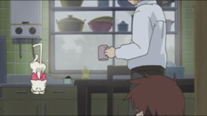
Then, as the camera moves away, Tama’s movement remains very broken and irregular. She falls so fast that the camera loses her for a moment, and has to move to keep her in the frame. Just as for the human characters, hair and fabric are used for expression, the cat’s tail is a tool often used by the animator : for example, as Tama jumps down, it rises straight up, emphasizing her fall, but also forms a sharp angle that denotes her disarray and pain.
But Tama’s misadventures do not stop here : she trips on a ball lying on the ground. It happens too fast for her to realize what’s going on : the first shot is on 2’s, but then there’s freeze-frame for a second, allowing the viewer to register the situation. Just like before, this is but the prelude to irregular and exaggerated acting : she turns around and adopts a variety of ridiculous positions. The animation, on 4’s, lets us appreciate these poses and laugh at them.
We then have a lateral shot of Tama sending various objects to fly off, and a last shot of her leaving, at the end of her wits. What’s interesting, this time from the point of view of cinematography more than animation, is that Tama’s flight has enabled us to explore the space of the living room. Whereas the first shot was behind Yurie, looking at the kitchen, the last one is in the completely opposite position : behind her brother, looking from the kitchen.
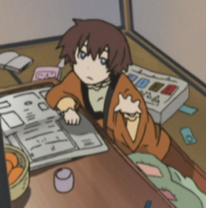
With this third and final cut, we’re back to human character acting. While I wouldn’t be categorical about it, this one was probably animated by Koji Yabuno himself : we can notice his specific way of drawing blob-like hands and the last, very bubbly shot, is pretty much his style. But then again, he was animation director, so these just might be the result of corrections.
The start of the cut is very dynamic, as Yurie’s brother rises and goes away from the kotatsu when his sister tells him she’s lost the good-luck charm that the girl he likes made for him. The disappointment is very palpable in his expression, but it also takes a very comical dimension : as he rises, he starts by rising the rear of his body, making him adopt an awkward, seemingly four-legged position at odds with his angry and determined face. In this pose, he has to bend forward even further and jerk back to be able to rise.
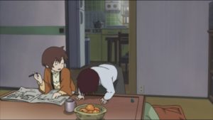
This creates a comical effect, but is also very dynamic and makes us feel his anger. The dynamism is also conveyed, again, by snapping and rhythm : when he rises, in-betweens are skipped and he does it in just 3 key frames. But the animator took care to make us feel the weight behind it : as he stumbles back, taken by the impulsion of his own movement, the boy is animated on 4’s, with more detailed animation and in-betweens. It’s only as he walks back and starts to criticize his sister that his movement becomes more approximate and brutal. He then walks off with a stiff air that strongly contrasts against the last few seconds of animation.
As he leaves, Yurie weakly complains and asks him to turn on the TV for her, as she can’t reach it without leaving the kotatsu. As she’s got her back turned, most of her expression comes off through her hands, drawn in the very schematic Yabuno style. The way the hands go back and forth echo Yurie’s call to her brother, and her disappointment when he doesn’t answer her. Her immobile position, with her mouth wide open, for a few seconds in the next shot, only make this impression stronger.
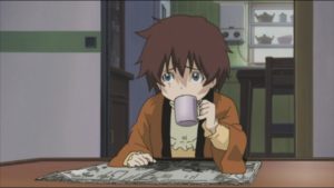
In the next shot, where Yurie looks sadly towards the TV, the hands are again worth notice. Her right hand, resting on the newspaper,is drawn in a very schematic and geometrical manner ; while her left hand holding the cup is more detailed and realistic. The fact that her pinky stands up is a nice and cute detail that helps this feel more real.
But the real highlight is the last shot : Yurie has an idea of how she might turn the TV on from a distance, without a remote controller. This is a great showcase of Yabuno’s bubbly and energetic animation. It starts with a freeze frame of Yurie looking at the paper, which creates expectations for what’s going to happen ; then she suddenly jerks forward with her eyes closed and her eyebrows down, creating strong contrast with the previous frame. Then her head rises up in a very dynamic manner, that plays on a series of opposing lines. 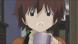
Her hair is taken in her movement and moves along with her, first up, then down, and then from left to right. Her mouth and the milk that’s left on her face form and inverted-U shape that seems to be looking up, in the opposite direction of her eyes looking down. As she opens her mouth, her expression becomes even more striking and emphasizes the milk on her upper lip, creating an impression of childishness that’s perfectly appropriate for this episode. What’s also striking here is that the movement is very slow : the viewer has the time to focus on each expression that Yurie adopts.
This episode is another showcase of how and why Kamichu ! is just one of the best slice-of-life series out there : thanks to its excellent direction and animation. This one in particular is exemplar, as it takes the conceit “cute girls doing cute things” to the limit : the cute girl here doesn’t do anything. But that’s just another excuse for the team to get even more creative, and therefore very much worth it.
Like our content? Feel free to support us on Ko-Fi!
You might also be interested in
Benoît Chieux, a career in French animation [Carrefour du Cinéma d’Animation 2023]
Aside from the world-famous Annecy Festival, many smaller animation-related events take place in France over the years. One of the most interesting ones is the Carrefour du Cinéma d’Animation (Crossroads of Animation Film), held in Paris in late November. In 2023,...
Directing Mushishi and other spiraling stories – Hiroshi Nagahama and Uki Satake [Panels at Japan Expo Orléans 2023]
Last October, director Hiroshi Nagahama (Mushishi, The Reflection) and voice actress Uki Satake (QT in Space Dandy) were invited to Japan Expo Orléans, an event of a much smaller scale than the main event they organized in Paris. I was offered to host two of his...
Akira stories – Katsuhiro Otomo and Hiroyuki Kitakubo talk at Niigata International Animation Film Festival 2023
Among the many events taking place during the first Niigata International Animation Film Festival was a Katsuhiro Otomo retrospective, held to celebrate the 45th anniversary of Akira and to accompany the release of Otomo’s Complete Works. All of Otomo’s animated...

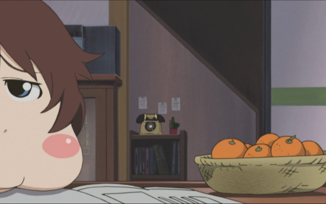
Wow! This was a great read, and I love how you pointed out both details about the animation and the cinematography. That description of the composition of staights (of the doorway) versus the curves of Yurie under the kotatsu was especially enlightening – I knew there was something appealing about that shot! Thanks again for your work; lovely and educational as always!