“Was there a need for a sequel?” is a question that comes up frequently. FLCL Progressive is a show which often gets harshly criticized. After all, succeeding one of anime’s most expressive and unique shows paints a target over your head.
FLCL made an impression not only through its themes, story, and compelling characters but mainly through the appeal of its visuals and the vast array of techniques used throughout the show to great effect, making it a cult classic to this date.
A lot of criticism towards FLCL Progressive is that the moments where it pays homage to its legacy feel like shallow attempts at nostalgia bait with no originality and that the moments where it diverts too much from it don’t feel like what FLCL is “supposed to be”. Many argue that the show does not present the same creative freedom and experimentation feel as the original does.
I feel like much of the criticism done to the show is done in bad faith. The analysis of the show’s themes and story will be left to a future article. For now, let’s focus on the visuals.
Episode 5 of FLCL Progressive is an episode that struck me from its very first seconds. The digital finishing, going for a rough crayon line, made it immediately stand out from prior episodes.
This is only one of the many aspects that make the episode memorable—Suezawa Kei’s directing and storyboarding successfully stay in touch with the spirit of FLCL while showing off the talents of a new generation of artists.
The scene which interests us today was animated by a friend of director Suezawa, a fellow member of the Mysterious Anime Group, Yuuta Araki.
Even though I could have chosen many scenes in this episode, I think this one makes the best use of the episode’s unique aesthetics.
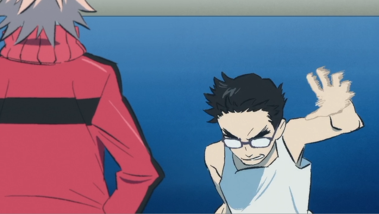
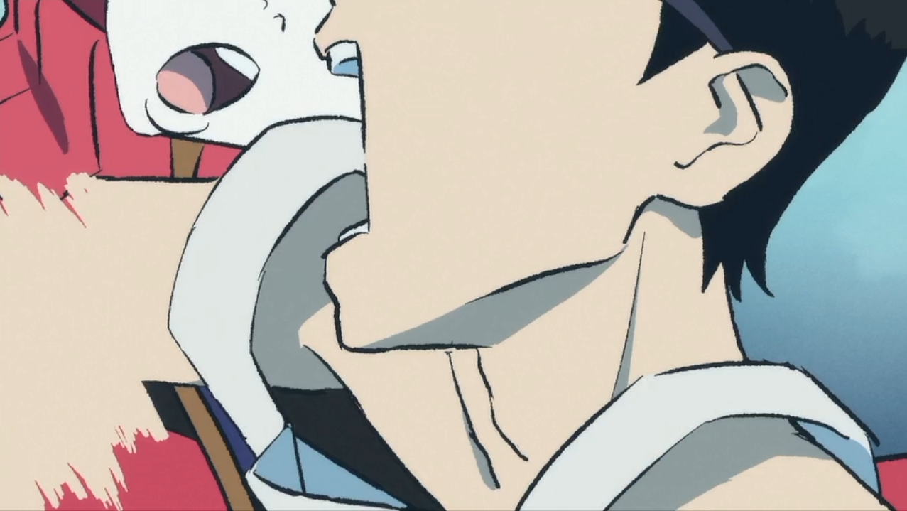
The abundant use of smears and speed lines blends naturally with the rough outlines of the finish. They add a lot of intensity to Ide’s movements while still staying grounded in a certain sense of reality, or should I rather say coherence, despite how cartoony they are.
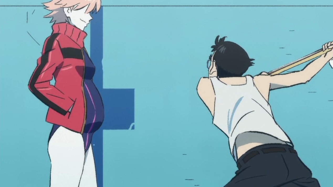
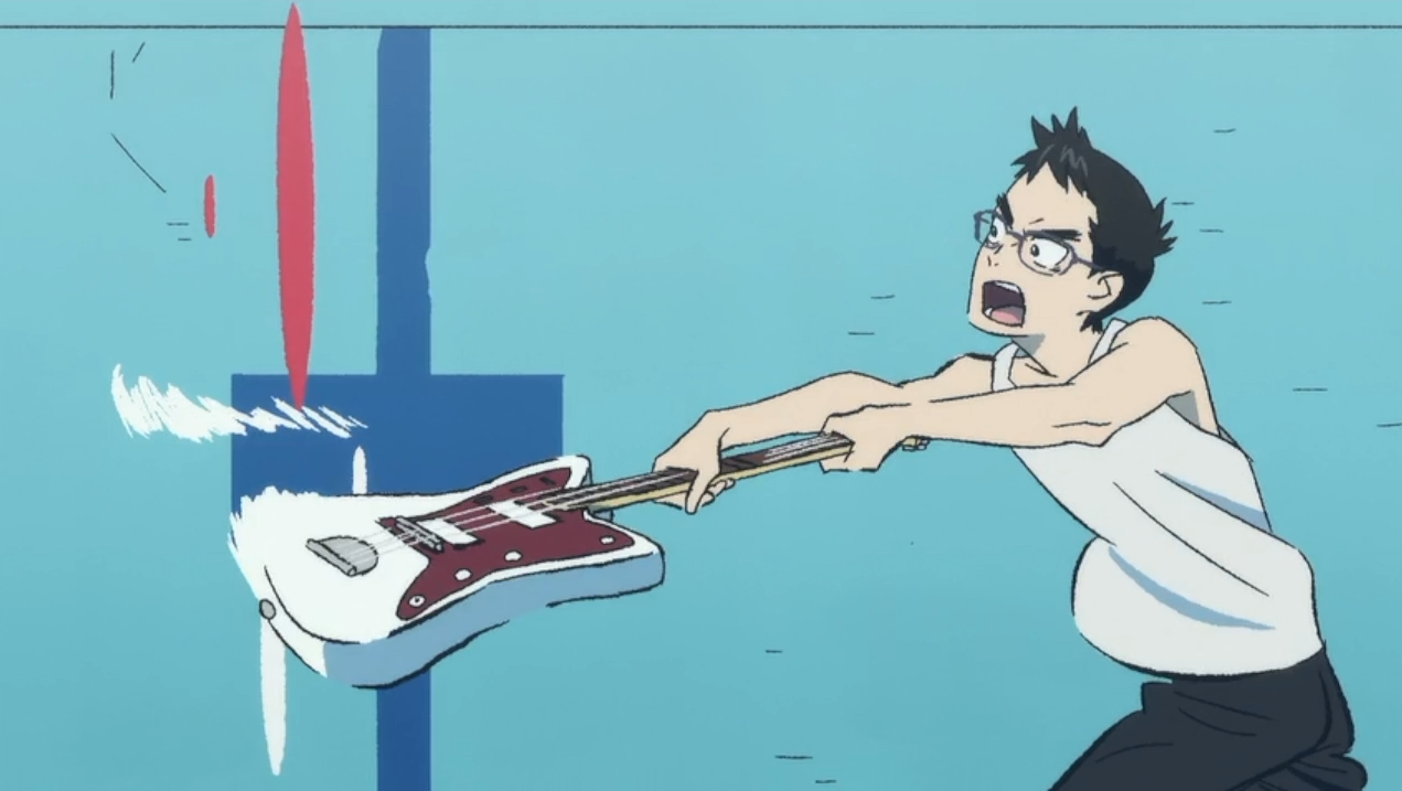
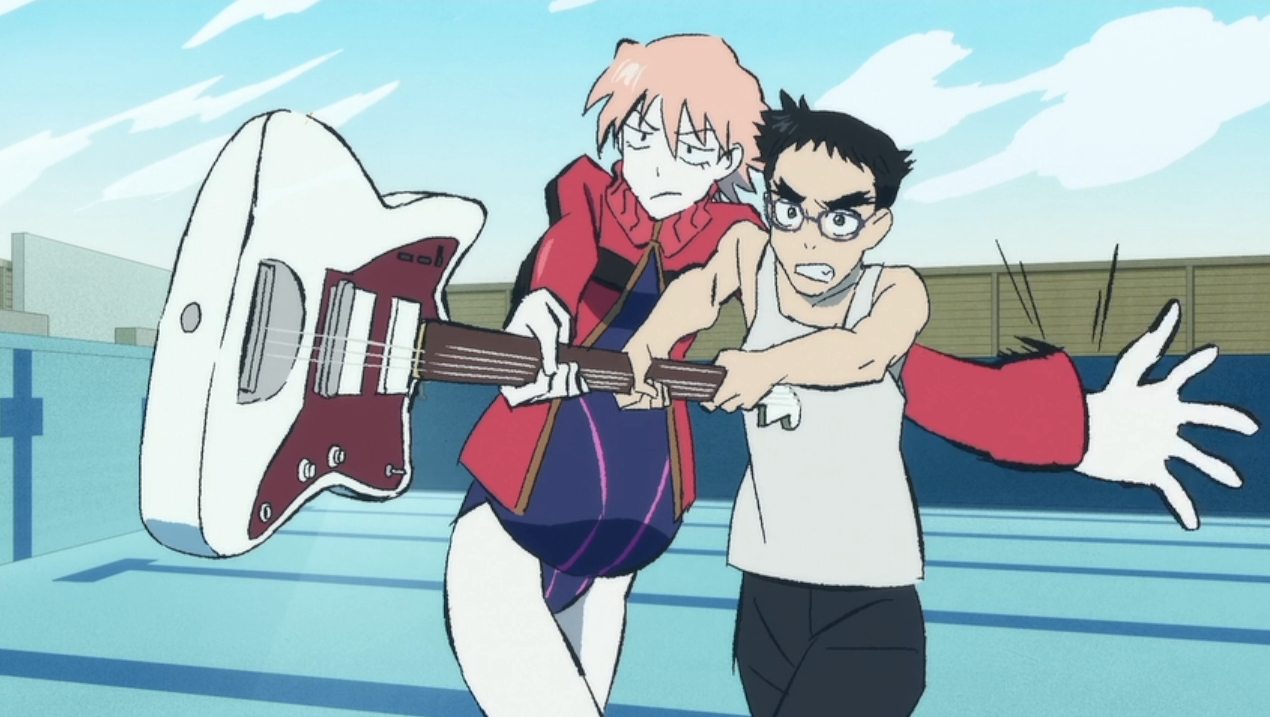
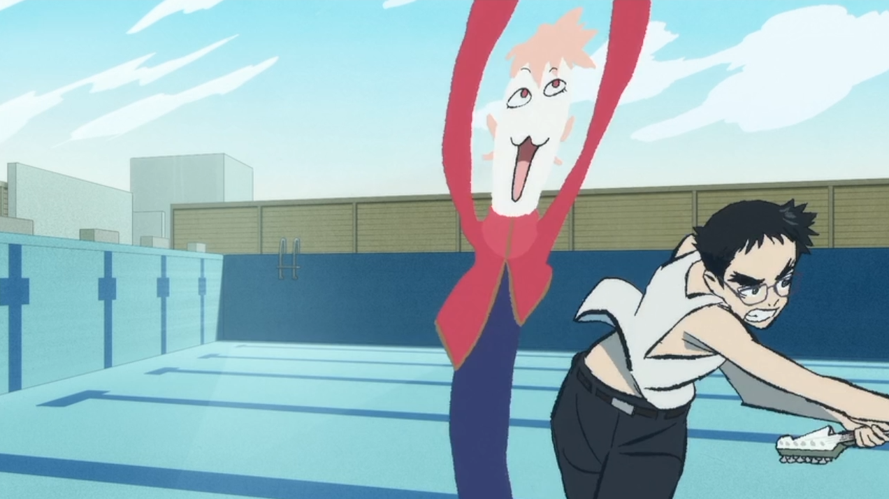
This drawing by itself is what makes the scene so compelling to me. Despite staying on screen for only two frames, it works exceptionally well on so many fronts. First of all, in regards to visual storytelling, it shows how mischievous Haruko’s character is through the catlike features of the figure and just how silly the drawing is overall.
From a technical standpoint, it makes perfect use of the conditions in which the episode was produced as such a result could only be achieved through digital painting.
I love the playfulness and creativity used in this scene, seamlessly connecting the visuals and themes. It’s a great example of a scene that looks great and carries a lot of infra-verbal information, which I find is a quality found throughout FLCL Progressive.

Recent Comments