When we first met with Benoît Chieux at the Forum des Images and saw his feature Sirocco and the Kingdom of the Winds, we were extremely eager to hear more. Indeed, not only is Sirocco an impressive animated movie that combines many influences from all over the world: Benoît Chieux is a talented creator and teacher whose ideas on animation, film, and directing are always thought-provoking.
In early 2024, we had the opportunity to talk with him individually for this interview. Rather than focusing on Sirocco’s production, about which Chieux had already talked about in many other instances, we wanted to know more about his creative mindset. It was an enlightening experience and an occasion to learn about the present state of French animation and many things about world animation as a whole.
Like our content? Feel free to support us on Ko-Fi!
The representation of wind was essentially an issue for the animation
Wind is something invisible that you can’t really see, but only hear. How did you take that into account in the staging and overall direction of the film?
Benoît Chieux: We mainly considered wind in terms of animation, only a bit in terms of staging. We had to create such an invisible element through the backgrounds, the characters, and also the costumes that conveyed this feeling of the wind. There were all sorts of important details in that regard: for instance, Sirocco’s hair, clothes… And, of course, animating the clouds in the background and things like that. So the representation of wind was essentially an issue for the animation.
As for the directing and staging, it was a completely different problem. The main thing, for me, was space: not showing wind, but space. It’s something I’m really interested in and trying to figure out in every single shot: how do I create space? A space that is clear, easy to perceive… When you’re doing animation, especially hand-drawn, you quickly get the impression that the background is completely inert, and so creating a cinematographic sense of space is very important for me – it’s something that the Japanese do very well, by the way.
I wanted to discuss space, of course, but let’s keep talking about the way you represented wind for a bit. You began working on the film with drawings. Was the motif of the wind there from the very start?
Benoît Chieux: Yes, it was one of the very first things I had in mind. Sirocco’s character came up very early on. He’s inspired by the works of an American comic artist, Lyonel Feininger. Just give me a minute, I’ll go get a copy on my bookshelf… (leaves and comes back) He was originally a painter in Germany, but he went to the US and did a few cartoons for big magazines. There’s this one, called The Kin-Der-Kids, with this character wearing a big hat and moving on a cloud. I love this cartoon, so my initial idea was to make an adaptation of it. This didn’t go anywhere, but I kept the character. The character remained, and he’s a shepherd moving on a cloud – so he embodied the idea of space, of moving in the clouds, of wind… That’s how Sirocco was born, and it very quickly developed in a universe more fantastical than the one in Feininger’s cartoon.
Checking out Feininger’s paintings, I see they’re rather flat. It’s very cubist, with sharp, aggressive angles, nothing like Sirocco.
Benoît Chieux: Yes, his paintings are very unique, with lots of angles… Nothing like the film.
Going back to what you were saying, you mentioned clothes, but there’s also all the means of transportation: for example, these sort of paragliders or kites…
Benoît Chieux: I mixed lots of things together. Some appeared midway and transformed during the process.
For instance, Selma’s kite is related to my own experience: my grandfather was a kite maker and used to take photos from the kites. It was quite unique. So when I was a kid, I often saw him create kites and make them fly – they could fly very, very high. Since the film was about air and wind, I wanted to put a kite in, and that turned into Selma’s paraglider. It’s somewhere between a kite and a paraglider, actually.
Another thing is that there are lots of flat surfaces in the film, flat like a sheet of paper. Like when the two girls move from a world to the other: when they cross the hopscotch, the first thing you see is them becoming flat. A lot of things in the film are made to recall a sheet of paper. I used that effect a lot – for example, the toy’s face is flat, it isn’t in volume.
It’s something I like to play with a lot: volume is something for 3D. So doing three-dimensional drawings today is pointless, in my opinion. It made some sense back in the day, when Disney created industrial animation, but now that 3D animation has developed, it’s pointless. Now, for me, 2D animation is about lines and surfaces and not volume. So I tried to give shape to that through the drawings and the character designs.
So, you can find flat things all throughout the movie. Going back to Selma’s kite, it’s got this sort of tail, just like a simple line or a sheet following after it – I loved that idea. It was a mix of many ideas I had had – that’s what films are about, always a sort of collection of everything you like and have in your mind.
“We were always cheating”
I was curious about the volumes. You mentioned space, and in the shot compositions, the perspectives are always emphasized. But on the other hand, the drawings and the designs are rather flat. I suppose you considered that gap?
Benoît Chieux: Yes, exactly: for me, today, that’s what hand-drawn animation is all about. Which is to say, I’m not doing 3D animation. But on the other hand, I’m still fascinated by the idea of space. I had to find a balance, and that’s why there are no shadows: I absolutely wanted to avoid creating any sense of volume. It’s something very ambiguous, very unique: an in-between place where only the drawings exist. It’s what I did on Sirocco, and you can’t do that in 3D. Not only is it impossible, it’s pointless – because we were always cheating with the perspective, the designs…
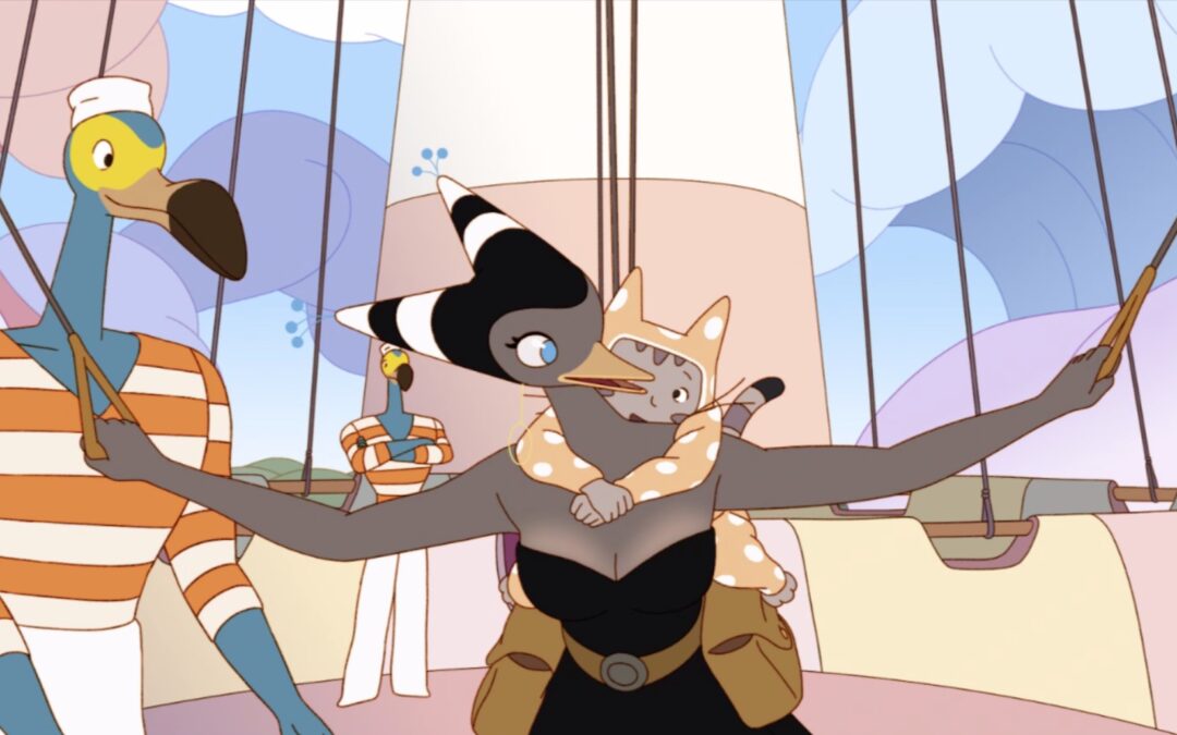
For example, let me tell you about one detail that actually isn’t one. You never have a frontal shot of Selma. She’s a bird with a beak, right? So if you show it from the front, it’s really ugly – it didn’t work out. So she’s only ever visible from the side or three-quarters. The character itself wasn’t designed as a volume – you can’t rotate her. Even during the animation, when Selma turns her head, we deleted the drawings where you can see her frontally. That’s what I call cheating. And you can’t do that in 3D animation. It’s another dimension altogether. And that’s what I’m interested in: there are some things that have no existence outside of drawing.
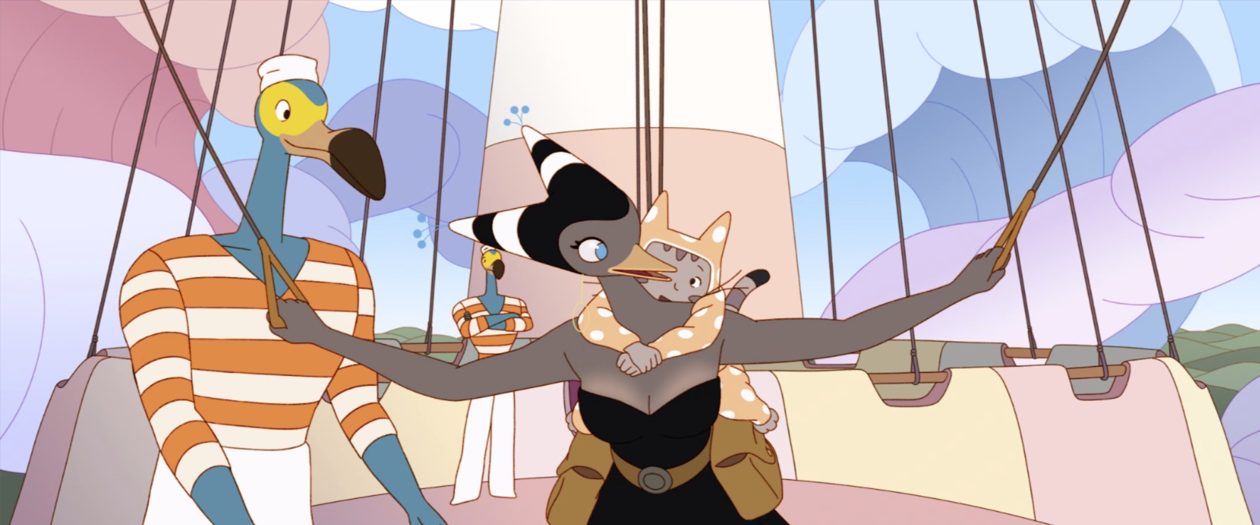
Another interesting thing in that regard is that, in hand-drawn animation, characters and backgrounds are usually completely different: characters are on cels and backgrounds on paper, and sometimes you see the difference, even in digital productions. But there’s none of that in Sirocco: the textures are the same, the drawings look similar… Did you have anything specific in mind regarding that?
Benoît Chieux: Yes, it all comes from the same idea. Well, at the very beginning, there was an economic concern. In my previous feature, Aunt Hilda!, I was in charge of supervising the backgrounds, and it was very, very intensive. I swore not to do anything similar ever again, and so I started looking for a style that would be as easy as possible to color. That’s why the drawings in Sirocco look like that. It was fundamentally an economic concern: I thought simpler drawings would be easier to control. And I was kind of right.
But the thing is that doing backgrounds without shadows isn’t that simple! Depth is everywhere in Sirocco, and we had to create depth without shadows. So, it became a question of colors: it’s all about using color gradients without going too far. We had to be very subtle in using the right colors to create depth without using shadows. And so it ended up on those flat colors. Which brought us back to the very same question: what I want to do – at least, what I wanted to do on Sirocco – is to animate drawings, not just do animation. Pushing that idea meant having a completely cohesive aesthetic where characters and backgrounds looked the same. It’s weird, but I found it extremely satisfying myself – I thought it worked really well!
That made me curious, because it solves so many problems, so why aren’t there more movies made like this? You have a unified aesthetic, which you usually never get in 2D animation – and that’s a problem, because you always have this gap between very detailed backgrounds and flat characters. It’s something that developed with time, culturally and historically, and we’ve grown used to it, but aesthetically I don’t find it particularly satisfying.
Also, another good thing with using flat colors on backgrounds like we did is that you can animate them – you can animate everything. I’d have liked us to go even further with background animation – of course, it entails a lot of money and problems, but I’d have wanted to do more of it, since we had that possibility.
Concretely, the animation and backgrounds were done by separate teams?
Benoît Chieux: They were made by separate teams.
Since you started with the drawings, did you also decide on the colors? For instance, did you do color scripts or image boards?
Benoît Chieux: Before the production started, I did a lot of key drawings for various sequences, which gave rather clear instructions about the colors. Then, we had the chief background artist, Alex Rimbault, who did key backgrounds: all on his own, he drew 300 key backgrounds, so around one-fourth of the entire film. We discussed things a lot together: he used what I had prepared, and I touched on his drawings as well. Once that was done, we called another background artist from Belgium, Julia Petroff, to help us out. She did all the other remaining backgrounds on her own: that’s something like 800-900 backgrounds, since the entire film required around 1200 backgrounds.
I did lots of corrections on the backgrounds, but what essentially made it work is how simple things were. The Photoshop files were very easy to use because I asked for a system where I could contribute as well: we used no other effects besides the gradients, and these were simple to play with since they were so visible. Whereas on Aunt Hilda!, every single file had hundreds of layers – that was crazy. This time, we only had up to 20 layers per file. It made things easy and worked out really, really well since I could correct things myself in detail rather quickly.
Besides the background, did you also supervise the animation a lot?
Benoît Chieux: I did supervise the animation a bit, but I mostly focused on layouts. First, we did clean backgrounds at the layout stage and added clean, on-model poses for each character. So, I corrected each pose a lot so that we had at least one on-model drawing on each shot from the very start. That helped us out a lot: it was very efficient, and our layouts were very, very well-made.
“Layout is the key, the core of everything”
I see, that’s quite impressive. I had seen the animatic, which was quite detailed as well… And considering everything you said about space, I guess things must have been quite hard on the animators: there are lots of high or low angle shots, things like that… So you had to plan things as much as possible early on to make it possible.
Benoît Chieux: It’s all about experience. What I learned throughout my career, after working on multiple features, is that if you want to control the creation of a film, you have to control the layout. It’s the key, the core of everything. When you’re doing storyboards, you’re on your own. But when you’re doing layouts, you’re in a team – but a relatively small one, so you can still influence the way things are made. Once the animation starts, it’s impossible: you can’t be behind the back of every single animator and correct every drawing. The amount of work is simply too large. So, the key is to master all the preparatory stages before the animation so that you can control the details of your film. And then, once the animation is done, you just have a few small corrections left, like off-model drawings and things like that… but overall, everything’s been planned.
If you get into a film thinking that you’re going to play around correcting the animators, you’re in for big trouble. The other solution would be doing like Sébastien Laudenbach, who uses a very simplified style – he’s very radical in that regard. It’s possible because he lowers the pressure, reduces the amount of detail on the drawings, and so he can control the animation. But that was undoable in Sirocco’s case. We did it to some degree, but it was very hard to handle: we had to go fast, and the characters weren’t that simple to draw.
The production was geographically pretty fragmented, right? With lots of studios everywhere.
Benoît Chieux: That’s right, we had 5 different studios. I was in the south of France, in Valence, with the managers and the main staff: art director Alex Rimbault, chief animator Susanne Seidel, and assistant director Titouan Bordeau. He played a huge role and helped me out a lot, for instance in correcting the animation and things like that. And then the actual teams were in Marseille, Strasbourg, La Réunion and Brussels.
It was the first time I ever worked with so many studios. I really wasn’t into it because it made everything so complicated. But the solution was to beef things up during pre-production. What I asked the producers was to have the pre-production on-site: we did the layouts in Valence, so I could really have a hand in all of it. Then, the other things I wanted to control were the post-production and the compositing. It was partly handled in Belgium, but we finished it in Valence so I could take back control. Pre-production and post-production are really the two key moments: at the beginning, you have to control things, and at the end, you have to take them back into your hands to bring everything together right so that the film ends up right. That’s what we did: I handled the production at the beginning and end.
You mentioned Titouan Bordeau. I believe you’ve worked together a lot.
Benoît Chieux: Yes, we’ve been close for some time and Titouan has worked on almost all of my shorts, except for Coeur Fondant which is in stop-motion. I’m very fond of him, and we share the same ideas about drawing and everything I just talked about: he understands very well everything I said about drawings and volume. We have lots in common. When he works, he puts lots of constraints on himself and his work, which is also something I like doing, for instance.
Working on Sirocco was an enlightening experience for him as well. He had never been assistant director, which is a pretty heavy, difficult job – if things get too hot, the one who has to leave isn’t the director; it’s the people under. Things weren’t easy for him, but he was amazing and did a fantastic job. I’ll never thank him enough. He’s extremely talented and draws very well, very quickly. On Sirocco, he supervised a lot of the effects, especially the tempest towards the end, which was pretty difficult to animate: there are the tentacles, the smoke and cloud effects, Sirocco’s hair… Titouan had done lots of models. He was also very involved in many other things.
Sirocco was special because of that: both Titouan and I were very involved and drew a lot. I never drew on a film as much as I did this time. It’s not always like that: directors aren’t always that involved in the actual creation of a film. But that was what I wanted to do: I didn’t want to spend my time in meetings. I’d spend the day correcting the animation, the backgrounds… Everybody was up to their ears, but I think that created a sort of mutual respect between all of us. In my opinion, that’s why everybody was so invested in Sirocco: they saw that we were there, working next to them. We couldn’t have done a film like this from behind our computer screens, just handling schedules and timetables. I don’t think anyone would have followed. Because we didn’t have a lot of money, we had to make up for it with our investment, and everybody was nearing burnout at some point. But they knew that the main staff was there to help out, to draw alongside them – I think that played a large part in the final film.
“To make films is to draw”
Listening to you, you’re not giving up on drawing. Is it because you need to keep drawing?
Benoît Chieux: I love drawing. I love it, and the older I get, the more I love it. It’s a real pleasure for me.
For example, right now, I’m doing design work for someone else’s project and just drawing on paper, with watercolor and all that stuff – just the joy of holding a pencil; it’s extraordinary. I love it. It’s my job, and I can’t live without it. To make films is to draw: if I got into this business, it was to draw. To this day, I can’t imagine making a film without getting involved. It would be meaningless for me otherwise. So, on Sirocco, I did the entire animatic myself. It’s pretty rare for the director to do it entirely by themselves, but I love doing it: it’s not extra work; it’s something that makes me happy; it’s the moment I really get the feeling that it’s my project. It’s nice to have others work for you, but doing things by yourself is even better.
For some directors, I think what’s most important is telling a story. But you’re all about drawing?
Benoît Chieux: It depends. I started working on Sirocco in 2013, at a time when I didn’t feel confident about writing for a feature by myself. So the end result is kind of strange: you can’t say it’s not my film. I was so closely involved that it’s mine, but I didn’t completely control the scenario. Scriptwriter Alain Gagnol came in, we had lots of back-and-forths, and that’s how the story emerged.
Shorts are different. I’ve written plots, I’ve been a lot more involved in the storytelling, the original idea… Things weren’t the same on Sirocco because it took a lot more time to take shape and I worked with many other people. But right now, I’m thinking about what comes next, and it’s true that I’d like to get more involved in the writing: I want myself to be inside the story too. So the film doesn’t just come from the pleasure of drawing, as you said, but also from the pleasure I get to share a story I like. I could do that on shorts, but not really on Sirocco. That’s how things go: the film was made like that, it was great, and I have no regrets, but the pleasure of making a film also comes from telling a story of your own. Sirocco became that way, but it wasn’t at the beginning. At the very start, it was really just about creating a fantastic universe – that’s mainly what Sirocco is about, isn’t it? It’s about the discovery of the Kingdom of the Winds. My main idea was about making the world as impactful and believable as possible.
And also as open as possible, right? I’ve heard you mention “open movies”, with all these small moments when you can feel that there’s something more to it, other stories that could be told.
Benoît Chieux: Indeed, the world had to appear as wide as possible, so it couldn’t have been closed: each shot had to open towards another possibility, another story. It became increasingly important: as the girls go on, the spectator follows them, but they also wish they could stop to go through other adventures. There are the small witches who go to Selma’s concert, the lighthouse, those crocodiles you’d like to know more about… It’s full of open doors, and I cared about that a lot: each of these doors opens into the spectator’s imagination. They let them imagine what the movie could be if it went in another direction.
Regarding that, there are projects about a book and a video game, right? It’s a perfect fit for your open world philosophy.
Benoît Chieux: Well, I told the producer, Ron Dyens, that I wouldn’t be involved in the derivative stuff. I mean, I spent almost ten years on that project, I want to move on. On paper, a video game could really work, but it seems that it has trouble starting up. But in my case, I think I want to do something else, explore other worlds, and tell other stories.
“The more you think about space, the world becomes increasingly almost tangible”
Going back to our earlier discussion, we talked about space a lot. And I wanted to know, why go to such lengths to produce such “realist” spaces, with such complicated perspectives and everything? What’s the point?
Benoît Chieux: Why bother, huh? That’s a good question. I think the answer is that, the more you think about space, about how you can make it believable, the world as a whole and the characters in it become alive, and it all becomes almost tangible. In other words, you feel everything that happens there, you’re literally into it, you’re fully alive within it.
To sum up a bit, it’s something I found out when I discovered Miyazaki’s work. It wasn’t so much the stories or the style, even though it’s all great. But really, what amazed me the first time I watched a Miyazaki film was that it touched me. I was moved. What I see when I watch his films isn’t something far away; it’s very close to me and very personal. And so I believe that I quickly understood that, to achieve this, I had to put my energy into the staging. It’s not just about the drawings: you have to think about where you put the camera so that this feeling of life be as strong as possible. So, I studied Miyazaki’s films a lot to understand this.
The one who theorized all of that was actually Takahata. Miyazaki couldn’t have done his films the way he did without Takahata, who was the one who wrote about all of this, who put order into these issues. The both of them really thought about how, in animated films, you could convey such a feeling of life.
On the other hand, what the Americans did was to make their films believable by pushing realism to the extreme through 3D animation. In other words, when confronted with the question of presence or reality, their answer is a visual, aesthetic one. They decided to make everything as believable as possible: when you see water in a Pixar film, you can’t think it’s anything but water. However, they never really questioned staging.
But I was interested in staging. When you see a Miyazaki or Takahata film, the impression of life is almost as strong as in a Pixar film, even though the graphic style is much simpler, far less realistic. And it works! Which shows that to create a sense of life, you don’t have to go for a photorealistic aesthetic.
The same thing happened with painting: impressionism offered the same answer to the very same issue. In the XIXth century, academic painting was ultra-realistic; painters were trained at drawing characters, backgrounds, animals in that way and were very good at it. But then, the impressionists came and formulated things a different way. There’s this great quote by Monet: “The motif is secondary: what I want to reproduce is what happens between the motif and myself.” So, representation itself isn’t the real issue anymore. When Monet paints the Rouen cathedral, he doesn’t really paint the cathedral, but the interaction between him and the cathedral: the light, the changes in color… And what has History remembered from XIXth-century painting? Not the academic paintings which were all over museums, but the marginal artists, the impressionists, whose work leave you with a much stronger impression of life. So that’s where things get interesting: at some point, photorealism becomes a dead-end.
What the Americans did between the first Pixar and today, that is since 1995, was to create technologies to get as realistic as possible – in a way, you can always go further and further in that direction. There’s no end to it, and yet it’s a dead-end: there’s no opening, the aesthetic itself remains the same. It just becomes an issue of technology. Whereas there are no limits to what you can express with drawings: it’s what I just said about shapes, lines… There’s no limit. That’s why it’s so interesting to do traditional animation today: you can integrate the cinematic language, create spaces… without necessarily being photorealistic. That’s what I tried to do with Sirocco.
You’ve just mentioned Ghibli, Pixar, and I was curious to hear you on Disney – let’s say the “classic” films, the ones in traditional animation. Where would you situate them?
Benoît Chieux: Well, Disney’s clearly different from what Takahata and Miyazaki have done. To sum things up simply, what Disney set up in their first films is what I call “pictorial staging”: the staging isn’t made to create a sense of space; it’s made to create beautiful pictures. Which means flat, most of the time, rather than in-depth. In the early Disney movies, Snow White or Pinocchio, the first thing you see is a book opening. What does that say? It’s just like telling the spectator what you’re watching isn’t real; it’s just a story. So, the spectator is immediately driven away from what they’re watching, which is the complete opposite of what Takahata and Miyazaki do.
There’s that, and there’s something more. Because if it’s a book, what’s the idea? It’s that you’re seeing illustrations – that’s the message of the first Disney films. So it’s not saying that you’re entering another world; it’s saying that you’re watching something far away, belonging inside a book. So for me, as a director, I have to face this question: can I invite the spectator inside the world I show them, do something more than just say, “You’re watching something from far away”?
But there’s a book in Sirocco, right? The girls literally enter it…
Benoît Chieux: Yes! Things are turned on their head. I borrowed that idea of falling into the book, but the point is that what happens is real, not just pictures.
“Takahata and Miyazaki put cinema into animation”
Regarding Takahata and Miyazaki, you just mentioned you studied their work, what does that mean concretely? Watching the films, taking notes, making sketches?
Benoît Chieux: There are two things. The first is watching the movies. I’m not shy about it. I’ve seen Miyazaki’s films many, many times. I must have seen Laputa: The Castle in the Sky around 50 times – at some point, I watched it on repeat, I still watch it today, and I know it by heart. There are also things like Satoshi Kon or Mamoru Oshii’s films – it’s pure cinema to me, so it’s always great to watch them. The other reason is that nobody can draw like the Japanese – the drawings are amazing, and they can animate anything. It’s pure happiness to watch such talent expressed in film. So I learn just by watching.
The other is that I teach in two animation schools – Émile Cohl in Lyon and La Poudrière in Valence. As a teacher, I had to learn a way to put the right words on my thoughts. If I didn’t structure things, the students wouldn’t follow, and I wouldn’t be relevant. That obviously played a big part, and that helped me formulate my ideas and go to the places I wanted.
As you just said, that’s what’s interesting with Japanese animation – the way they see animation as cinema.
Benoît Chieux: Exactly. Well, it’s mostly Takahata and Miyazaki who did this amazing thing: they put cinema into animation. Let’s be clear: before that, nobody had ever tried. The language of cinema is so complex, so rich, and before these two, nobody had ever thought about what the “cinema” in animation could be – before that, people who thought about animation just saw it as a plastic, visual, and graphical form of expression. Of course, you had things like rhythm, stories – there have always been great stories and great animators. But it wasn’t before Takahata and Miyazaki came and created this film called Hols, Prince of the Sun that the idea that cinema has its own language was introduced. And then, that spread all over Japan and became the norm. For some reason, that only happened in Japan, but nowadays, when the Japanese do animation, they’re first and foremost doing cinema. I mean spatial cinema, which uses the full range of what film language can do.
And now, that rubs off in Europe, especially France, with people liked Rémi Chayé, Jérémy Clapin, Jérémie Perrin…
What about Benjamin Renner?
Benoît Chieux: I’d say he approaches things in terms of aesthetics. He’s an animator, so he considers the movements of the characters and the gags above all, but he also thinks about space, a spatial kind of staging. But here, films like Mars Express, The Summit of the Gods, these are films relying on space, on editing… We’ve barely started treading that path. It’s strange, but animation directors haven’t really grasped cinematic language yet, so a lot remains to be done. But that’s what makes it interesting – it’s fabulous, there’s a lot left to experiment with.
For instance, when I mentioned Mamoru Oshii, his cinema really questions montage – the editing is always excellent. It’s the same for Satoshi Kon. It’s crazy, seeing all of his films, especially Paprika or Millennium Actress – to this day, there’s no animated film which has gone as far with editing. We still have to catch up to that.
In your case, have you also been studying a lot of live-action cinema?
Benoît Chieux: Of course, I watch films, but it’s not what I’m interested in most – what I care about is drawings and turning drawings into film. Of course, cinema has been interrogating that for a long time, it’s nothing new, but I think that it’s a pity that so few animation directors take up those questions through their directing. It’s so important to me.
But on the other hand, I get it – learning to draw is already so long, it’s so hard to make good pictures, good compositions. And then, on top of that, you have to tell a good story, and then raise actual cinematic questions, think about the montage… it’s always more, more, more. That’s what I tell my students: you need ten years to learn how to draw. Then, you know how to do a decent storyboard, but you need ten more years to really interrogate things in cinematic terms. So you can only do really interesting films at my age, 50 years old. It’s the same for all the directors I mentioned: Jérémy Clapin and the others… That’s the core of the issue: you can’t do without the drawing experience. You have to go through that, master your own line, and do something with it.
That’s one of the wonderful things with Japanese animation: all these directors I mentioned are incredible artists. Miyazaki’s a genius, same for Kon… They draw incredibly well, and just seeing how much knowledge and skill they accumulated is fabulous. It’s easy to underestimate the amount of work this entails. After having done Sirocco, I think I can safely say that nobody truly understands what making an animated film today really means.
That’s actually something I’ve always been thinking: you have to be crazy to be an animator. As you said, just drawing is difficult enough, but then, let’s not say 24, but just doing 8, 12 drawings per second for 15 minutes, 1 hour, even longer, I can’t picture it. It’s really impressive. So, I have a lot of respect for animators, but they also scare me a bit… You really have to be crazy to do that.
Benoît Chieux: I concur! That’s what makes this job so beautiful: you have to be a bit crazy to do it. I also have a lot of respect for all the people working in this field because it’s a thankless, difficult job in which you’ll work so much for something that sometimes just appears for a few seconds. It’s madness.
Going back to Japanese animation, but under another angle, the thing that’s often discussed is limited animation and all that stuff. I believe you’re quite knowledgeable about that, as you’ve even taken part in academic events…
Benoît Chieux: Yes, it was quite an interesting conference I attended some time ago! There were a lot of very interesting guests, including someone called Amid Amidi, the creator of the Cartoon Brew website, who did a great, very didactic conference – it was really American-style, the kind of talk only the Americans can do, very well-prepared, with every argument down pat.
He notably explained what limited animation is because people usually think that “limited” animation applies to Japanese animation when it doesn’t. He explained very well that limited animation is, first and foremost, a word with a history that appeared in a certain context when people started doing TV series and used the minimum number of drawings possible. There were lots of attempts, because all of that happened when the only reference for industrial animation was Disney, which used around 24 drawings per second, and people realized that they couldn’t go on making things that cost so much money.
So, around the 1950s, limited animation pipelines started being implemented in order to produce TV series. Amid Amidi showed examples of that: there’s basically no animation. It’s just a few drawings for each shot. It’s very snappy, the kind of thing you’d find nowadays in cutout animation or series where it isn’t really animated anymore but just computers doing interpolated in-betweens. On a single shot, you have one, two key drawings, and the rest is interpolated. Anyways, that mindset proved productive, and it worked out. But that’s not the same thing as what you can see in Japanese animation: Japanese animation isn’t limited.
Japanese animation has a very elaborate system in which there are lots of drawings. Getting into the details would be quite long because it’s quite complex, but the first thing that’s interesting about Japanese animation is how they don’t have a rigid system. It’s evolutive: they adapt everything to each shot. Naruto is a good example. You’ll have long sequences in which there’s almost no animation and then some when there’s lots of movement. So, for a long time, the Japanese have been thinking about this: they don’t have lots of money, so they’ve been thinking about where to put it.
That’s what’s interesting: you can’t call it limited, because they do have the budgets needed to make animation. But they don’t animate everything: they think about how to spend their resources. So even in very simple series, they’ll be able to include very sophisticated animation. That’s not limited animation!
The first time I talked about this conference, it was with Sébastien Laudenbach, who said that it was something between Disney-style full-animation and the kind of limited animation that developed in the 1950s. Today, this in-between style has become the norm. The two of us call it something like “parsimonious animation”, because it’s between two extremes, somewhere in the middle.
Sirocco is a perfect example of this style. Sometimes, the animation is very simple: with the chief animator, Susanne Seidel, we had to ask for lots of retakes and ask animators to remove drawings, to make the movement more simple, because they went too far. For some veterans used to working on very big projects, everything had to be animated: whenever a character was on screen, it had to move. We told them not to do that and removed some motions. But on the other hand, in some scenes, the animation is on 24 drawings per second and a lot more complex, for instance, Selma’s action scenes… We really decided to go with this style, with some very simple and some very complex sequences.
That’s something important to think about: not set up rigid codes, but think seriously about how to spend money, how to make the animation efficient in relation to the project you’re working on. Mamoru Oshii’s very good at this. I think he’s one of animation’s greatest thinkers because he can do such things in very ambitious films. For instance, in Ghost in the Shell or Patlabor, he’ll have very well animated, very realistic sequences – the kind of thing nobody else could do. But in other scenes, he’ll find every possible trick to limit the animation. So, for instance, one of the things he does is show a character talking from behind. That’s genius. The character gets up from their desk to talk with someone who just entered; they face the window, arms in their back, and start talking for a half-hour. The reason it’s genius is that it creates such a specific atmosphere – showing people from the back is very rare in animation: usually, you put the characters in front of each other. But he does the opposite, without any lip-sync – that’s why I love his films. Everything is so thought-out. Another thing he does is reflections in glasses: you have a guy close to a computer screen, and then all of a sudden, you can’t see the glasses anymore. So you don’t have to animate the eyes.
All of this is so interesting because the intent behind it is always so strong. And as a result, the scenes themselves become stronger and more realistic. Paradoxically, showing a guy talking to the window creates a very specific but very intense atmosphere. While not needing any animation. So thinking about animation is essentially an issue of direction: today, it doesn’t make any sense to say, “Let’s do limited animation” or “Let’s do full animation”. Anyway, nobody has the budget to do full animation anymore. So now, it’s all about how to spend money.
Thank you very much! I think people have already asked you a lot about influences and references in Sirocco, so I’d like to change things a bit. Basically, I’m going to show you things Sirocco made me think about, and I’d like to hear your reaction or your thoughts. Here’s the first…
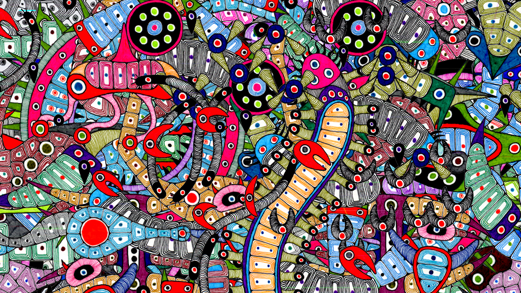
Benoît Chieux: That’s Mirai Mizue.
Ah, so you know about it!
Benoît Chieux: I love it. It’s very strange, though – it’s such a thankless kind of work… Seeing such films is really fascinating, because it takes so much energy, and also so many ideas, it’s beyond my understanding. I’ve seen videos of him drawing, frame by frame, these pictures which he scans afterwards…
The amount of work is crazy, and yet it’s so, so rich visually, there are no bounds to it. Both in terms of shapes and movements. And also, without a lot of resources: the staging is completely flat; it’s all about shapes and lines moving. There’s no depth whatsoever. You would think anyone would get tired of it at some point, but he never does. He keeps on, he questions himself and comes up with new forms, new movements… It’s really crazy.
As you said, it’s very flat, and I’d say that his art is pure drawing, all about shapes and lines.
Benoît Chieux: And rhythms too! He’s working a lot on rhythm, playing on creating unexpected speeds and compositions… He often completely saturates the image until it becomes completely unreadable. It’s really beautiful, I love it.
Ok, let’s do the next one.
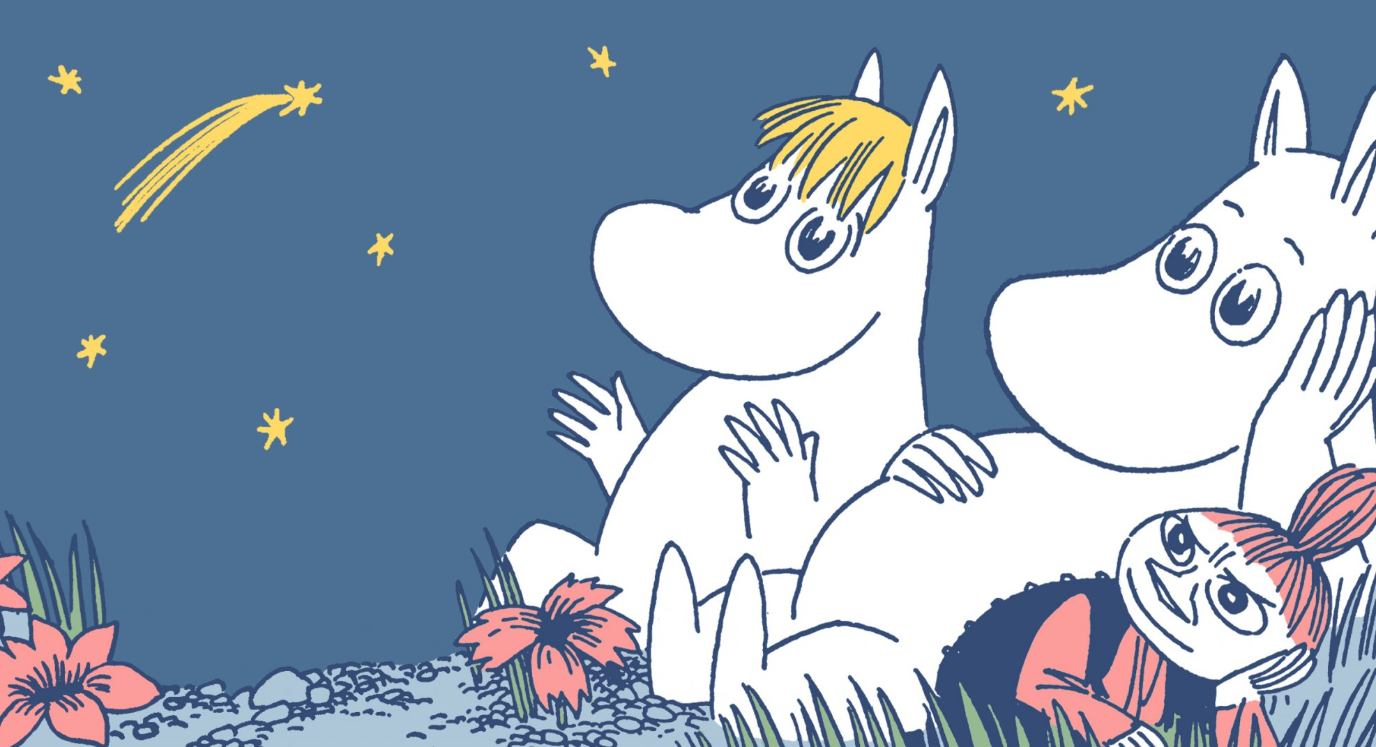
Benoît Chieux: Tove Jansson’s Moomin. I know that very well.
I knew about Moomin for a while, but there was an exhibition of Jansson’s work in Paris recently, and I realized how amazing of an artist she was.
Benoît Chieux: Moomin are great for multiple reasons. Jansson, through her drawings, built a very unique world with characters that are very believable and all leave a strong impact. The characters are amazing. There’s also the theme – if you read the Moomin today, you’ll realize how completely revolutionary it is. These characters were already ecologists, completely oriented towards nature. They’re revolutionaries: they don’t like money or profit… It feels so good to see such stories today, with such a message about compassion, brotherhood, and being disinterested. Nowadays you see so many things where it’s all about money, nice cars, golden watches… The Moomins are the antidote to that. It’s pure genius. I love how strong it is.
As a small aside, the Moomins came rather early in Japan. It’s another sign that the Japanese were very good, because they saw the potential in those stories. One of the animators on that series was Yasuo Otsuka, who worked a lot with Miyazaki. And you can make the connection, more-or-less direct, with the character from Panda Kopanda which then became Totoro. Since Otsuka was there, maybe it all comes from the Moomins. It’s absolutely fabulous, you have to read it!
That’s what’s surprising. I think that, in France, Jansson isn’t well-known at all, but in the rest of the world, she is – for instance, in Japan.
Benoît Chieux: There’s artists like that in every country – some people just don’t get across the border. For instance, in the US, there are some artists whom everybody knows that are completely in France…
That’s the perfect transition. Next!
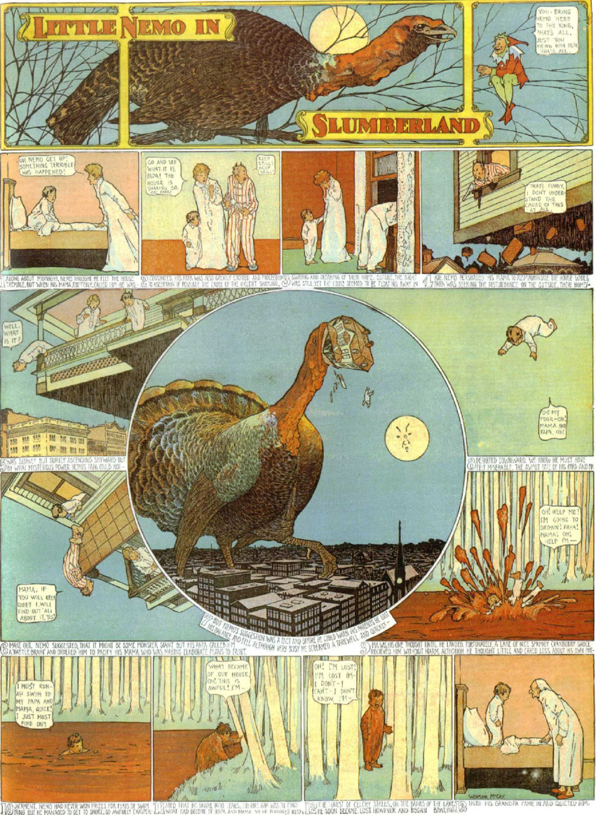
Benoît Chieux: Ah, Little Nemo! I read it often. I’ve never seen anyone doing comics better than Winsor McCay. Just a few days ago, I read some of it at home. So, of course, I know it very well.
It’s crazy how well-built the world is and how well everything is drawn. There’s never anything half-baked in the drawings. He has so many great ideas on space – what you’re showing here is a good example because what you see is the entire page. This one here has this composition; it’s a real composition where each panel has its own shape… And at the same time, it’s about space. Once you’ve seen the page in its entirety and look inside each panel, you enter into a world of its own. Windsor McCay is huge – there’s no equivalent; it’s just so fantastic.
McCay was also among the first animation film directors. These are still fascinating to this day because he made some rather funny comedies and an animated documentary, The Sinking of the Lusitania. It’s very surprising because it’s very realistic: you can see the ship sinking, the people aboard jumping into the sea…
There’s a link with Miyazaki here, too, by the way! There’s this Nemo film on which Miyazaki worked, Moebius as well by the way, so you can make connections between Miyazaki and Winsor McCay.
Have you seen that film?
Benoît Chieux: Yes. The first time was in Annecy, when it came out. I don’t think it’s very good, but all the people who worked on it are very big names. Moebius’ sketches are amazing. Just the preparatory sketches are great…
Ok, here’s the next one.
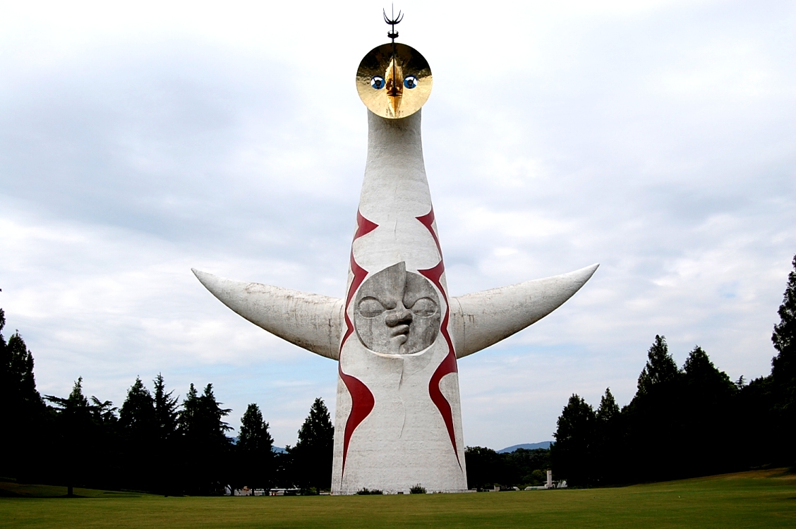
Benoît Chieux: I don’t know that!
You don’t? It reminded me of the toy in Sirocco. It’s a big statue called The Tower of the Sun, by Japanese artist Tarô Okamoto. He’s a kind of surrealist artist who was active in Japan mainly in the 60s and 70s.
Benoît Chieux: You’re right; it’s exactly like the toy. That’s funny.
Right? The overall shape, and also the way the face isn’t really straight.
Benoît Chieux: That’s a great find. But I don’t know that artist.
That statue was made for the 1970 World Exhibition which took place in Osaka.
Benoît Chieux: I see. I’d have dated it to when they built all these great towns in Brazil and Argentina… It’s the same vibe.
Last one is a film…
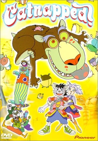
Benoît Chieux: Catnapped! I know that one very well. Takashi Nakamura, right? I love that film, it’s so good. By the way, one of the main animators of that film is the director of A Letter to Momo.
Hiroyuki Okiura.
Benoît Chieux: Right. I believe he’s one of the greatest animators in Japan.
I love Catnapped, it’s great. The directing isn’t always the most efficient, the story is a bit hard to follow at some points, but the worldbuilding is amazing. What’s great about this film is how different it is from the usual codes of Japanese animation: the aesthetic is superb. The backgrounds in particular.
So, of course, when I made Sirocco, I had Catnapped in mind. The connection is just too obvious, isn’t it? Afterward, I rewatched the scene when they change into cats, and I thought, “Wow, it’s really similar!” Even though it wasn’t intentional at all. Also, there’s the way the film approaches color: it’s very well balanced, very strong. You can find some of that in Sirocco. And that thing about characters puffing up like balloons… There’s obviously a lot of things in common.
Yeah, as soon as I saw the cats in Sirocco I thought about Catnapped.
Benoît Chieux: That makes sense. To be honest, I don’t think that Catnapped is a perfectly complete film… But I like Nakamura a lot, especially the one he did just after…
A Tree of Palme?
Benoît Chieux: Exactly. I love his films, how ambitious he is… He has these incredible stories to tell, but they’re often pretty difficult to follow. You often get lost… Even in Catnapped! What’s fun is that Catnapped also reminds me of that Astérix album when the Romans puff up at the end. You have the exact same characters in Catnapped, and then some incredible scenes.
So, I love Nakamura. I don’t hear a lot about him, and yet he did great movies. His aesthetic is somewhat different from normal Japanese animation. His characters are built in volume, so I think there’s something kind of European in his style…
I’m very glad to hear about it as well! That was all I had to ask about. Thank you very much for today!
All our thanks go to Benoît Chieux for his time and for his film. They also go to producer Ron Dyens and Ms. Lestage from the Forum des Images for their availability.
Interview, translation, introduction by Matteo Watzky.
Transcript by Emilia Hoarfrost.
Like our content? Feel free to support us on Ko-Fi!
You might also be interested in
Oshi no Ko & (Mis)Communication – Short Interview with Aka Akasaka and Mengo Yokoyari
The Oshi no Ko manga, which recently ended its publication, was created through the association of two successful authors, Aka Akasaka, mangaka of the hit love comedy Kaguya-sama: Love Is War, and Mengo Yokoyari, creator of Scum's Wish. During their visit at the...
Ideon is the Ego’s death – Yoshiyuki Tomino Interview [Niigata International Animation Film Festival 2024]
Yoshiyuki Tomino is, without any doubt, one of the most famous and important directors in anime history. Not just one of the creators of Gundam, he is an incredibly prolific creator whose work impacted both robot anime and science-fiction in general. It was during...
“Film festivals are about meetings and discoveries” – Interview with Tarô Maki, Niigata International Animation Film Festival General Producer
As the representative director of planning company Genco, Tarô Maki has been a major figure in the Japanese animation industry for decades. This is due in no part to his role as a producer on some of anime’s greatest successes, notably in the theaters, with films...


Recent Comments